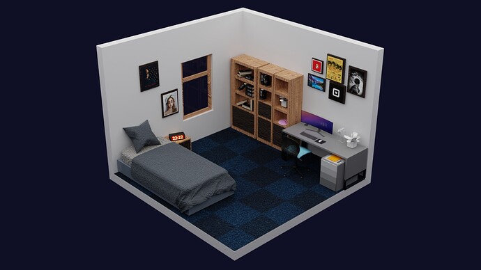
Hi this is my first render and also my first time posting any forum. Just wanted opinions and suggestions to improve this render so that it can look more realistic. Thanks!
I really like the texture on the wood.
But the cloth looks a bit scruffy.
But everything looks really good.
It’s beautiful! If you want it to look more realistic then you could think about adding imperfections, light sources as if there where a sealing light. Maybe some more textures? Flattening the pillow a bit in the middle so it looks more used? Maybe more details around the window? Also the left wall of the left book shelf looks to be more thick then the other shelf walls.
Thanks. I also noticed it and I am unable to understand why the cloth material looks so rough and bump. I will try changing the texture.
Thanks a lot. Actually I also wanted to make it room for my animations but adding any type of light source brought a lot of noise and some white spots in the render so I had to replace it by an area light. Any suggestion how I can add it without sacrificing the quality.
Hi
The main problem perhaps you need to improve the window. This i very simple now, and the wall around it, is very thin. And the main error can be the texture in the vertical sides of the frame. You can use a uv map to set the wood grains more vertical only in vertical sides.
Same for the book cases, but this is not so serious
The computer monitor is very wide. Extra-wide monitors exists in real life, but in the first look we expect a regular size monitor and this looks weird
A important rule is to have a constant level of detail in all the objects around the scene
The whole pic looks quite alright. Just feels like it lacks a fish tank, a cosy place for cat and a birds cage with net space around special birds window with plants in it for it to fly in.
While blankets and pillows texture feels a bit rough, maybe You need to reduce it’s geometry of texture
which You have used as it seem to me.
It’s very good, I don’t see any problems with it. Maybe the wood texture is too strong, looks like raw wood. You don’t use raw wood to make things 
Thanks a lot, I will try imrpoving the monitor and the wall.
Thanks. I will try changing the texture with a more polished one.
 Adding a fish tank and a cat place would be tough but I will try adding one,thanks for suggestion.
When I saw the thumbnail for this, I was expecting a cartoony low-poly thing because it’s in an isometric view (which is ok in my opinion but it is unrealistic). You could try putting the camera inside the room somehow.
Also, the desk and printer look cartoon-low-poly (which again, isn’t bad, but it is unrealistic). Maybe look at pictures of printers. They’re more modular in real life (i.e. made up of big pieces).
And find a texture for the desk, maybe?
Also, the textures for the bed could be better. It looks like sponge material.
^@ 6:25 solves a similar problem. (rewind video if you wanna learn how to make good seams before UV unwrapping).
Using real posters helps the realism, as far as I know. Good job!

