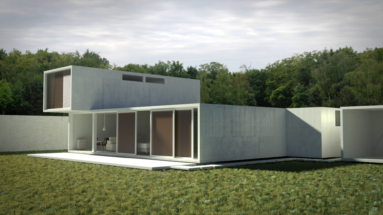
Hi guys, I’m not so happy with my work, so I need some critique. Please tell me, what can I do to make it look better?
Blender Cycles
1280x720
2000 Samples
Hi guys, I’m not so happy with my work, so I need some critique. Please tell me, what can I do to make it look better?
Blender Cycles
1280x720
2000 Samples
Step one, add some bevel to the sharp edges 
personally I think that grass looks a bit dead and you should replace those 2d trees in the background with something better or get rid of them entirely. color correction and some more outer features on the building could help as well
The lighting stood out to me. There’s a lot of bright sunlight on the front of the building and on the grass, but the background has a cloudy gray sky and no sunlight on the tree tops.
Thanks for the comments guys