Hej guys and girls. 
I with love to here if you could give me some critique on this project to the AA-competition.
I stil think something is missing. 
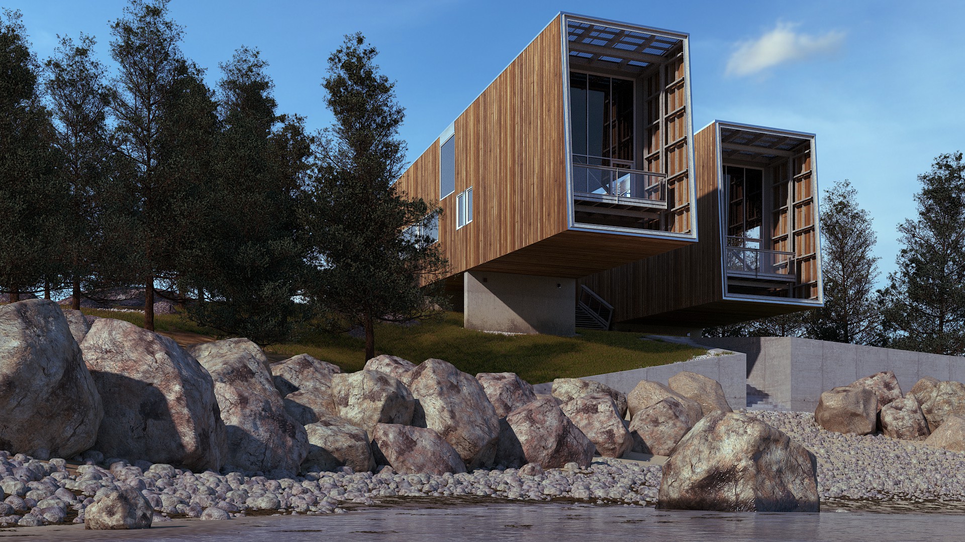
It is a raw render. No postpro yet.

An exceptional job, Perhaps a little more variation in the color of the trees would be my only critique.
The large rocks seem off too me. I think they should be more similar in color. Like the smaller rocks. Maybe increase the scale of the large rock texture as well for some sharper detail.
Looking pretty good. Are you using HDRI? And what is the AA competition?
Hi lucblend, this is a great image. This is a great outdoor scene. I love the modeling and texturing on the house. There are two things I would critique. The first is the trees. There colour is brown and murky, and is really not nice. The grass is a nice, vibrant green. I would do this to the trees. They really are quite off putting. The second is the rocks. They lack a lot detail. I’m not sure how you made them, but, if it was through displacement modifiers and textures, I would definitely add more detail. When I make rocks, I normally have about four displacement textures—two voronoi and two clouds—as well as a subdivision surface modifier before the displacement modifiers, normally set to about five or six.
This is a really nice image and with some tweaking—and the post-processing that you haven’t yet added—it could be great.
Thanks all for your constructive criticism.
Mmoore500: The AA stands for The Architecture Academy
I agree that it is the big stones and the tree need some work. More colorvariation on the trees is a good idea.
David_G-D:I have used more or less that way to make the stones on which you mention. But after that i aplied a decimatemodifer. I will change the closets stone, and make them more highpoly. But only the closets i think because i already use 10 gb ram. 
Also only have few colorvariations on the big stones as mmoore500 says.
Hi Lucblend AA-friend!
I suggest: greener trees, remove the right trees, thats seaside - open air (in my feeling), lower cam even more close to water, add big stones from left into water even very close to cam (on left side), and big stones must have more surface-roughness (if thats english), little higher contrast (darker shadows, its sunny), lift cam and increase focallenght some to “get the house”(ok to lose some stones and trees to the left), rotate sun ccw some to add some more light touching the windows. Looks great already!
Thanks Ola my friend I knew I could count on you 
I agree with most of you points
Here is an update. Totally new stones added. Bigger focallenght, lowered the camera closer to the water and tried some postpro.
The trees still need som random colornes.
Trees are too dark if the sun is shining from the left side. If they are images, add little emit for those planes. Crocks are now better
Something about the rocks still seems off to me. Maybe they should be smoother. Like they have been smoothed by water over a long time. Like in this image: http://yubariver.org/wp-content/uploads/2013/06/49-crossing-upstream-view-September-2012-Abigail-Limov-boulders-river-sky.jpg
Don’t get me wrong. Its pretty cool. But something still seems off to me.
Thanks again.
TynkaTopi the trees is 3d så i change the material a litle bit.
mmoore500 Have look at som ref pictures about rocks and stone and it is vere different how they are. Some times sharp and somtimes smooth.
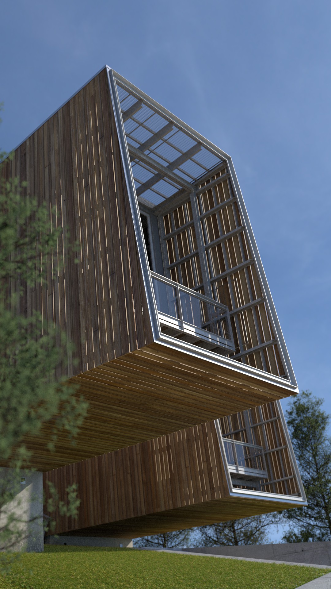
New update and some other shoots…


Change the sunposition, some materials and some rocks but i am stil not happy
You’re right about the rocks being different. But the small rocks in the image seem to be smooth. So I thought it would make more sense if they all were a bit smooth. That said, I think the rocks are looking much better in the recent render.
You may want to add some detail to the angles of the concrete. Both on the retainer wall and the stairs and railing. Like shown here: http://cgcookie.com/blender/2013/06/21/tips-creating-sharp-edges-modeling/
I’m not sure if you’ve done any compositing, but you may like it more after you add an AO pass. I really like the perspective in the third render. I have a great deal of trouble framing my renders in a dramatic way. So nicely done.
Ofcourse you are not happy: trees always grow straight vertically, regardless of the position of the roots.
Be happy it looks great! The lower close up is lovely!!!
Great job. I think that the trees could be a bit brighter and the water looks too flat.
The scene, modeling and compositing is beautiful. Wow.
I would try removing some of those trees so you could see through between them, they’re a bit heavy and the viewer perhaps gets the impression you’re trying to hide something.
As for the building design itself: I’m not a huge fan of using steel I-beams in such sympathetic setting. The white color brings the beams forward even more, they’re popping up and hiding the wood. Have you tried with rectangular steel profile (or could you even use timber?) painted in dark color? What about coating the structure from both sides with wood?
You’d have to check your structural stability with your engineer, these masses form some long extensions without support 
But excellent work with the images, there’s barely room for improvement.