I want to improve so I am here asking for some critique on these images. Thanks!
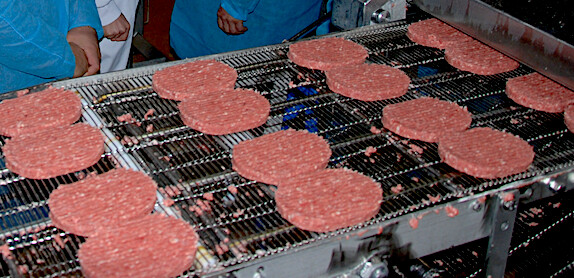
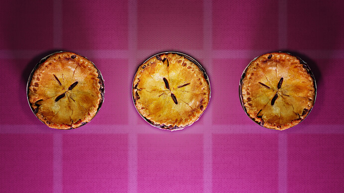
Wow, that chicken looks great, So do the Pies! food is really hard to get to look right.
Colour on point and composition and lighting all look really good.
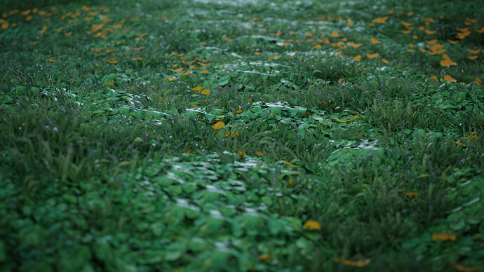
Top image has a great camera angle and scale I dont know what Jonny Humphrey is, but it looks like some acid, spongebob, western dream.
I cant say much else.
Top Job(s)
That’s really cool and such …
But I don’t see the point of these images,
The last tree look like some really good tests.
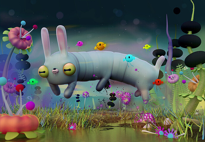
The first one is quite interesting with a narrative going on, interesting mood but it’s very busy.
What you want to tell is very unclear.
The last tree lack some meaning, so we can relate too.
The last one looks like something like this :

Let’s pretend this is a 3D render, is it well done ? yes !
What’s the point ? a tribute to steak ? How this is interesting ?
let’s pretend this is a 3D render :
Is it technically well done ? yes at least it’s an interesting exercise if I build everything rather than playing 30mn with scatter 5.
Now as an image, is this interesting ? What that image is conveying ? what effect does it want to produce on the viewer ? probably not a lot of things…
The first one has a lot of potential , but on the other hand it’s very confusing…
I can point out a lot of things but I’ll stick to a few things :
What is the focal point ? or what is the first read ? or what is the most important thing in the image ?
It’s hard to tell , but I would say that it’s the purple star in the center /bottom.
What do we see ? looks like it’s being captive, tortured but at the same time with an happy face.
How other characters relates to it ? green gards : hard to tell what they do but at least they are aggressive ( yet the character is happy for no apparent reasons) .
All that happens in front of a king , which seems bored or sleepy, for no reason.
There are other star character which seems happy , for no reason,
And it’s hard to tell who is the front character in all this, what it’s purpose ?
We can pretend it’s nonsense, but it’s kinda like putting random words together that somehow are related but on the overall doesn’t make a lot of sense.
So yeah , two road to take, either try to explain more things and add more coherence, or go a step further in the nonsense :
Something from an artist I really like ( pokedstudio) :
It’s really hard to tell what’s going on here, is it friendly or not ? But it’s really well balanced, it’s really clear that we are at the edge.
This one too, it’s super weird, but it’s made very clear that it’s the point, we don’t need to look further !
Sorry to be a little harsh, the images are quite cool, but if you do cool things like that , why not put it a bit further and go a bit more into the narrative ?
Keep up the good work !
Thank you for the critisism! I will work on readability. The bottom ones are tests but they are also based off things I really liked in real life haha. I really appreciate your answer and how in depth it was!
Thanks for the enouragement!
these looks fantastic !!
Thank you!
I gave a quick look at your porfolio, there are super cool stuff there, it’s super promising.
When a work of yours gets complex with a lot of elements the eye is quickly lost in many details, so yeah, stuff like readability, or put some hierarchy in readability is something you might look into at some point.
It’s part of visual storytelling, and it’s similar to storytelling : you need to tell things in an order, and insist on important things, and things less important you should spend less time explaining them in detail.
Even tho you know some of these rules you can work a bit more on that and you’ll get instant progress because on the overall it’s really cool stuff already !
Well done and I hope to see more from you eventually !
Thanks you man! I will work on visual storytelling more. I actually just finished a book on composition a week ago and have a lot of things I need to apply with it. Readability and too complex(or bad hierarchy) are good to know! Thanks a bunch man!
Yeah , I find that your image in general are well framed, you have a sense for composition.
But yeah, You can then start to think in terms of hierarchy : what is the most important thing in the image, how it relate to the second most important thing, and in general what remains is less important.
There are many tricks to lead the eye to these things, or visually give some clues that “this is what you’re supposed to look at”…
I’m not a master at this either , but it’s much more comfortable to work when you start to use these tricks into your work .
A really cool channel that teach me a lot of these stuff among other things is this one :
Good luck and keep having fun !
Thanks for the channel man! Yeah I really want to get better so I can make some cool stuff! Also I like the cartoon you made! I watched it a while ago and have wanted to make a youtube cartoon since! Nice job and cool work with geometry nodes!
Thanks a lot SketchCat !
You’re clearly on your way to make cool stuff, it’s already impressive ! But sadly because some parts are very good it’s easier to unbalance them with a bit of missing knowledge ! BTW I don’t want to sound like I know everything, one life isn’t enough and I keep learning fundamentals stuff on a regular basis.
I just watched your POLE devlog 1 , there is some super interesting manga-like animation , with a weird graphic style. You definitely have your own universe ![]() Worth developing and bringing it on screen !
Worth developing and bringing it on screen !
The game looks quite crazy and fun too !
It’s super cool that you want to make a youtube cartoon, it’s starting to get very doable with a small team and a good deal of energy and patience. The tools are starting to get there and it’s really a super cool, uncharted territory to explore. Even tho there are very awesome and very inspired commercial series out there, it’s quite difficult to take risks given the money investment it represents. I’m really looking forward to see more indie project on that side, that can bring new things to the table alongside some really interesting commercial project that we have nowadays.
Looks like artists keep pushing the boundaries every time and having an bigger indie animation scene will definitely help a lot.
Thank you so much! I will keep working on it and appreciate the critisism! Can’t wait to see more stuff from you too!


