I have some experience in games, and i’m mainly used to modo, but i may be able to offer you some critique composition wise.
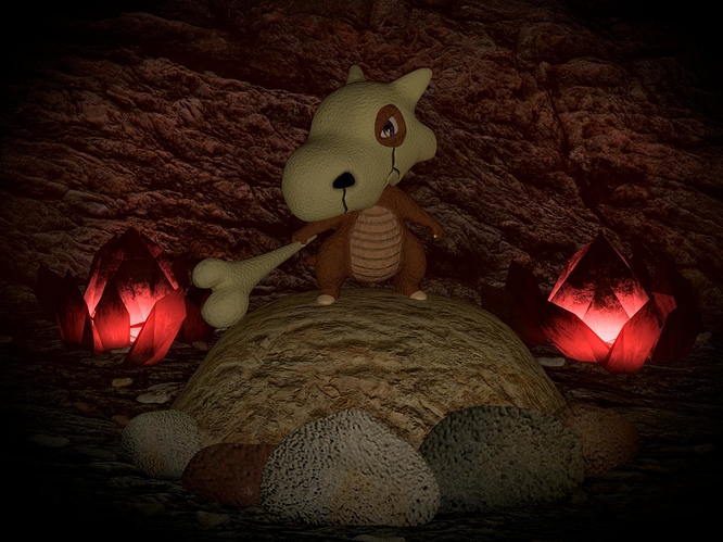
Cool Cubone, and good use of a vignette  let’s focus on the environment, because it’s the main thing we can improve here.
Cubone has a very earthy body (clearly) and he’s the focal point of your work, so what you want is for your cubone to stand out well against the background. He’s in a cave which is naturally very earthy looking. How can you solve that using stuff you already have?
Well, you have some red light sources already. If you fill the cave backdrop behind him with bright red light you will make him stand out more, and if you have some directional red light as well, you can create a soft light around him to highlight his silhouette a bit. That will make him really pop.
I can see you’ve put some pride into the background crystals, and they look nice. However, they are are conflicting visually with your cubone, causing us to get distracted from the main subject. You can remedy this by breaking them up and scattering parts of them around. That will look more natural and avoid focus bunching up in those place, while solving the problem of how the red light source can be spread through-out the background.
Lastly you may want to do a study of how rock clusters should look. Find several cool look rock formations and sketch up something so you can make something that compliments the form of your subject. So maybe underneath the bone he has a stone surface that runs parallel to it, and on the other side something that points to his arm and runs the same direction. Your environment should be helping your characters really stand out and look interesting in contrast. If you want to have environmental elements next to your character, that’s cool, but you still need to put a certain amount of finesse into them even if they are subtle. And the reason for that is that if something looks odd in the bg of your character’s scene, it will draw unwanted attention towards it, and away from your main subject.
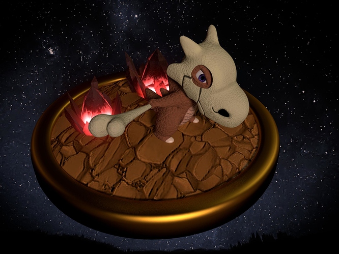
In your bottom picture, i’d recommend picking a camera angle that makes it easy to comprehend the whole form of cubone, just fiddle with it in the non render view-port till it feels right.
Other than that, keep up the good work Matgarate 


 let’s focus on the environment, because it’s the main thing we can improve here.