Not sure where i red it, but cycles doesnt have a Logo yet
So feel free to dump your logo’s here.
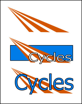
I’ll dump mine, and its not a serious attempt.
Though describing it might be nice so people can get better ideas in general for logos.
Cycles the word seems related to bicycle, who are used a lot in the Netherlands.
Blenders origin is from the Netherlands, and bicycles have a light just as cycles have.
Although cycles origin is not from a single country, its just a cross-reference to it.
A logo for it might include rays, after all its rendering.
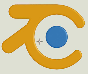
And another thing from the logo it doesn’t look like the Blender logo on purpose.
A logo can be its own identification to a brand.
Logo’s don’t require text, hence only the orangange light beams could be a logo**.
But if you use letters, be playfull with it.
** (like nike or the horse of ferrari).
Strong visual logo’s usually have a simple design (are easier to remember).
Well, it’s not a serious attempt, but if people create logo’s here is a tip.
Create a logo in Inkscape or blender, so your images can be saved in scalable formats.
Another note of this thread, I’m not a cycles developer, and they might use something in this thread someday or might never do that, i think it depends on how awesome your logo would be. And to be honest my version is just a funny one in my opinion just to get others started.
Making an independent logo for Cycles isn’t a bad idea! It could be used to improve the visibility of Cycles, Blender and the BF.
I’ve always thought that what Blender lacks is not about the program itself, which is constantly improving, but it’s really a matter of not having enough resources to really spend the time and effort needed in the creation of a consistent and well thought marketing strategy, which of course includes the creation and positioning of a solid brand.
Bookmarking this thread to comeback (hopefully over the weekend) and share some ideas
Just because the name is Cycles doesnt mean you should incorporate something resembling a cycle into the logo. Or a bike for that matter. God, that is just awefull! This reminds me alot of when new hair salons try to come up with a name and logo. Hairitage, Hair and Beyond, Hair Affair, Hair We Are.
So funny!
So i succeeded there it was a funny one, not a serious one.
Although Hair we are on the serious side again, it cannot all be 42 in live the universe and the rest…
Some variations and a bit more serious, i’d prefer simple shapes.
Can have text but not required, though that’s just me everyone is free to do what he wants.
Hey, I went to a hair salon recently called the Grateful Head. But it was full of punks and metalheads so I think that was more their intention. Got a great cut, nonetheless
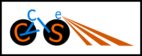
@Geographic you’re being a bit too literal with your graphic design. I don’t mean to be rude, but it looks very amateurish. The first logo is completely illegible to anyone who doesn’t already know what they’re supposed to be reading.
Say, I’ve always wondered why the engine was called cycles. Does anyone know what inspired the name? For example, blender is called blender because of a song by yello. Is there a similar story concerning cycles, or is it just called that because it uses cpu cycles or something like that?
I always though it was called Cycles because when you render an image (especially using a single tile) - the image appears to cycle through, building up samples towards a clear image.
I felt the logo should have some color to link it to Blender (orange) but it should have its own stand alone color, Blue (Complimentary color).
I modeled this in 3D then rendered in orthographic view. I mixed in the bounce rays, the slight " 2D fresnel" (the small ray bouncing at the glancing angle), and of course the render box at the bottom.
This was done real quick, I need to smooth all the vertices out and tweak a few more things.
Still not completely happy with the shape of the C. Might want to add another render square (or two), and add in some gradients.
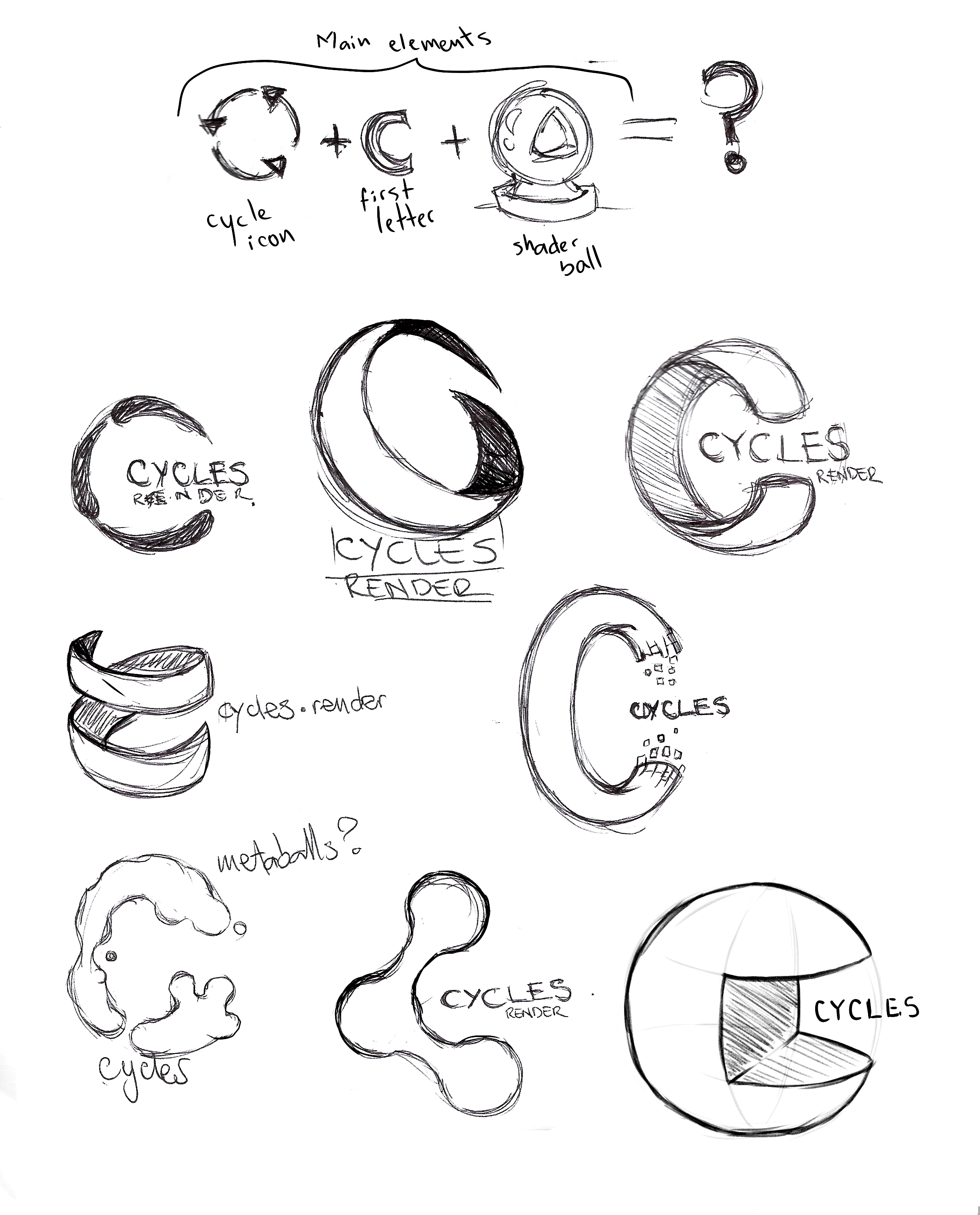
My intent was to do some proper vector designs and exploration for this but haven’t had much free time lately so I’ll just post some of the sketches I made, if anyone sees any value there just go ahead and use them.
My main rationale for those sketches is at the top of the page, basically the cycle icon, the letter C and the Shader ball commonly used to test shaders. While sketching I was always thinking of making the main form of the logo in 3D, using a sphere or torus as a base, and then just vectorize it using flat colors to maintain readability and respect the guidelines of logo design.


 it was a funny one, not a serious one.