Nice colours, the “ycles” part seems to be a bit too high up in my opinion.
Color scheme is nice
Lose the “ycles”
lessen the “glossyness” and unskew it
then
it would be cool
great idea, however i think cycles logo shouldn’t resemble blender’s
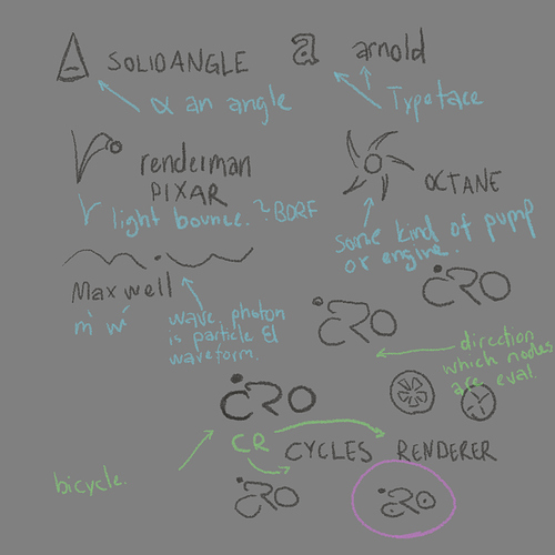
here’s my version of a napkin sketch, something sketched in the uv image editor in blender.
I choosed to look whats out there, solidangle logo is impressive. and easy to remember. They also use some light calculation formula that is pretty cool.
octane is pretty meh, that goes also for arnold. but the good thing is that they work in negative space. b/w.
lots of the current ideas wouldn’t look good as negative space, cut out. or b/w print. which I think is necessary for a logo.
maxwell has a pretty weird take.
renderman has a simple to recognize and it’s looks playful!
anyway my idea is to have a logo that resembles a bicycle. also the letters C and R is visible within the logo [Cycles Renderer].
the direction becomes from right to left which is unatural for us in the west. but I think that’s how the render engine process the nodes in the shader editor and it starts from the material output.
even though the name ‘cycles’ comes from … somewhere. I think I’ve read it in a pdf from nvidia about gpu rendering? but anyways bicycles are a huge part of Amsterdam and probably the rest of the netherlands and belgium. do we have a back story why brecht took the decision to call it cycles renderer?
anyway if there is a need for a logo, I would do a vectorized version. but maybe with curves in blender ^^
but I wouldn’t use a embossed look, or colors.
There’s tons of good logo reference to be looked at in books such as los logos.
but I would go for something much cleaner and simpler than the Blender logo.
and I would start with something that works in b/w. before trying with colors.
