Hello Mina-san!! Long time no see…
Well, where should I start? Recently I have been working on a very complex scene (from Dark Souls III). And I’m glad to announce that after countless hours of ardous (and not so ardous) work I’m about to conclude it. BUT (here’s my favorite part) I came accross a final issue I’m not able to resolve. Normally I try to figure my own problems out but this case is different for I need other’s opinions on the matter.
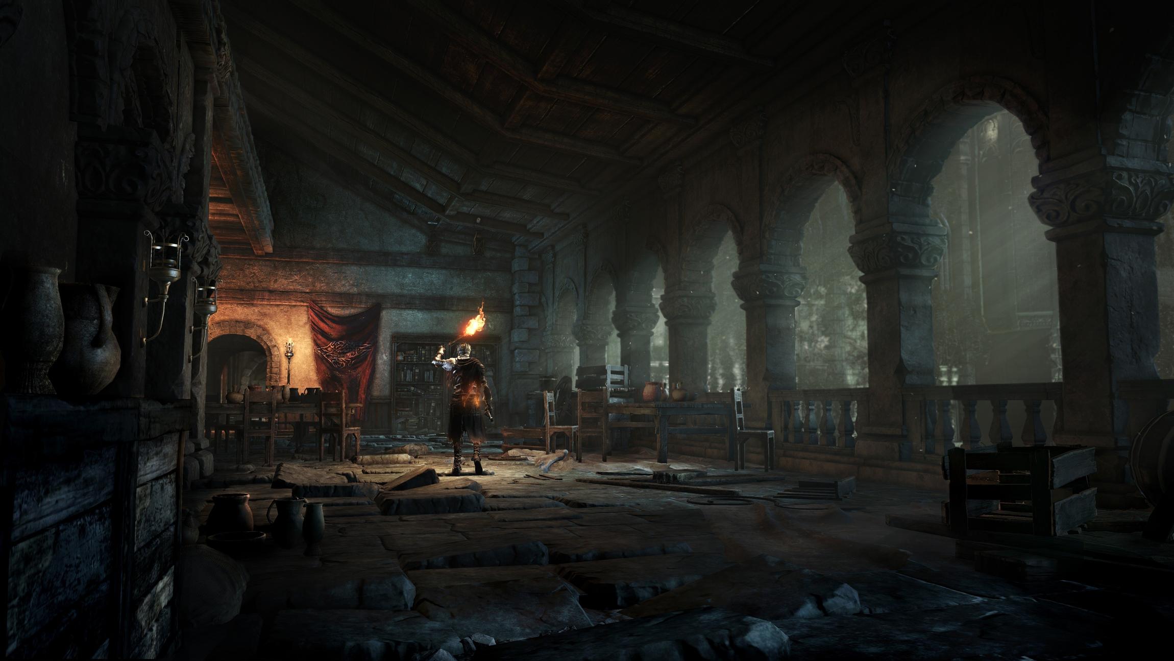
So, here is the reference:
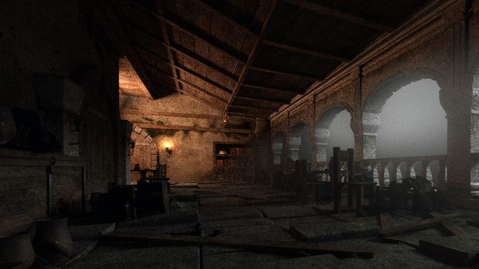
And this is what I have achieved so far (needless to say that the following image is NOT the final render)
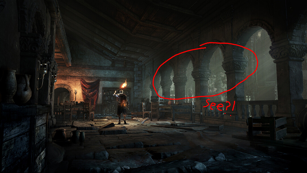
So? Well, texturing and modeling are done (I’ll do some minor changes but that’s all) and now I’m on the 3rd step, aka lighting. As you can see there is some fog and little particles floatting in the reference image, not to mention how the light passes through the columns.
Fog and particles:
Light:
I’ve been trying to simulate it with volumetric lighting, however given that the fog is situated in the right part of the image it difficults such a task. The HUGE plane that you may see on the following image is the “fog”, you know, volume scatter nodes and so on…
But it does not fit as well as I expected cuz the interior lighting makes it look fake. it cuts through the fog, so to speak…
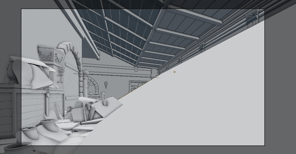
For further information here you have the “object mode” image.
In short, I’m trying to imitate the light of the reference image but I fail to do so. Do you have any idea?
Thanks for your time.