Like most of the images posted in this thread, it all very interesting (up to the point it starts to give me a headache), but with all of this I tend to come back to my basic problem and question.
Which one is correct for what you wanted. As in did you want/expect a bright somewhat orange circle or was the intent for a more red starting to lean towards pink circle?
At the end of the day, just pick whatever gives one the results they wanted/expected.
As for what should be the default… yeah, I’m not going down that rabbit hole.
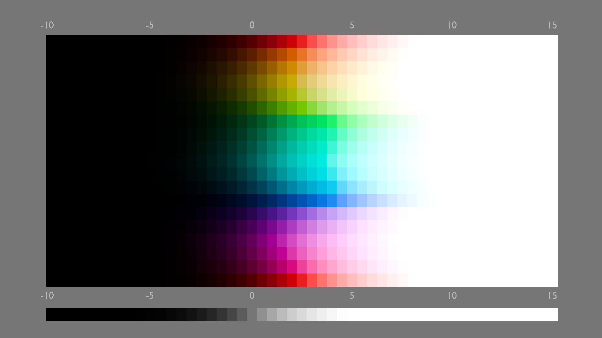
The red-orange red is what you get with AgX default.This was a simple correction test if you can get back a pure red,if someone wants AgX but without that much orange on red.
Tbh if i would have made this default AgX setup,i would going more neutral toward pure red.However i know the early AgX test renderings and how much purpleish the whole blue spectrum was looking.I guess for this reason Eary had made the decission to bring a de Abney to the blue with the effect that the red turned into that much orange.Maybe @Eary_Chow can clarify why it is how it is.
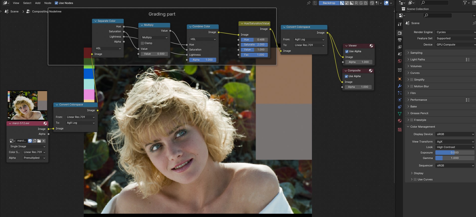
Not sure about this Lego one.I exported it as still from Resolve as exr.In Blender it appears very bright in the preview.I tryed trough the input colospace selections.
This was rendered with Agx base contrast,hue rotation and saturation nodes
Here they are.I have tryed different colorspaces as in and output for grading.This is basicly the same techniqe as in Resolve where i change the input colorspace to davinci wide gamut for grading,and after the grading nodes i go back to rec 709 with cst.
In Blender i go to Agx log,since these was the only one that give me no artefacts.Without the switch of the colorspace the nodes do not working,instant artefacts.
Not sure this is the best method,but for now it seems to work.
The HSL and HSV nodes are for the filmic saturation i saw in a resolve video.
I wanted to highlight this as an incredibly astute observation. As “obvious” as this observation is, it is a point that an incredibly select few have made a mental note about.
This “detachment” from the ecological perception of propelling our bodies through space, toward some specific task that shifts our visual cognition, I wish more folks would pay attention to.
It leads to the erroneous assumption that many foolish minds propagate, blindly…
Key word here is if. As best as I understand pictures, which is to say incredibly poorly, I would suggest that the idea that a picture is a simulacrum is pure, unadulterated, nonsense. We have a tremendous body of research hidden away off the beaten path to support this notion. Judd, Plaza, and Balcom made this precise a priori error in 1950, and they had close ties to Kodak. It took none other than David MacAdam himself to counter that claim rather strikingly.
At risk of falling into a tremendously philosophical debate, I’d like to draw attention to two facets that folks tend to mash together into one “filmic roll off” discussion.
First, there is no such thing as ‘highlight roll off’. There’s no “point where things go white”. In fact, within a picture, and specifically colour pictures formed by chemical creative film, the density of the dye layers interact in an entire continuum of complex interactions. At some range, the stimulus is more pure, at another, less pure, at another, so occluding it is “dark”, and in another, the density is zero and we cognize the direct illumination from projector bulb or the paper.
Why do I bring this point up? This is precisely the mechanic that pulled me into picture formation approximately 29 years ago now.
After 29 years, here’s a quick set of bullet points to get more folks thinking about pictures in a way that might help us disentangle what is going on, and help a new generation work on mechanics:
A picture is not a simulacrum.
Task influences visual cognition.
Identical stimulus will and does modulate based on task.
A picture relies on memory encodings; it’s not an A/B comparison.
When following the above, an A/B comparison will lead to “correct” analysis for one task and “incorrect” analysis for another. EG: A SMPTE pattern can look “correct” under one picture formation, and utterly uncanny in another.
The rate of change of purity is likely tied to low level neurophysiological signal relationships.
The flight of stimulus with respect to an axial representation in a CIE xy colourimetric projection, is incredibly important, and also tied to low order neurophysiological signals.
Polarity of stimulus with respect to luminance and chrominance seems to be of paramount importance.
With those bullet points, and the caveat that the tunings in the Blender 4.0 variation are not mine, so I can’t speak to them directly…
This is something that we need to be incredibly careful around with respect to engineering picture formations. The reason is effectively a direct straight line to neurophysiological signals and how we cognize a picture. Remember, in the end, a picture is presented as an array of stimulus that we have to peel apart and decompose into shapes and meaning. Specifically, if we fail to attenuate purity, the pictures we will form will inevitably be generally crap. This is the general “banding” or “posterization” problem, which while many folks might be able to spot, fewer are able to explain why “banding” or “posterization” is detrimental within a picture.
I’ve said it before and I’ll say it again: NPR folks need proper picture formation prior to conversion to an NPR form. This idea that the sRGB inverse EOTF encoding is a good idea is nothing short of bunko nonsense, with exactly zero reasoned logic behind it. A reasonable picture formation will generate denser colourimetry from which an NPR algorithm can pull from.
It’s tiring having the same discussion when Filmic first arrived rekindled. It’s exhausting frankly, and if someone wants to go there, maybe it’s worth re-reading the endless discussions and seeing why it was set default in the first place?
The inverse sRGB EOTF encoding had its reign. It sucked. I can say this because I survived it. No really… it sucked. No… really, it did.
The “hue” notion rears its head again. We ought to be careful when saying it, as I could rattle off a hundred demonstrations that will make one crawl into the fetal position when considering “hue”. The “original” AgX tends to, when presented in sweep articulations, have a more direct line to achromatic for the primaries, which for some applications, can be deemed useful. In others, it’s nightmare fuel. In the vast majority of cases, there are enough general trends to make the SB2383 repository generally preferred for the vast majority of “Just Work” types of scenarios. Not all. Just a loose hand wavy “most”. Feel free to experiment and roll your own. After all, that’s why I tried to make the generation tool reasonably ergonomic.
Just stop with this, please. I beg. When I said be careful when one says hue I meant it.
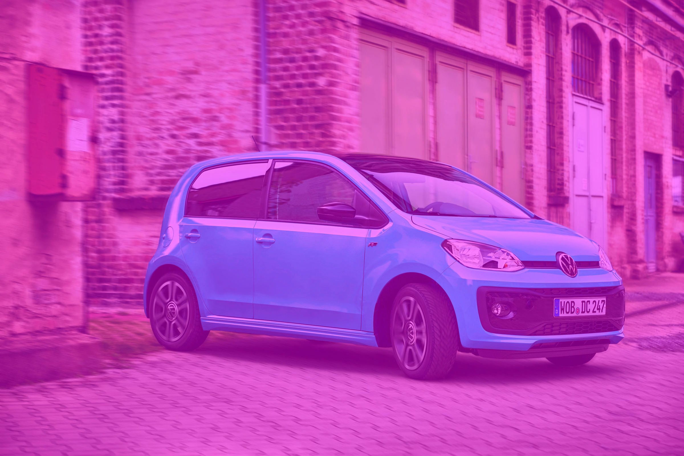
What is the colour of the car here? Then sample the tristimulus.
There’s no such thing as “absolute red”. In fact, if you want to really get your head exploded, go read some research on how there isn’t a researcher in the world who understands how our cognition partitions “hue”. No really! No one knows how the hell “red” is determined “red” when compared to “magenta”. And display tristimulus? It’s really just Yet-Another-Tristimulus-Generator.
Oh and that “absolute red”? That is one of ITU-R BT.709’s primary stimulus that is being labeled “absolute red”. Is there something special about the stimulus? Of course not.
I’m sorry, but at this juncture, I’ve spent so many unhealthy hours reading visual cognition research that I’d at least hope that someone affords the benefit of a doubt when they might read “Colour is cognition and doesn’t exist in the stimulus”.
We all need to be careful with what we think we understand. That’s all. What one thinks, no matter how passionately, about colour and pictures, is steadfastly false in 99.9% of cases. Visual cognition is a flipping incredibly complex matter, and pictures are probably an order of a magnitude more complex than that.
Anyways, I wanted to give props to @rawalanche for hitting on a point that I’ve literally had to force folks to think about. The way that purity attenuates in a picture is absolutely dumbfoundingly mystifying. Why the hell is it an absolutely mandatory facet of “photographic like” picture making?
Ain’t no one on planet earth even has a clue! That should be fascinating, and inspiring.
Keep in mind that you are talking to artists here, many of us will naturally find it very difficult to wrap our brains around what sounds like Ph.D doctorate levels of color science (so while the research has in fact greatly benefited the quality of our images, our understanding of color is still largely based on what has been known by human society for thousands of years, ever since color was first applied to a canvas or a wall).
I am fine with just letting you and Eary do the deep research, since I have obviously not done the research sufficient to make worthwhile feedback for things this advanced (as I have never been to college and some of the key terms I do not even understand). As you said yourself… Visual cognition is a flipping incredibly complex matter, and pictures are probably an order of a magnitude more complex than that.
Can you just DM me your address? I will buy and send you a smart light bulb at my expenses. Once you will see how far what you see is what the tonemapper does I hope it will at least give you something to think about for your next tonemmaper after AgX
I personally also thought tone mappers were pretty good because I assumed all light sources fade to white if intense enough, but once I got that LED light bulb and tried how the colors look at 100% saturation settings, it changed my perception of how vivid real world light colors can get.
Here’s an experiment I have been thinking about lately:
Take a laptop with high quality OLED screen, which can produce deep saturated colors, pure blacks, and fairly good peek brightness intensity.
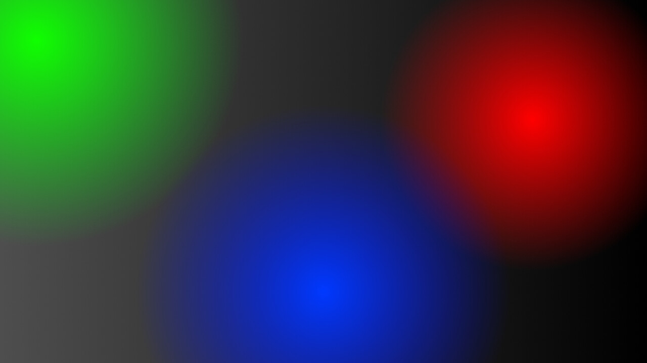
Put deeply saturated image in the screen, something that maxes out saturation values but doesn’t fade them to white. So essentially some synthetic image. Could be something as primitive as this, or more sophisticated:
Take raw photo of the OLED display with high quality camera in a completely dark room (only display is lit up, at max brightness).
Have another identical laptop with identically calibrated OLED screen.
Put it next to the first one and try to tonemap the raw photo so that it ends up looking identical to the synthetic saturated image. Basically to try to get the both screens sending the photons of as identical wavelengths as possible to your eyes.
Even if it was the case that everyone perceives colors differently, if you just can get the same wavelength photons being sent to people’s eyes, they all should think that they are seeing the same color as they see in the real world, even if everyone’s brain interprets for example red color differently.
Not sure about Painter but Krita does have OCIO support for its HDR workflow. In principle, it ought to be possible to simply use AgX as your OCIO config in Krita and get that to look the same.
Here is a really old video from 8 years ago showing off the feature:
I’m not sure how tricky it is to get AgX to work in Krita though. Might be the modified version for DaVinci Resolve also works for Krita?
not sure why you get those Cs in the Blender version, should probably be all Bs, but what you’re looking at there is nonlinear vs. linear RGB.
A linear RGB value of 0.5 corresponds to a different nonlinear value. If you work in non-linear “gamma corrected” sRGB. Painting programs usually work in the later unless you specifically set them up to work in the former assuming they support this.
It’s been a while that I worked with GIMP but I’m pretty sure this is possible. It certainly is in Krita.
To be clear, Filmic shifts the hue of literally every single color except for precisely six. That’s the Notorious Six, Red Orange Yellow Green Cyan Blue Magenta.
And most of the colors are shifted towards Yellow, Cyan, and Magenta specifically.
I kind of pity you for those discussions you have to go through each time.
One thing everybody should probably try to keep in mind in the context of discussing such a most esoteric of subject matters, is this:
" Quite generally, the familiar, just because it is familiar, is not cognitively understood. The commonest way in which we deceive either ourselves or others about understanding is by assuming something as familiar, and accepting it on that account."
- Georg Friedrich Wilhelm Hegel, Phenomenology of Spirit
You seem to ignore the psychological effect of usability and user expectations. If a users picks as color red and inarguably gets something that looks orange, that’s garbage from a usability point of view. And it is garbage as a default.
There is a lot of research about usability and user expectations too, also something that can be looked up.
If it is good choice for AgX and its goals, that’s fine, I have not problem with that.
I think KickAir_8P wanted to put in a value of 0.5 into the RGB or HSV tab and assumed that this gives a 808080 HEX value and showing 0.5 on the display?
I explaned before
Its the same gamma correction as with the image node and sRGB colorspace option
Example you have a sRGB image with HEX 808080 loaded into the image node
As default Blender sets Colorspace to sRGB and the HEX 808080 gets gamma corrected to linear the same as if you put in a hex value into the HEX sRGB colorinput as described before
For new artists,the colorspace input of the image node is set to sRGB as default
@troy_s correct me on this if I’m wrong but as far as I undertand it:
This is not what Troy was saying at all.
This is about OCIO having the concept of “Looks” which Blender’s color managing does support but many other softwares do not.
AFAIK you can just basically bake in a “look” into the base transform, bypassing the looks concept to get this to work as intended and be perfectly matching in other software. That’s more or what has been done on the DaVinci Resolve version of the AgX OCIO, as I understand it.
Instead of a single AgX with a bunch of look variants, you’d then need a bunch of separate “Agx Look1, AgX Look2” or whatever.
Now whether looks are a good idea in the first place is a different story. But either way, it has nothing at all to do with AgX as such.
On that note I should mention the way to generate the version of AgX that landed in Blender is completely open source. (In fact, that was kind of a requirement)
If anybody wants to “roll their own”, that starting point is there for y’all to try.
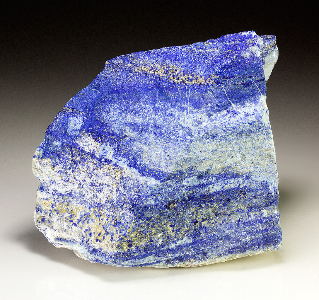
I mean, color understanding was more bound to stuff like particular materials. For instance, you can have an “absolute blue” if you talk about a very specific, say, Lapis Lazuli Blue. In that case, you refer to a very specific compound, and it has its own “texture” and behavior when it is lit in different ways or mixed with other pigments or what not, and all of that would then be included in what it means to be “Lapis Lazuli blue”.
And in this scenario, the “absolute” color also has effects to worry about such as changes with age! Physical pigment colors have a half life. Classic paintings such as the Mona Lisa used to look very very different in the past. Classic Greek marble statues were painted and not just plain white.
Of course even this has caveats such as there are different quality levels of that kind of blue, i.e. how deep blue was the lapis lazuli you crushed up to make it?
Was it very high purity, or did it have a lot of white material or specks of pyrite?
Like, it’s gonna depend on which of these you crush up to make your “absolute” color.
So how about using precisely spectrally defined light source then?
Sure, in a completely black room with an exact scene setup, you can then reproduce hyper exact stimuli in that particular environment.
But when is that lab setup ever real?
Your room is not black so you automatically have to worry about ambient. reflections. The lighting also changes on whether the sun shines or the LED-based light bulbs start to shift or what have you.
And the ambient reflections thing is not a trivial matter. A colorist working at PIXAR for The Incredibles kept posting work that was too cool. It was a big mystery why, until the director paid a visit and found that the room had red curtains.
The curtains kept spilling onto the screen, completely skewing the result! They had to change to grey curtains to fix it.
I even noticed this myself while helping test AgX: It mattered a lot whether I looked at my screen in the morning with sunlight streaming in, or late at night. The kinds of issues I’d see or not notice completely shifted. And it’s not just a matter of “oh this situation is better than that situation for testing.” The issues were just in completely different parts of the image.
For the same image.
Rendered on the same screen.
And notably, color perception shifts a lot even with things like language. To the Ancient Greeks, the ocean and their own red wine had the same color category. For ages nobody even had a word for blue. That’s an incredibly recent invention, in fact.
One place where this sort of thing is in action today is the notion of “pink” (not “hot pink”) which is just a light red. If it’s blue, you see that as “light blue”, if it’s green, you see that as “light green” or “lind green” or whatever. But with red? Pink.
Why? Not because your eyes process this differently somehow, but because your brain has learned to divide up the category differently simply because there is a category in the first place.
None of this stuff is objective or absolute. None of it can be. It’s intrinsically linked to how we see the world.
If you were a goldfish or a duck or a dog, colors would look wildly different to you simply from seeing a different spectrum. If you have any of the several variants of colorblindness, same thing.
Heck, even the color of your own eyes and, apparently, the degree of yellowness of your retinal nerves have a measurable impact on how you perceive color, that some of the studies I have read attempt to correct for.
All the mathematical models (such as the “hue” value proclaimed by a painting program based on sRGB) are just that. Models, meant to make sense of perception.
But unfortunately, perception comes first. The math is completely arbitrary and, quite often, a rather poor fit to “what’s really going on.”
Certainly, historically we have not dealt with a hardcoded sRGB for “thousands of years”.
Of all the examples of scenes comparisons I’ve seen so far, the only thing that I tend to think at the moment is that Blender AGX results look more “tight” together than filmic, as in, the various values and saturations feel more coherent, relative to each other; and therefore, to me, “realistic”.
The one thing that I hope is that at some point there will be a “proper” pipeline for the various color spaces transformations in compositor, shipped with Blender, or documented, after which one can make the edits to taste.
This has nothing to do with looks or OCIO. In Resolve in Troy’s recommended way to use AgX you don’t use the OCIO node at all but you use nodes that are behind a Resolve paywall. Blender AgX is not real AgX and he has said again and again that its not.
You seem to ignore the fact that nobody elected you as a representative of all Blender users. The certainty you say things with is a bit disturbing.
Anyway… what’s up with all the color picking? Who does that? Where does everybody pick the colors from? What is this workflow? What do you use it for?
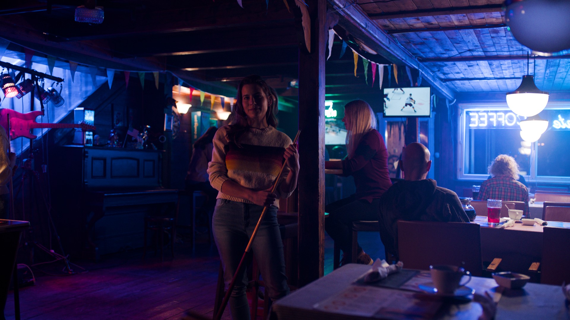
I am also kinda having trouble of picking up the red of this train. Could help me out? What color should i put into my shader to accurately represent it in my renders? What hex code?
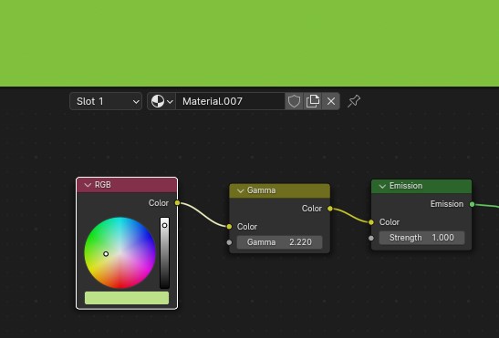
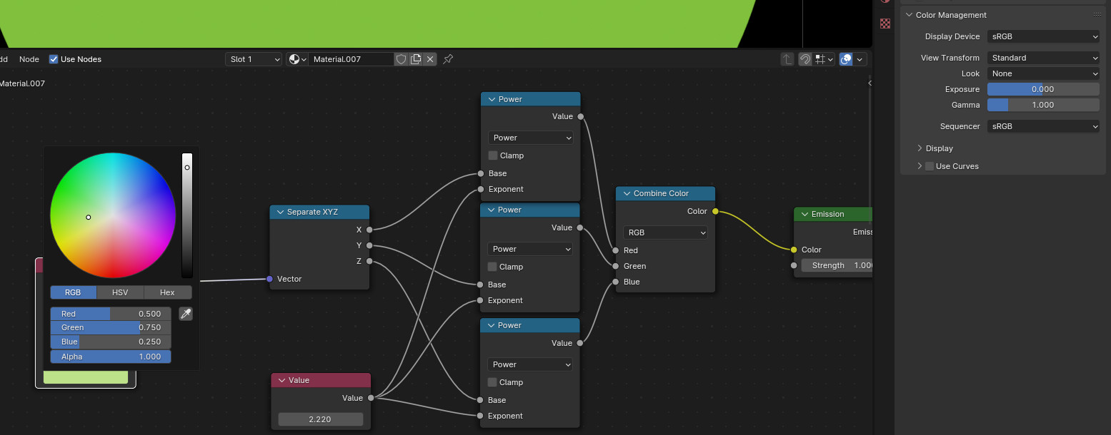
The RGB input is still linear,since the linear input does no gamma correction,we can use it for our sRGB input and doing a gamma correction to linear with the gamma node
And the color displayed at the colorinput node is brighter because its the displayed sRGB values before gamma correction (double sRGB)