Hello,
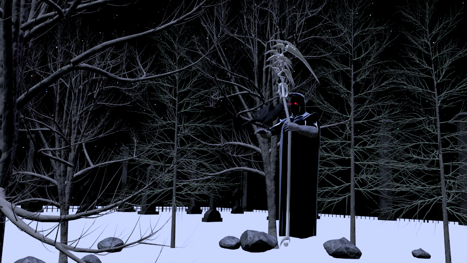
Okay so other than the obvious horrible hideousness of this render so far, what do you guys think? Im gonna add mist, and grass, and a moon, and better lighting and compositing, but any feedback on what you guys think would be greatly appreciated! What do you think would improve it? What should i add to make it more detailed? Also, just FYI, this is the BI render engine
It doesn’t look horrible to me. It already looks pretty cool. I actually have a project I’ve started that’s still in the early stages that is a personification of death, as well. One thing I see you could do is to add some snow to the stones, since even the tree limbs have snow on top of them. It seems a little difficult to determine the actual scale of this picture, too.
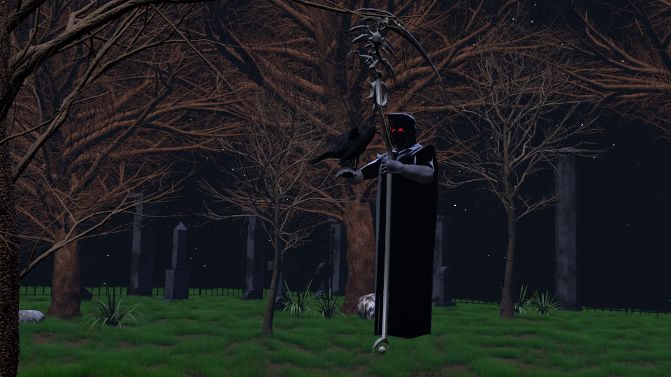
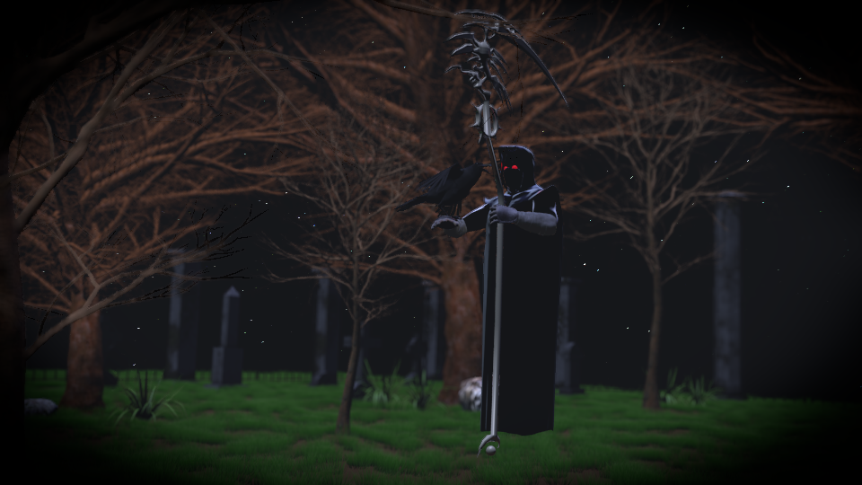
Here is an updated version to my “Death” piece… added fog, retextured trees, added grass, (somewhat) better lighting, fog, and added a few saplings… still isnt up to what I was hoping it would be… any ideas on how I could make this creepier/scarier? Any feedback at all is greatly appreciated!
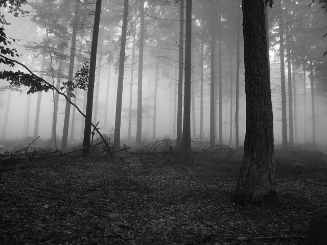
I don’t see any fog. I think you should have a lotmore fog (e.g. fog, e.g.2 fog). Right now it looks like we can see the edge of a fairly small plane with grass on top. Fog will add atmosphere, and will also make it so that the black fence is partially visible (right now it serves no purpose against the black background).
The lighting seems quite off for a night scene. A blue hue to your light source may be a good start (see e.g. 2 above), and perhaps some desaturation (via compositor? See both e.g’s above). I don’t think the grass or tree bark would look that vivid at night time (I’m assuming moonlight?).
Your DOF is way too shallow (i.e. way too out of focus). It’s a nice effect in the right circumstances, but I don’t think it’s appropriate here. Strangely, the entire background seems out of focus and only the character is in focus. I think it would look better if the whole scene is in focus, and if you want to try it, then perhaps try setting the DOF so that only the most distant objects are slightly out of focus. Right now everything seems to be a similar distance from the camera, so having a shallow DOF means it all looks blurry except for the character.
Related to the DOF, I would have more trees in the distance (see the fog pic I linked). There isn’t enough depth to the scene right now. You could try these being slightly out of focus if you want, but it may just look better if they are faintly visible through the fog.
Perhaps there too many small branches on the trees. It’s hard to say until the fog has been increased, but they might look spookier if the trees look a little less alive.
Remove the vignette for now. I would address all the problems with the scene before worrying about finishing touches. To be honest, I probably wouldn’t put a vignette on it anyway (. But if you must, then perhaps make more subtle than it is now.
I quite like the back light in the fog example 2. It might work well in your scene if your Death character is well positioned and appears somewhat in silhouette and casts a shadow slightly diagonally towards the camera (your personal preference and composition with respect to all your other objects will determine how to place him and any light). I can’t remember whether the Blender Internal renderer will actually draw the light source, you may need to do some work in the compositor afterwards.
Death appears to be floating, which may be intentional, but with no apparent shadows he ends up looking out of place (like he was almost pasted in post production). After you have tried improving the lighting, I think it will add a lot to the scene to ensure that he is casting a shadow that is complimentary to the overall composition.
An alternative compositional idea could be to have a gap in the trees on the opposite side of the character, and have a fairly strong moonlight be the main light source.
Render in cycles? A fair bit of work to get to grips with it if you have never used it, but your lighting will look a lot more natural.