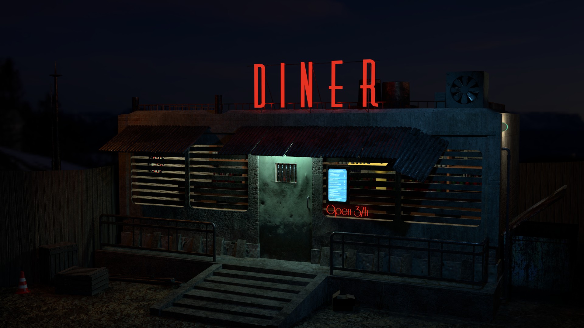
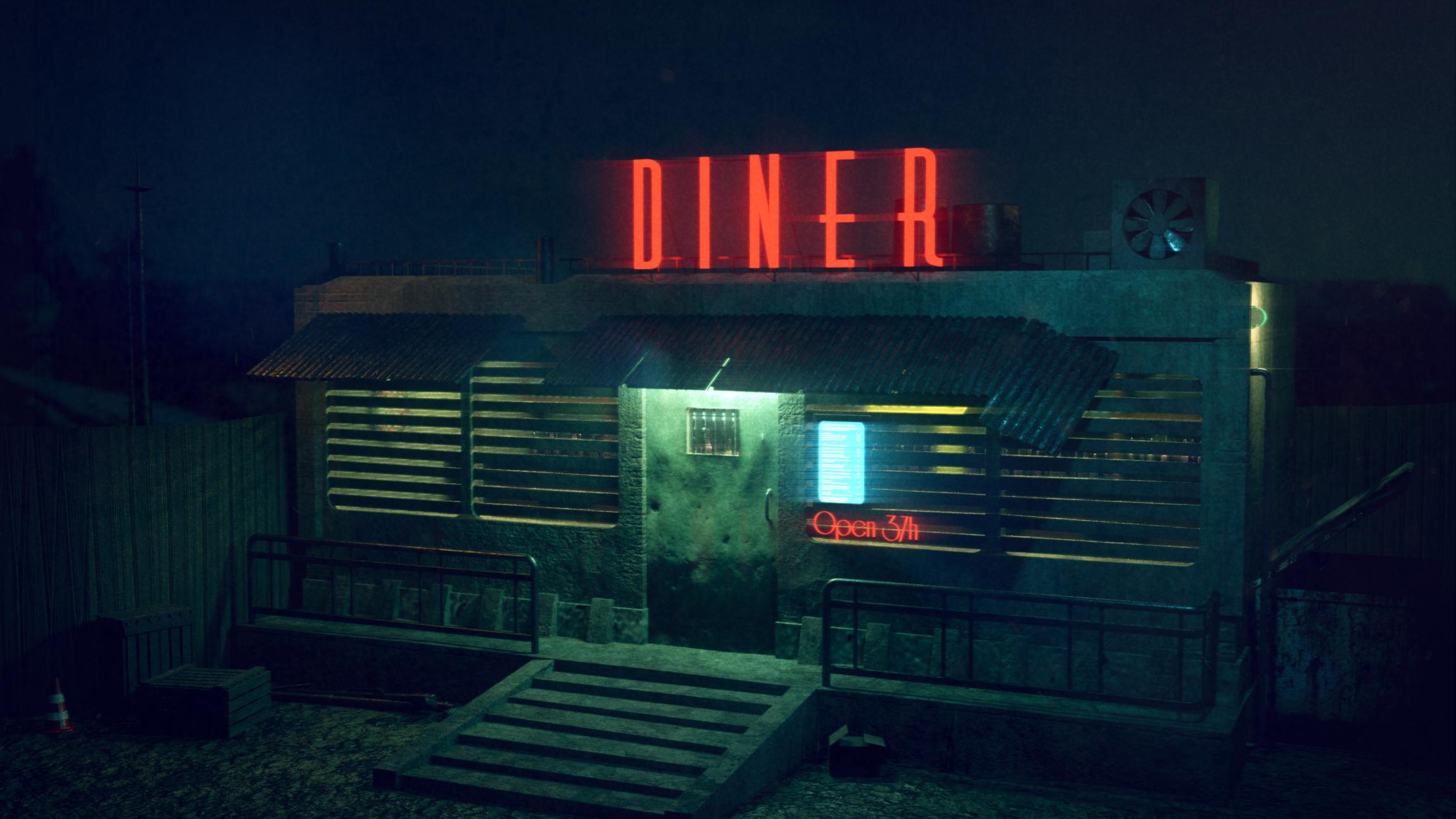
I’ve currently resurrected an older project and try to improve my texturing, lighting and post processing skills, which are still at low levels. The following pictures show the raw render scene as well as my work on post processing I’ve done today.
The scene isn’t complete yet, I know there is a bad texture at the bottom of the diner, the light on the right side is not complete, a blue glowing sign is missing on the top left side of the diner and some other things.
What I want to know are some tips to improve the scene. In the end, it should be in the mood of a mixture futuristic and dirt, in the style of Firefly, Starcraft, Warhammer 40K, …
What can I add to the scene to indicate it’s not on earth (besides the 37h day duration)? The only thing I can think of are two moons in the background or something like that, but there should be something closer to the diner.
Is there anything I can do to improve post processing to give the scene a more intense futuristic but dirty look?
I always like to create darker scenes, is the result too dark? Is there any way to “measure” if the scene is too dark? I often think I do things to dark. Is there anything that can be done (in general) to give night scenes a high level on realism, without making them too dark? (Any tutorial on this?)
Is there anything that does not match to the scene?
Any additional ideas?
I thought about to add rain, puddles and some “drops on the lens” after finishing the current scene, as I think that reflections can improve the night visuals, what do you think about that?
Okay, overall, pretty good. I like the overall design and where you’re going with it. Very reminiscent of Fallout 4. I like how the menu in the window is on a screen. give me an impression that you might be able to orderA few things stand out that I think should be addressed:
Overall, I think the bump/normal mapping can be toned way down. In my opinion, this is one the things that make CG look like CG. To much grime, to much hardness and to much texture. A lot of CG artists tend to put a lot of work in some aspect of their art and thus want to accentuate it so that people will notice it. But to me, subtlety is always better.
I think the neon “DINER” sign should throw more light into the scene.
I know you’re trying to match the painting but the stares look really odd being so short. I would actually have a hard time walking up them.
I think the railing in front of the Diner is for a kind of ‘Front porch’ that you could stand on. In your version of it, there is no room for a person to stand. This makes the railing seems un-motivated and unnecessary. It also might look cool if there was a chair on the porch too… Just a suggestion.
Obviously the original image is pretty dark and can be easily remedied by adding a dim blue sun lamp to mimic the moon. Blue light will help brighten up a scene that is supposed to look dark but turns out looking “Too” dark.
Again, it’s obvious that the ground is not finished yet. It needs more individual rocks, junk, and plants/weeds to make it look more convincing.
Go through your model and make sure you bevel all the hard edges. Nothing says beginner like unleveled edges.
Just a suggestion: The overall image reads a very green (like the original). But, you are missing some of the elements that add a little more color variation. For example, in the original, the sky is amber which helps balance out the color. There is also a metal baseboard that runs all the way around the front and even run across the bottom of the door. I think this really helps balance out the image a little more. In your image, the baseboard has an odd blotchy texture that matches the overall color of the rest of the building. Not to mention that this texture is particular really stands out as being very out of place. If it was concrete like the rest of the building, then the scale of the pits and bumps is not in scale with the rest of the textures. I would just put a very diffused reflective material with a lite texture in the amount to give it some variation. Another spot to consider is the door: In the painting it looks like it’s been painted brown. In your image it looks more like the same kind of texture as the rest of the walls. And yet another example of another missing color element is the amber glow from inside the Diner is not present in your image.
Last suggestion: If this is supposed to be on another planet, why not show this by putting two or more moons in the sky.
Many thanks for all these valueable detailed tipps! I will try to work on all these things.
I’ve beveled nearly all edges, but maybe not enough.
You suggest to give the image more color variation, I’ve much green, blue, red. Are there any good tutorials on this aspect? I have not much experience in this area (good composition), but try to become better. I always thought that too much colors produces a happy or funny mood, which is not the intention on this image. As a software developer I tend to have “measurable facts”, is there any way to judge a good / bad composition watching the RGB levels of an image? This may sound a bit crazy, but I always have problems to find out what is missed in an image to look “good” or “pro”.
The pitch on the steps look too low. You could probably get by with having four treads instead of six. If you want to make it look a little more sci-fi-ish, you might consider substituting metal rungs instead of stone.
Thank you, I already have reduced the count of treads. Regarding your tipp to exchange things made of stone with metal is nice, I will give this a try!
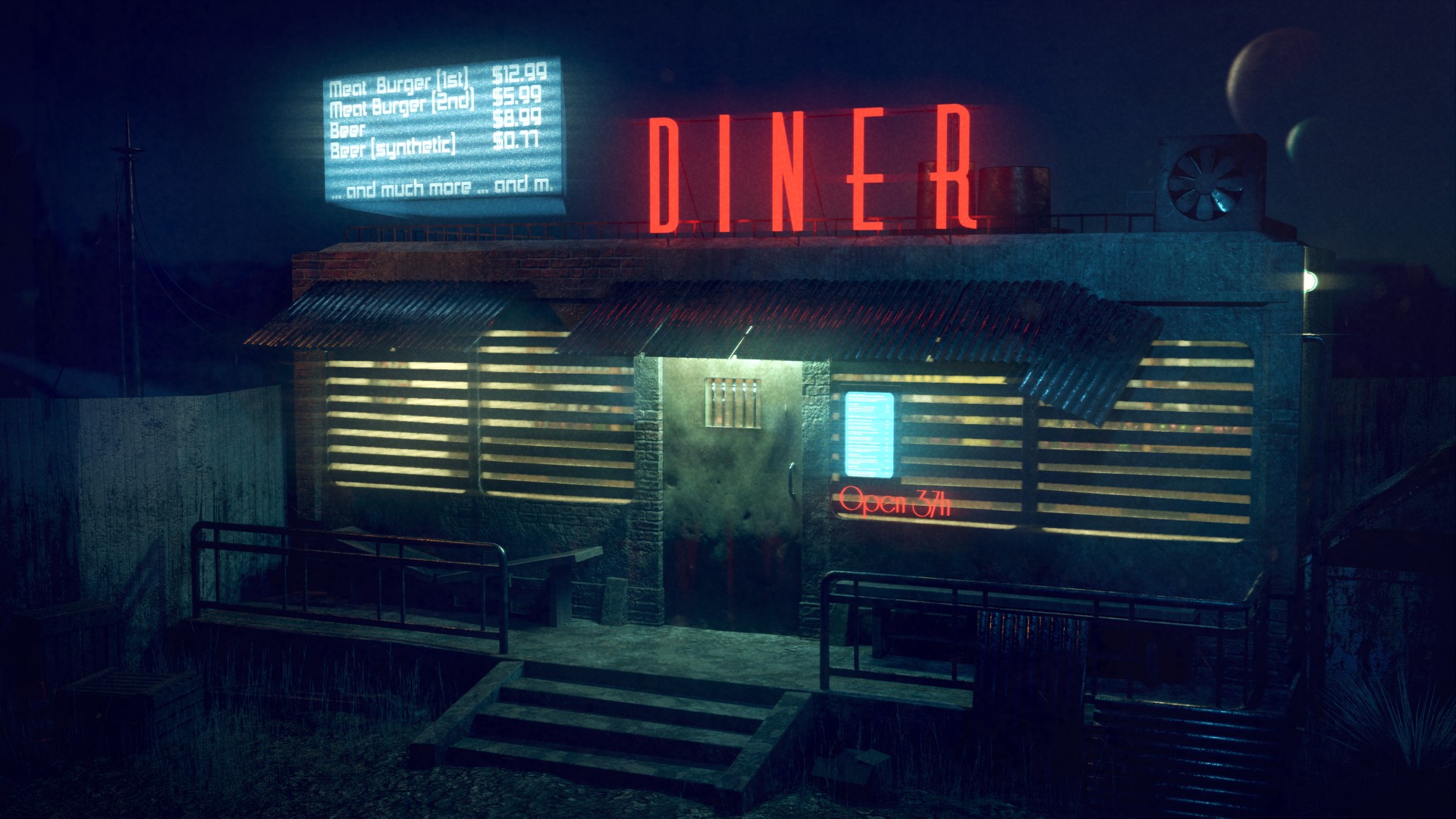
This is my current iteration. I currently experiment with the hologram, as well as with the ground in front of the diner (plants, stones, trash …). I have changed many things suggested by Indy_logic and a bit “happier” with the result atm.