Hey,
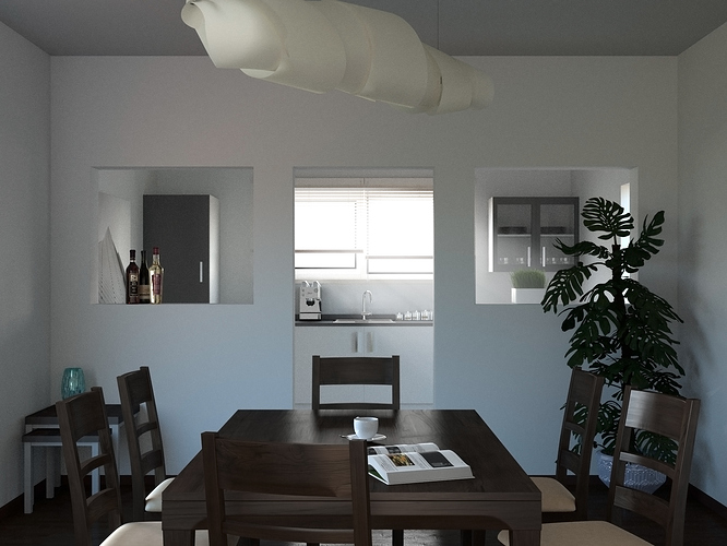
after not getting a single critique on my thread in the focused critique forum (  ) i decided to make another render.
I tried to enhance the impression of someone actually living there. Howewer i don’t like the actual render as much as the first one. (light, textures not as crisp, grainy, etc.) It took really long to render so i decided to move on from this project, to start something new.
So here it is.
Dario
A great piece of work, but i want to give you a little more feedback. For my taste it is too blueish. For example the two Ikea tables on the left or the pot on the right. And where does the blue come from? It is not the wall, is it? Is there a big blue light behind the camera?
And for my personal tast it is too centered. The window is in line with the sink, with the chair, with the door and with the cup. Camera slightly to the right or left and a little bit up or down could be interesting…
