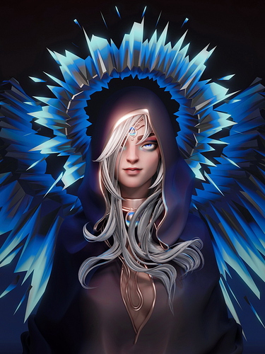
Divine

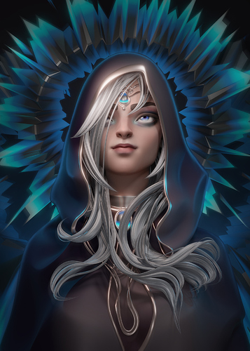
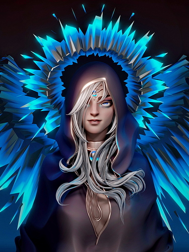
Hi, everyone! This work was made with ZBrush (head sculpt), MarvelousDesigner (cape) and Blender. I wanted to make it bright and stylized, something that games can use. I didn’t receive a lot of feedback, so not quite sure that to fix. Please help me to see that went wrong, any critique will be welcome! TwT


Thank you for watching!

47 Likes

Hello Anna,
Amazing artwork,
The only thing that I would change in this artwork would be,
To add some rim light to the character
Since there are those blue lights behind the character,
This, of course, is in my humblest opinion,
Hope I haven’t been offensive in any way,
And to be honest I love the feel of the character’s expression
Keep on creating art like this,
Happy Blending. :smiley:

2 Likes

Hello Ali,
You are very kind!
The rim light would definitely change the image, I totally missed that! That’s an amazing tip, thank you so much for the feedback ^.^

1 Like

Anna, congratulations on a very sophisticated concept; no doubt, game designers can put her into dramas worthy of her mystery.
I might, with respect to you & Ali, mention that what strikes me about this lady is that her face conveys a quality of force & leadership in potential action. Notwithstanding her evident beauty - clearly, no airhead/prettybaby here.
So, if I understand the intent of “rim light,” it would outline just her face within the hood? Or, what seems to be the upper torso within a loose cloak?
This might be tricky, either way - because:
1.) Her unique, almost silvery face already has to compete with both the steely grey of her hood; & with
2.) The electric visual force of the blue radiant elements surrounding her mesmerizing gaze; are these part of bright angel wings & halo, or rays of some unknown energy?
If so, is she the source of the radiance, or is she caught in it?
Graphically speaking, it dominates the image.
Perhaps some way of warming the pallor of her face (& breast?), without losing its ethereal character, would give her its deserved central focus in this dramatic portrait.
Not suggesting some schlock makeup; I’m sure you have control of appropriate subtlety.
If it is her breast appearing in the opening of the cloak, that might be best left alone, as to the skin tone there (not compete with her face; or add low-level Eros - she doesn’t need it).
She certainly makes us want to know: Who on earth (or elsewhere) is she?
What adventures has she been through in her life?
&, not least, what the hell is she about to do next?
Great work, Anna.

1 Like

MDR43Arch! First of all, thank you so much for spending your time on giving me so heartwarming and useful feedback! It means a world to me.
The rim light I intend to place on the top of the hood, so the silhouette of character can be more readable.
Angel wings & halo wasn’t meant to be so bright, in reality I was carried away while trying to make unknown material (with very unknown nodes). I see now how bad it turn out for the main focus (face and glance), it’s lost.
Pallor skin is my favorite, but in this case it’s really lacks of warm.
Actually, showing her breast was a real looow level Eros move, I kinda was afraid that her personality not gonna be enough.
I’ve made a little paint-over to test, and it’s definitely better now!


You’ve pointed out very weak spots in my work, where is a lot to think about for me. I can’t say how much I appreciate your help, but I promise to work harder ^.^
Thank you!

My eye’s having a little trouble with the bright light above her head and with the fact that her hair obscures so much of her face. Also, maybe that her cape is both dark and without texture, which somehow keeps me from seeing the “very bright” face highlight and the “very bright” feathers nearby as one object. The lack of texture also makes her torso “sort-of not be there at all.” I suggest that some texturing is needed and that maybe the relative levels of light vs. dark in closely-placed areas might need to be made more equal. I definitely want to see both eyes – and a catch-light in her eyes. (I think that the shock of hair could be reduced to a mere suggestion …)

1 Like

sundialsvc4, thank you so much for your feedback! It’s very helpful to see thing from another perspective. I think you have right suggestion, I’ll definitely take notes! ◕‿◕

dayum amazing work , get ready for the featured row i guess ? :ok_hand:

1 Like

Anna - I think your revisions are well studied, & balance her portrait effectively.

Your original image, itself, was executed on a high level, technically & expressively. Had you not touched it, it would remain a very fine accomplishment; so, please don’t over-criticize yourself about “weak spots.”

Fascinating, & sometimes scary, to realize that the more excellent the work, the higher the level of possible critique.

We earn the right to be criticized on a higher level.

And, once a composition is at, or very near, completion, the harder it becomes to modify any part - every other element is affected, maybe demanding very subtle adjustments all around the design.

Lots of damn work…again, not so?

:slight_smile:

One of the great English poets (Keats? Shelley?) said something to the effect, “…a poem is never really finished, merely abandoned.”

Myself, I was a long time learning to stop designing, in frustration or exhaustion, when I knew I wanted a work to be perfect; & I was not making it better, merely different.

“Abandoning” that project for anywhere from 4 days to a month (always assuming a client’s schedule allowed that), may give new thought, offer clearer perspective.

Just my experience…

Finally, Anna, as part of that getting distance from a design, keeping 2-3-4 versions of it, over time, may bring great value to your future work.

Let’s say, you choose a version, #3, for now.

At some future point, you may surprise yourself by seeing something in the other versions that leads to a totally new idea, or a new way of using the original design.

Your work is really good; trust yourself to keep learning from it, whether or not you present some of it to others.

OK - let me risk being tedious w/ 1 more thought:

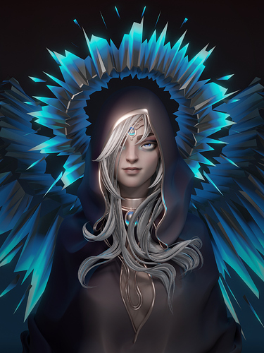
Have you raised her head slightly in your revised portrait?

I had the sense that she looked right at me (or thru me) - giving great force, a meta-physical radiance.

Looking upward now gives a sense of her awaiting that force, w/ calm, knowing it to be hers; & yet unaware of “me” the observer - so that she is detached, in that moment.

& “I,” observer, have neither threat nor gift from her in that moment - until?

Much dramatic potential in your creation, Anna.

Michael **Michael David Rubin **LEED-AP
Architect / Planner / Consultant

127 Eastern Avenue, Suite. 16.308
Gloucester MA 01930
USA

voice / text:
978 675-5652

[email protected]

[email protected]

www.linkedin.com/in/michaeldavidrubin
1 Like

Wow, Dorian! You are clearly flattering! But I like it :smirk:
Thank you! ᵔ.ᵔ

1 Like

Michael, you’re so right about the process. I’ve learned it the hard way do not be too attached to the original design. I’s always good to iterate on it, have different versions. And having the awesome critique is priceless! ´ ▽ ` )ノ
Yes, it’s a different render, I couldn’t post both of them because I’m a newbie here. Like the first more though.
Thank you so much for your support and inspirations! I feel like I can really try to make a dramatic character now! < (^^,) >

I featured you on BlenderNation, have a great weekend!

1 Like

Wow! It is a great weekend now! So nice, thank you! (〃^∇^)ノ

1 Like

You’re #featured! :+1:

1 Like

I like it, a better version of Drow ranger from the dota 2 game !

1 Like

Oh! I see pattern between them)
Thank you ^ . ^

Really nice image. I think the character’s expression works for the style. You’ve kind of got a “graphic” feel to the image with simplified shapes and no high-frequency textures - so the character is working with the “radiance” IMO - it’s a nice image and stands on it’s own.

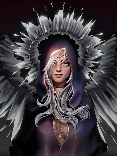
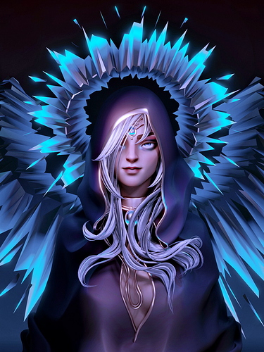
IMO (for what it’s worth), I would consider experimenting with contrast, vibrance, color curves, exposure, etc. The image is pretty “graphic” - but the colors are very muted. So, the question is: Does your palette match the style - or the “feeling” you wanted to get from the image? Personally, I would have made the image more “punchy” (again, this is just my opinion - if it were my image). Here are a few examples of “tweaks” that might be considered:

A more punchy/saturated palette:

Neutralizing the cyans/blues to tie the hair and radiance together:

Boosting the purples to make the robe pop a little more:

And finally pulling back the cyan and pushing contrast to emphasize the face more:

As someone else mentioned, I think putting a “kicker” light in to separate the back of the hood from the background (some people call it a “highlight”) would help separate the character from the background - but that might not be what you want. Also, perhaps play with the idea of a radial gradient in the background as opposed to just black - unless again, that’s what you were after. I don’t think I ever use an image right out of the renderer - no matter which renderer. Pretty much everything I do gets tweaked in an image editor.

These suggestions aside, it’s a nice image on it’s own - I like it just the way it is, too :slight_smile:

1 Like

Thank you so much, Joe! ^▽^)/
I’ve really enjoined your examples, especially first and second. And you made me feel like I actually didn’t finish the job with colors (which is true, I see now >.< ). I should go back and try to focus on that feelings I want from colors.
And yes! Background not the best here. I felt it, but didn’t pay enough attention to it anyway. Real mistake, the contrast it makes with the halo is too strong.
You’ve been real help and inspiration! Thank you again :slightly_smiling_face: