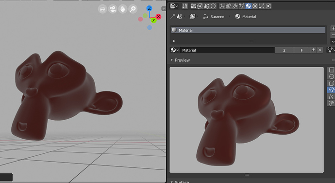
Is there any way to make the eevee material preview not suck? It is just flat. There’s no way to tell any of the actual material attributes except for the color.
Haha, yeah. It seems like the material preview just needs a better scene, with light/shadows/background etc, cuz it’s not that different from the viewport.
And btw, the default Blender scene with the cube should be updated as well (or removed completely). Seems odd the way it is now. ![]()
I think maybe this is still WIP.
If you are working with HDRi for lighting, you use the last “World Sphere” button in Preview type. You can include HDRi rotation (rotation is updated when you mouse over preview)
I hope they’re going fix it. There’s almost no difference in the view between a 100% diffuse material and 0 roughness glossy object.
But yes thank you Yafu, the HDRI sphere preview does fix this, although I rarely use HDRI.
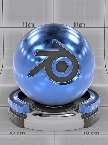
100% Diffuse
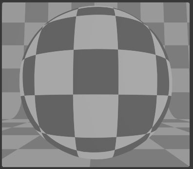
Metallic, no roughness (mirrorball)
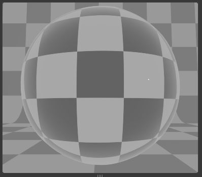
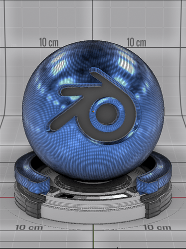
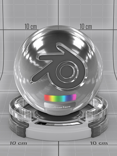
Glass
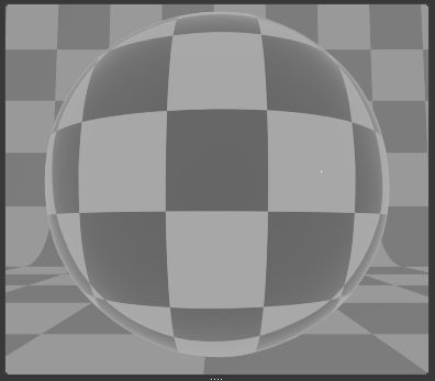
I just realized that maybe my example doesn’t show real well. I put a checker texture on the material. I probably shouldn’t have made it the same pattern as the background but you can still see that there is almost no difference between them and it should be quite drastic.
I don’t get why it doesn’t just use the Cycles preview scene. Seems it would be far better than this.
I’m pretty sure this is the Cycles preview scene. But Eevee does not work with emissive planes, so that is why it looks so flat.
We could either change the preview blend file so that it uses lights for consistency, or we could make a special Eevee preview blend file.
Blender really needs its own official shaderball for previews. A sphere doesn’t give enough geometric complexity to see all material properties, and Suzanne doesn’t have enough contiguous areas (not to mention being ugly as sin).
I would welcome improvements to the preview in the Materials tab, but at the same time I do tend to use the giant material preview known as the 3D Viewport 
Yes we should add a proper shader ball. I would welcome any help to make a good default one.
I’ve got one sitting around here somewhere… I found renders of it, but I’m still digging through .blends.
That might make a fun call for content.
But the main problem posed here in this thread is that at the moment scenes in Material Preview are being illuminated with some kind of global illumination, right?
I guess Clément will configure better lighting later. And maybe then the preview can be improved too, with more options to customize the lighting.
Edit:
Ok, I’m not sure if the correct technical name is global illumination. I mean lighting with the same intensity from all points, such as default World lighting.
Edit 2:
I just saw the William message about Cycles using mesh lights.
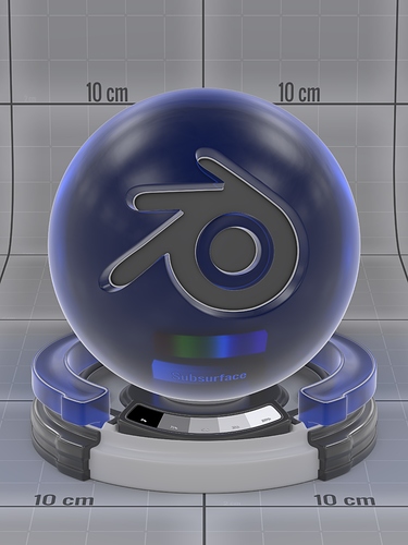
Found my file. Updated it to play nicely with Eevee. It’s UV unwrapped, has a value bar, subsurface grayscale bar, and subsurface spectrum bar, and has lots of concavity, convexity, and large mostly flat areas, and has real volume for glass/transparent materials (although we’re somewhat limited by Eevee’s abilities here). It’s worked well for me in the past, especially when crafting procedurals within Cycles.
NIce one. Would you be willing to donate this to Blender?
Of course the licence has to be CC0, so you’d just be giving it away freely.
A few comments:
- How would your sphere look in a wide view, similar to how the material preview is often shown?
- The Blender logo is almost centered here. I noticed that most shader balls usually have their cutout part offset to the side a bit.
- The value bar is hard to see, because it’s on the part that faces away from the camera.
I looked at some other alternatives.
Blender’s built-in demo files has this:

I believe Robin Marin made this. It seems a little simpler at the bottom, and the center part of the Blender logo looks a little nicer here I think, esp at small sizes.
Blenderdiplom has one:
Don’t know if it also has an SSS bar.
I’m happy to give it away, wouldn’t be my first donation to the BF!
- The sphere renders fine in wider aspects, and I personally think the backdrop keeps it from looking like wasted space as well.
- I/you/we can rotate the ball into whatever angle people think looks best. It’s all separate parts so the positioning isn’t a hassle. I personally prefer the centered look, especially since I use it for authoring materials and not just for showcasing as many shaderballs are used.
- I agree on the value bar. It could pretty easily be angled up a bit more if needed to face the camera at a steeper angle.
If you guys would like access to the file, shoot me a PM. I should note that we’ll need to find a CC0 HDRI to use, as the current one is from a package I purchased and I can’t redistribute it.
EDIT: Did a quick little test to re-angle the value strip.
This might be a good time to pass around this link to anyone who hasn’t seen it before: https://twitter.com/jcanadagarcia/status/1009152211157442560?s=21
The original shaderball had an extremely specific design which gets lost on a lot of variations for other engines.
That concave part provides nice information, I like it!
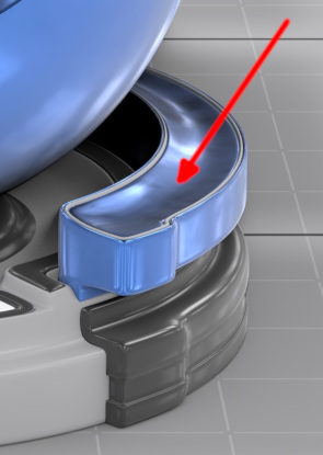
I also like that kind of bubbles in the Blenderdiplom version above.
Edit:
It would be good to test all those versions with the same material and the same lighting.
Eh, I would prefer the ability to specify a custom material preview scene with whatever I want in it.
First: in user preferences the ability to specify a default blend containing the “preview” scene.
Second: the ability to override it within a Blend by just having the “preview” scene present.
If neither are specified, Blender’s default is used.
Naming convention for the scene/scenes can be whatever, even start with period to hide in the scene datablock list: “material_preview”,".preview",".cycles_preview", “eevee_preview”, etc.
The selectable preview objects can have a naming convention as well, such as a common prefix. Material is applied to first material slot of object, secondary slots are left alone.
In projects I currently never use the material preview because the lighting is wrong, the style is wrong, or the limited selection of objects is useless for the material. Add to the fact that the icons generated for said material have been microscopic in size for a decade and a half, and the result is that I have been trained to not use or rely on them at all. Since cycles, I have only ever relied on the viewport for material previews. Project context is everything: custom uv channels, vertex colors, and other project conventions are important in previews.
Having a great default preview scene to use is excellent, but one size does not fit all.
I am sure there are some that do not want this type of custom preview because “dumb user make bad preview scene” just like “dumb user make bad UI theme” or “dumb user pick bad wireframe colors”, etc. The tool should help people get the job done, not coddle the “dumb” users or get in the way of the “pro” users.
