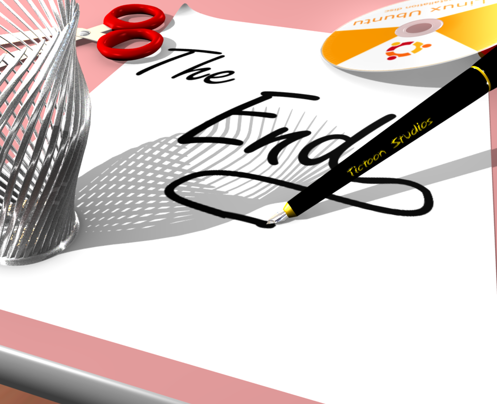
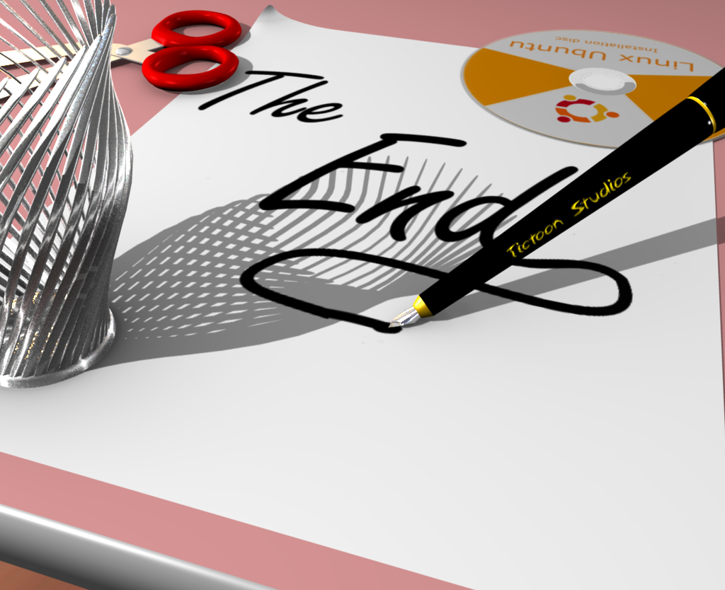
they looks slightly better. I like the texture on the CD but to me it looks like it is floating because of the shadow. And I think someone mentioned making it a bit thicker so it doesn’t look paper thin.
ok. i saw the little red thing. I had to scroll my window over a bit. Maybe you could put it on the paper more so it makes a little bit more sense. quickly looking at it it looks like it is floating.
I think you are starting to beat a dead horse. Sometimes with art it is hard to know when to say your finished. I think because this is only for practice you should start a new project and try to apply things you’ve learned from this one to that one. Then with that new project you might learn something new that you can come back to this image and work it. Personally if it were me that is what I’d do - start another project.