Sit down. Have a drink. Relax.

Hope you like it. 
Sit down. Have a drink. Relax.
Hope you like it.
wow - very realistic…is the ice in the glass a texture? maybe I feel it is because of the curvature. Pretty good piece of work.
Thank you.
The ice cubes are just subdivided subsurfed cubes (I moved the vertices by hand) with a “clouds” texture (mapped to NOR)
May we see some wires please?
Looks great! Did you say you were making this for a competition? Which one? And if so, good luck, its a lovely render!
http://img431.imageshack.us/img431/4497/prueba17ht.jpg
http://img431.imageshack.us/img431/3668/prueba23ta.jpg

Nothing too fancy. The key was to use HDRI lighting.
BumGravy: The competition is called “Maestros del Pixel” (Pixel Masters)This is their website (spanish).
http://www.maestrosdelpixel.cl
I hope to win something (although they might not even give me a candy
:x )
Great, my only crit is the glow in the background. It shouldn’t go white so quickly imo, but a smoother transition instead.
I know its a Finished project…but I work at a liquor store and im pretty sure the beefeater bottle is square.
I said the same thing earlier yfkar and I still agree with you, it take focal point away from the bottles to me.
mhuhahahah somebody thought it was a real photo! thats some supurb causing of confusion =D
really well done, i actually love the backgroumd, has the real bar feel tht most of the ads do too. The only thing i notice (i dont usually but something so realistic) is the OSA is a bit jaggy, which when put in front of the bright background does cause some problems, but hey its no biggy at all, i can only imagine Yaf rendering speed. Maybe one other small thing (just to be picky, its sooooo close to perfect realism) ice in the glass, the refraction seems to be lying to my eyes a bit, could be a bit off. It does have that feeling of pushing into the glass, maybe a little trick to solve it is to have the drink level a tiny bit lower and the eye can see one of the blocks of ice sticking out a bit from the surface, something like this…
http://www.facogel.it/public/cocktail-19.jpg
Just amazing stuff, and great composition.
Peace out!
I’m pretty sure that the glass is empty and that it’s the glass causing everyone to think it has liquid in it, but maybe he added it in since the last post on this mage?
ohhh did i miss that said, just ice no liquid…interesting, well, hey its close enough to pure realism, ill tell my eyes to beleive it or else =D
Thank you. I’m horoured. ![]()
can i have one drink, please?
excelent, congratulations!
one question: the ice on the glass, its look how a eye fish len, but the glass its empty, yes? an empty glass not curve image so much.
wonderfull render.
bye
“Half empty or half full?” 
The glass of ice is the only thing that feels not quite right … that and the question of whether the label on the leftmost bottle should be rounded on the bottom as well as the top.
The background lighting arrangement is certainly plausible for a studio photograph: glass bottles are difficult to light, and what you generally look to achieve is a “refraction edge,” particularly around the top of the bottle as you, in fact, did do here. In other words, you have light from the background, being through the edge of the bottle, as the primary element which defines the placement of that edge. The Beefeater’s and Ballentine’s bottles show this effect most clearly. And you also get “edge-definining highlights,” coming from the underside,/i] in such difficult-to-light places as the cap of the Chivas bottle. This overall lighting design is also [i]visually powerful, placing the client’s products as a force to be reckoned with and making them appear to be very sophisticated.
I’m hard-put to say whether or not I’d put the backlight as you have it or if I’d bring it down to intersect the plane of the table. Upon reflection, I’d probably leave it the way you have it, because the dark band helps deal with problems that might otherwise arise from the secondary label on the Red Label bottle.
You have just enough fore-light (in the studio it would probably be provided by a passive reflector) to make the labels read clearly, and also to give just a hint of the metallic nature of the Chivas label.
Overall, an extremely fine piece of work! 
I think the labels add quite a bit to the realistic value - nicely done
Ok guys, the results were published. I didn’t win :x
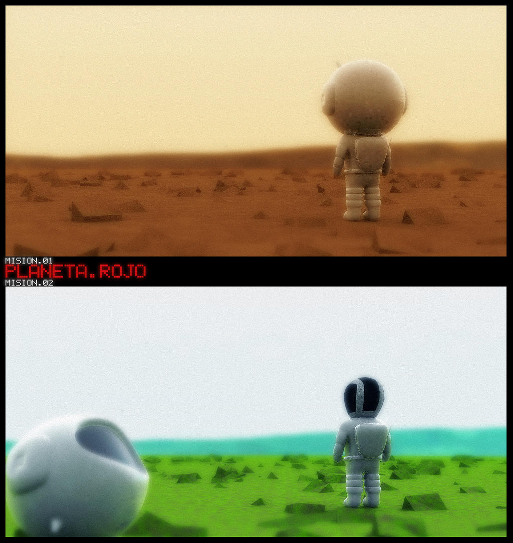
I was beaten by a yellow house, an astronaut in mars, and some picture that hasn’t been published yet.
Yellow house: http://usuarios.lycos.es/dookie3d/mdp/imagenes/postpro/realidad-o-ficcion_hermang.jpg
Astronaut in Mars (very cute): http://ic1.deviantart.com/fs8/i/2005/339/6/2/Planeta_Rojo_by_SpawnV2.jpg
Win some, lose some.
To bad. But you were probably on third place.
Great work anyways.