Thanks. The ideas would only be small changes. I have experience in web development so I understand the complexities of specific tasks.
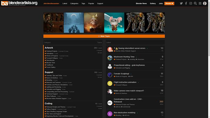
I’ve shuffled some elements and modified the css to come up with this.
When visiting this website for the first time my initial response was to look at the top bar to see what content was available. From this my assessment was that Blender Artists is news site and gallery. Then I looked down the screen to see more menus which had a forum type feel. I didn’t know where to start because the menus are scattered. It feels disorganized and a bit disorientating looking around for functionality.
- I’ve attempted to resolve this by moving the forum menus to the forefront of the top menu.
- Two call to actions have been added in orange.
- The user starts off with a polite call to action - “Join the discussion” to encourage reading
- The new topic button has been change widened and enlarged to encourage participation.
I’ll develop my ideas further when I get some time. I specifically want to look at how the menus respond to window size changes. The menu gets obscured by the logo when your window is small.
Let me know your thoughts.
I’m shocked at the disorganization of the Discourse documentation. I will need to do some research to see how complex it would be to move the menu up.
Oh and the featured images would hopefully be a carousel.
Looks good, but some elements won’t work:
- You can’t have a ‘new topic’ button on the homepage - Disourse only enables it on places where you can actually post and this is only within categories. I also think that a page-wide button is probably too much.
- How would the large top menu work on mobile?
- A caroussel for the top row could work, but not with ‘infinite’ scrolling. We could provide 20 thumbnails or so.
- Also note that for now, I’ll only be able to make changes through CSS. Doing a full homepage redesign will require hiring an experienced Discourse developer - this is not a simple task…
Agree about it being to wide. It was something I was just quickly toying with to get the initial idea out there. I think it would be nice orange though. I just modified the CSS of the existing button on the homepage. Or is that not the homepage? I arrive at that page when I click the Blender logo.
Tbh I don’t have any experience with discourse but from reading some articles it doesn’t look like it gives you much customizability out of the box. My web experience has mainly been through Content Management Systems like WordPress. I was hoping there would be plugins already designed for customising the top menu in that way so you wouldn’t have to hire a developer. This would be a very simple task if that were possible.
On a mobile the top menu would be displayed at the top of the drop down menu. Basically the drop down menu would be reorganised and styled to make the priority pages the most prominent.
I would like to see a carousel mainly because I just click the app button that I have on my homescreen and quickly browse through the latest. 20 would be more than enough, especially for the regular visitors.
I think for the mobile experience the last two tasks would be the most important.
