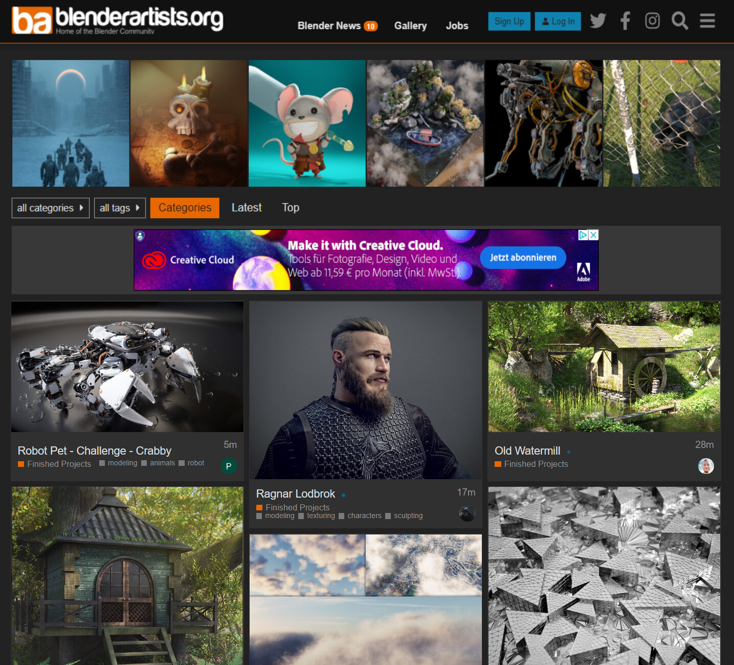
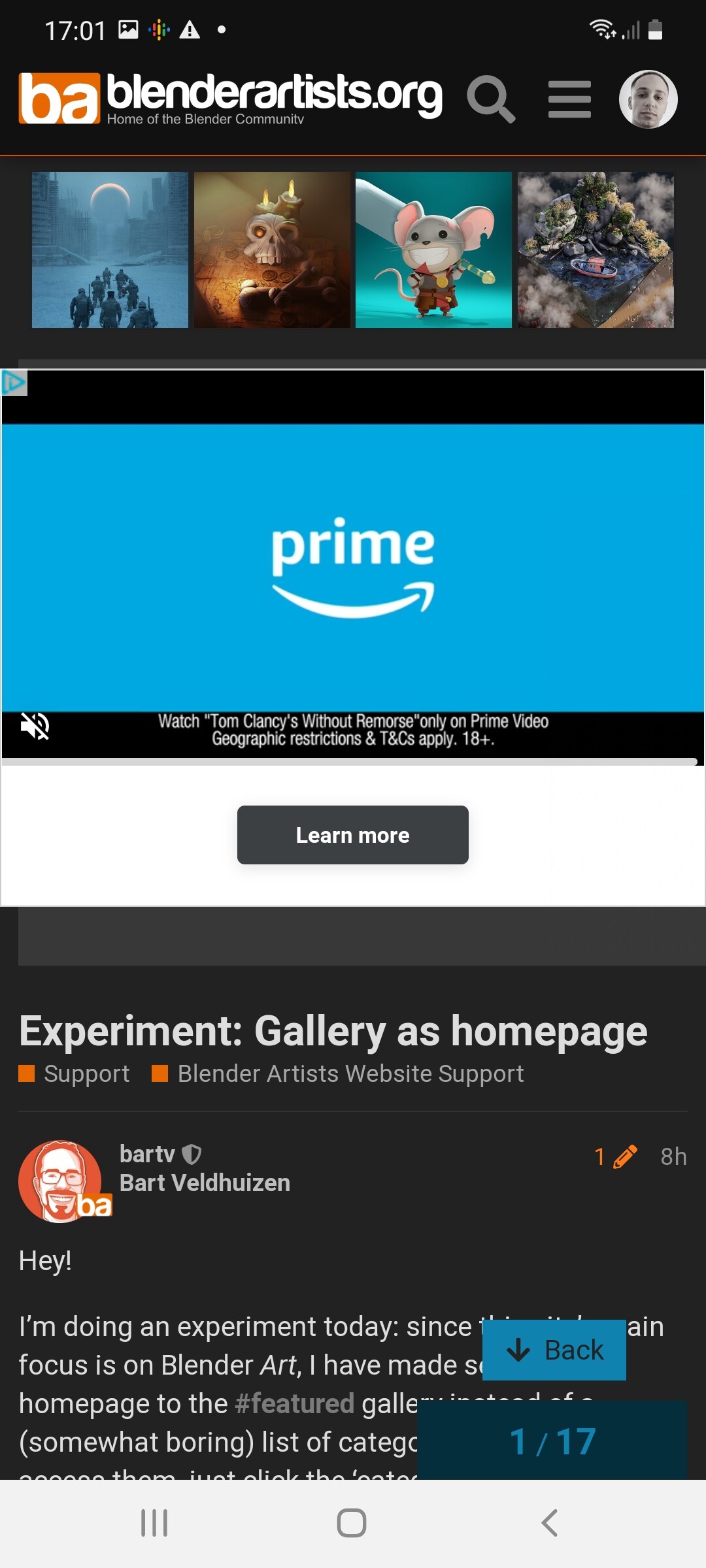
I’m doing an experiment today: since this site’s main focus is on Blender Art, I have made set our homepage to the #featured gallery instead of a (somewhat boring) list of categories and topics. To access them, just click the ‘categories’ link at the top of the page. (Pro-tip: press :g-c to jump straight to the categories page or g+l to go to the latest topics. Hit ? to see more keyboard shortcuts)
Do you prefer a gallery homepage?
Yes
Yes, but I’d prefer something else (leave a comment below)
I find this a very difficult question to answer. On one hand, the platform is called Blender Artists, so it makes sense to go for a gallery homepage. But I also think a lot of Blenderheads, including myself, frequently visit BA to catch up on the latest Blender developments, not necessarily artwork.
Well it looks nice, but to me blenderartists is first and foremost a forum and its community. Reasons to be here can be really many, there are alot more topics present here than enjoying finished art. Sure art itself is a substantial part and it might be pleasing decision from an aesthetic standpoint, but overall I find it wrong.
The forum itself seems hidden behind a small button and somehow declassified. Being confronted with the galleryview as a newbie I think I’d have never noticed the categories button or would have assumed that something different than just more subgalleries would be presented there.
Beside that, I find it impractical for users/usecases with limited mobile connections to have such an entrypoint.
6 Likes
Renzatic
(Professor Emeritus Billy H. Wafflesmith XIV Esq.)
12
I’m of the exact same opinion. I can understand the drive behind this, but BA has been primarily a forum for so long now, it’d be a bit too jarring to change the focus of the landing page now.
Tough to judge in the abstract. I’ll have to see it in place (I missed seeing it before server issues hit). I’ve always said that the most positive and welcoming parts of the forum are the artwork and support categories… so anything that could be done to focus attention there is good in my opinion.
That said, I suspect that “just” swapping the gallery as the homepage is going to be insufficient. An alternative approach might be to set the Latest page as the homepage, but using a grid view rather the the default list. Another option would be to keep the current layout, but on the right side (again, where Latest lives), use a grid view rather than list. That might give us the best of both worlds.
3 Likes
Renzatic
(Professor Emeritus Billy H. Wafflesmith XIV Esq.)
14
That’d be the happiest medium, I think, since it combines the forum’s two primary points of interest (for me at least) onto a single page.
The latest posts on the right, and a 3x12 grid of renders on the left.
I agree with Metin_Seven and Debuk on this, the artwork is already right at the top in the feature row, maybe I am being a bit conservative but I also like to see the latest posts on the right.
I think that the current design represents what the forum is about, art is at the top but discussion takes a prominent position.
Going a bit off topic, one thing I have always thought of is the possibility to scroll back in time in the feature row.
Ive not been here long but I voted ‘yes’ because when bored I click visit here to see what’s new. Usually I want to see images first because I may not have much time to respond to questions.
To be honest though I think the menus on the mobile need improving either way.
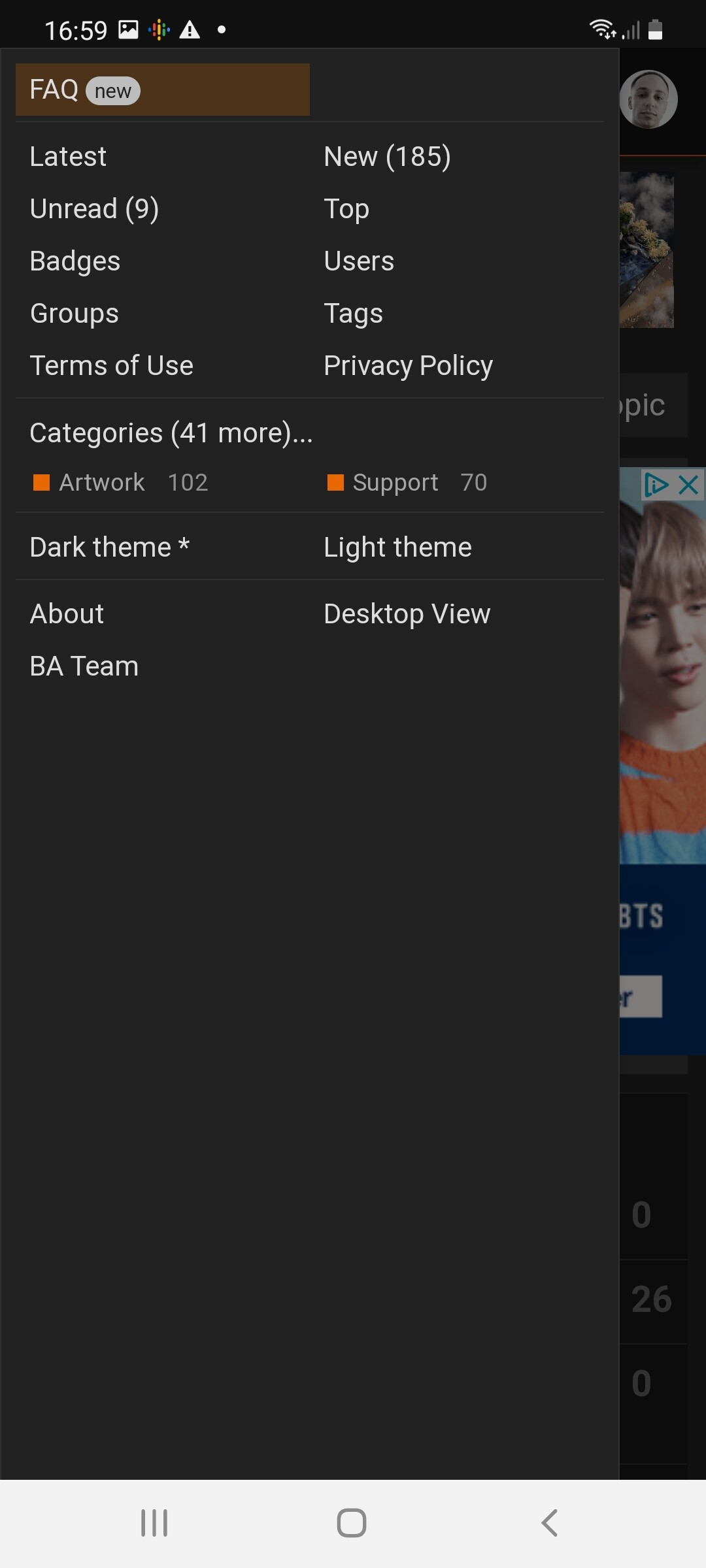
The categories should be listed first in my opinion and not just show artwork and support. I would suggest having a top level menu item that says 'Gallery’s that links to the featured tag and then have the other most used categories listed directly. Currently you only see artwork and support under the categories section the menu. When glancing at it, it’s not obvious what is available.
What ever option you choose I think its going to come down to usability and ease of finding the gallery or other forum posts.
I’ve added a couple of images. The first shows the menu on mobile and the second is in response to the comment about already having the images in the banner. Currently it only displays four static images. I think the ideal solution would be to have a carousel instead so that you can scroll through the gallery whilst seeing the latest posts on the same screen.
We’re using Discourse, about 10% of our users are on mobile. Suggestions are always welcome, but do understand that implementing them is usually complex work