Hey Hey hey,
long time mo see.
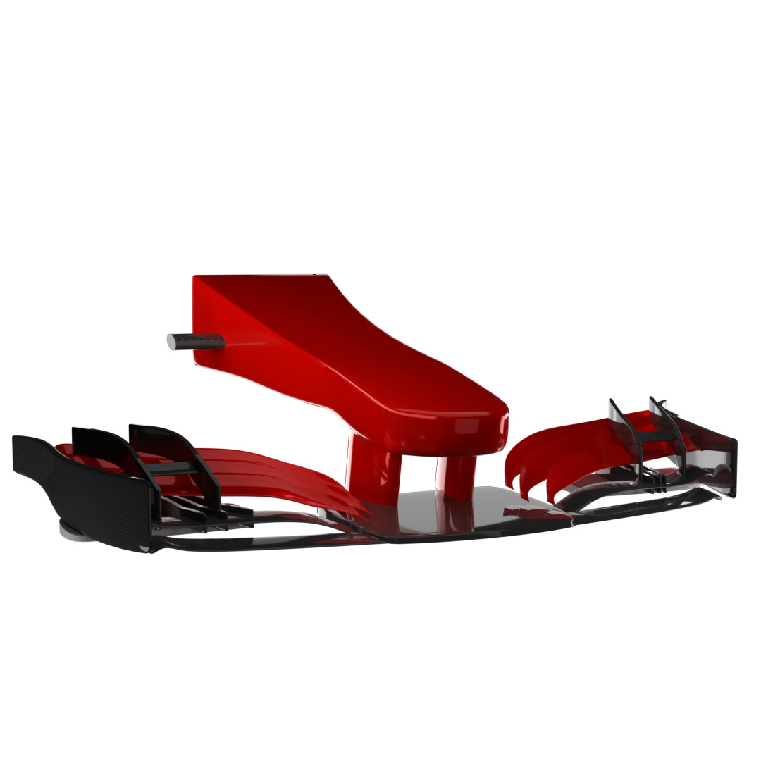
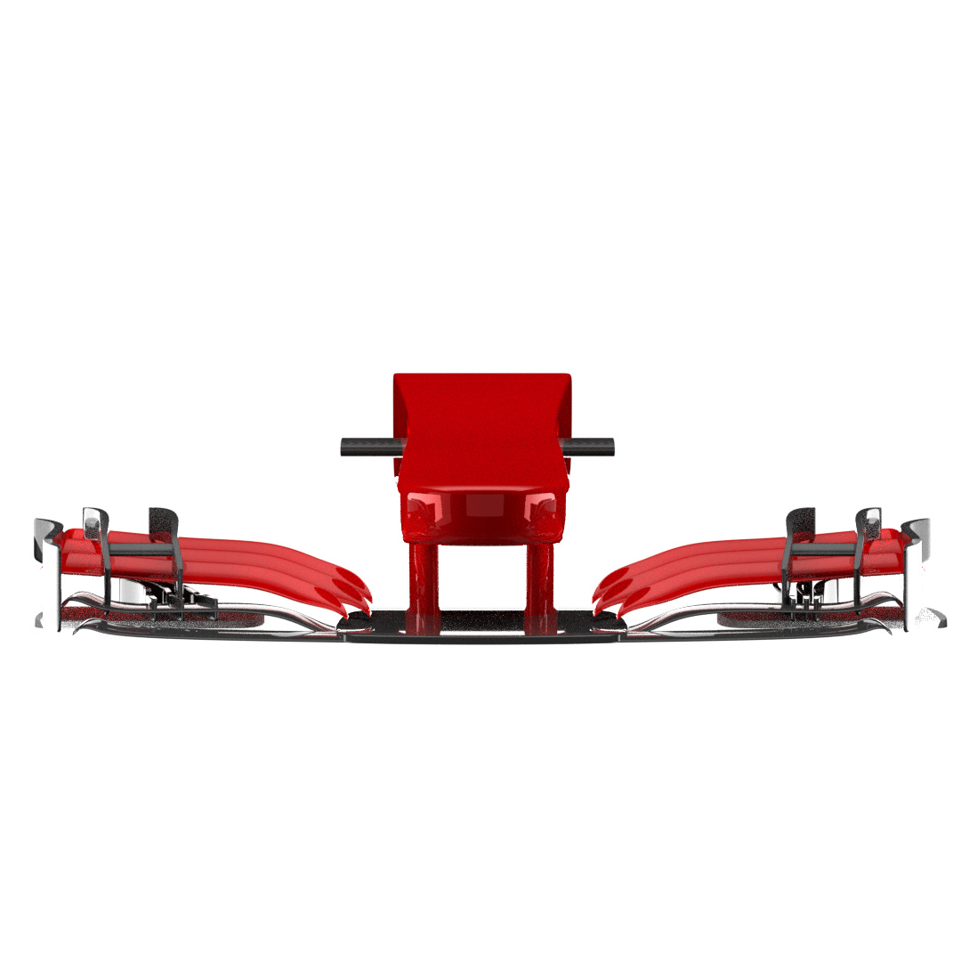
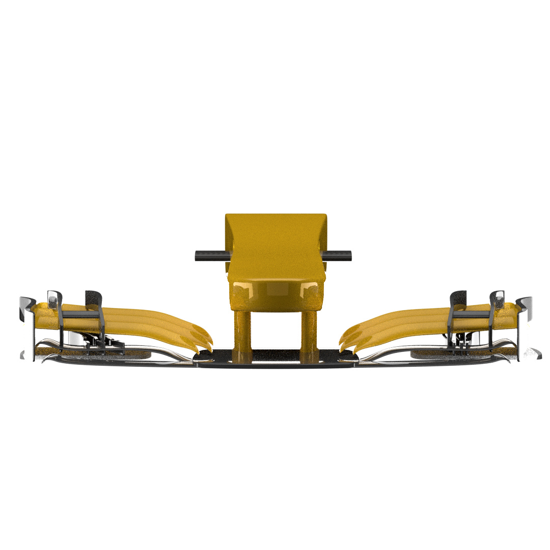
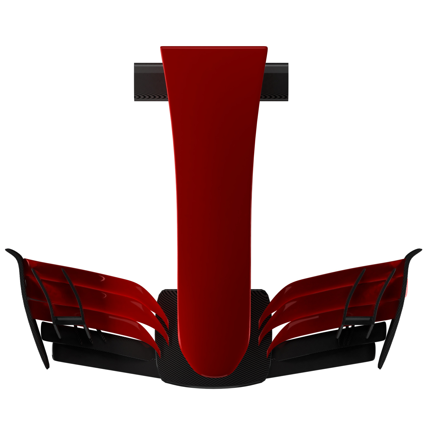
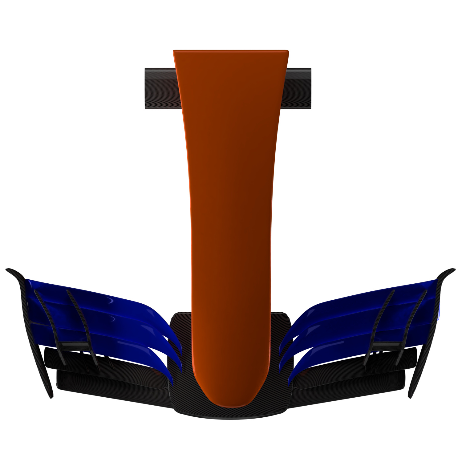
SO, i got really inspired by a guy who 3D prints decorative F1 wings (his Instagram is: https://www.instagram.com/greenlight_3d/?hl=en). And anyway, I made a nose and front wing.
I am planning on making the whole car, but, just this for now.
Feel free to prompt me every now and then if I stop posting.
And, critique away ![]()


1 Like
‘Aerodynamic sense’ is a relative term in F1. The governing body, the FIA, regularly ban things or set new/revised limits to keep speeds/danger under control. The designers regularly try to find loopholes or ways of interpreting the wording of the rules. Over the last few years that has led to the cars’ noses being very ungainly (there are usually people who predict this, but not in the FIA unfortunately).
Without any rules (or very few), an F1 car that made aerodynamic sense might look like this. Notice that the wheels are covered and the bodywork doesn’t have lots of complicated parts.
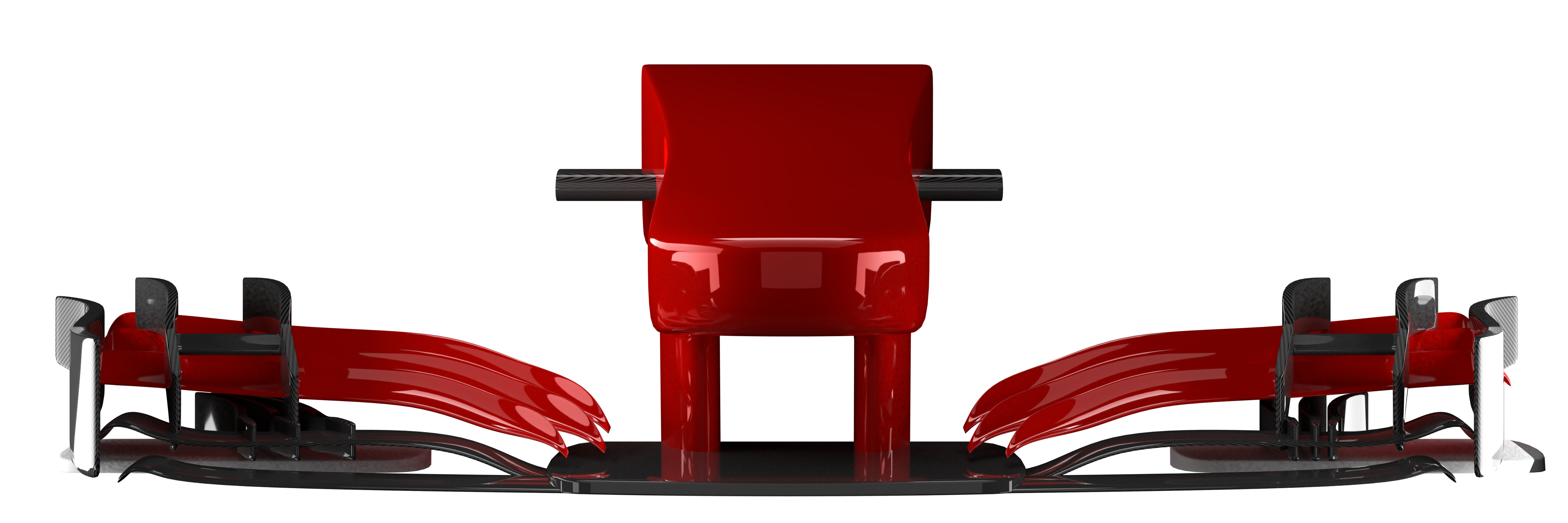
The tip of the nose in your example is very thick along its whole width. You can see some good reference images here. The thick part is a narrow stub. If they could, the designers would have the noses much higher and more pointed, like this. They want to get lots of air under the nose so it can be diverted around the bottom of the sidepods. From the top view you can see that the bodywork becomes very narrow towards the rear of the car. This helps the air to flow out of the back in a way that draws out air from under the car, lowering the pressure.
The high noses weren’t well liked, and they also posed a safety risk (imagine that coming at you from the side). This is where it all went wrong. The FIA tried to use words and numbers to force the cars to have lower noses, and the result was like this horrible step design (to allow as much air as possible under the nose, the front suspension is mounted as high up as possible).
For 2014 the FIA tweaked the rules hoping to spare us such abominations, but instead they gave us even worse (possibly NSFW). I think they wanted to allow a the teams to use narrow (from top view) noses, or wide ones, but the designers did whatever they could go get lots of air under the nose.
After a few more tweaks the rules produced noses like the one in the second link in this post.
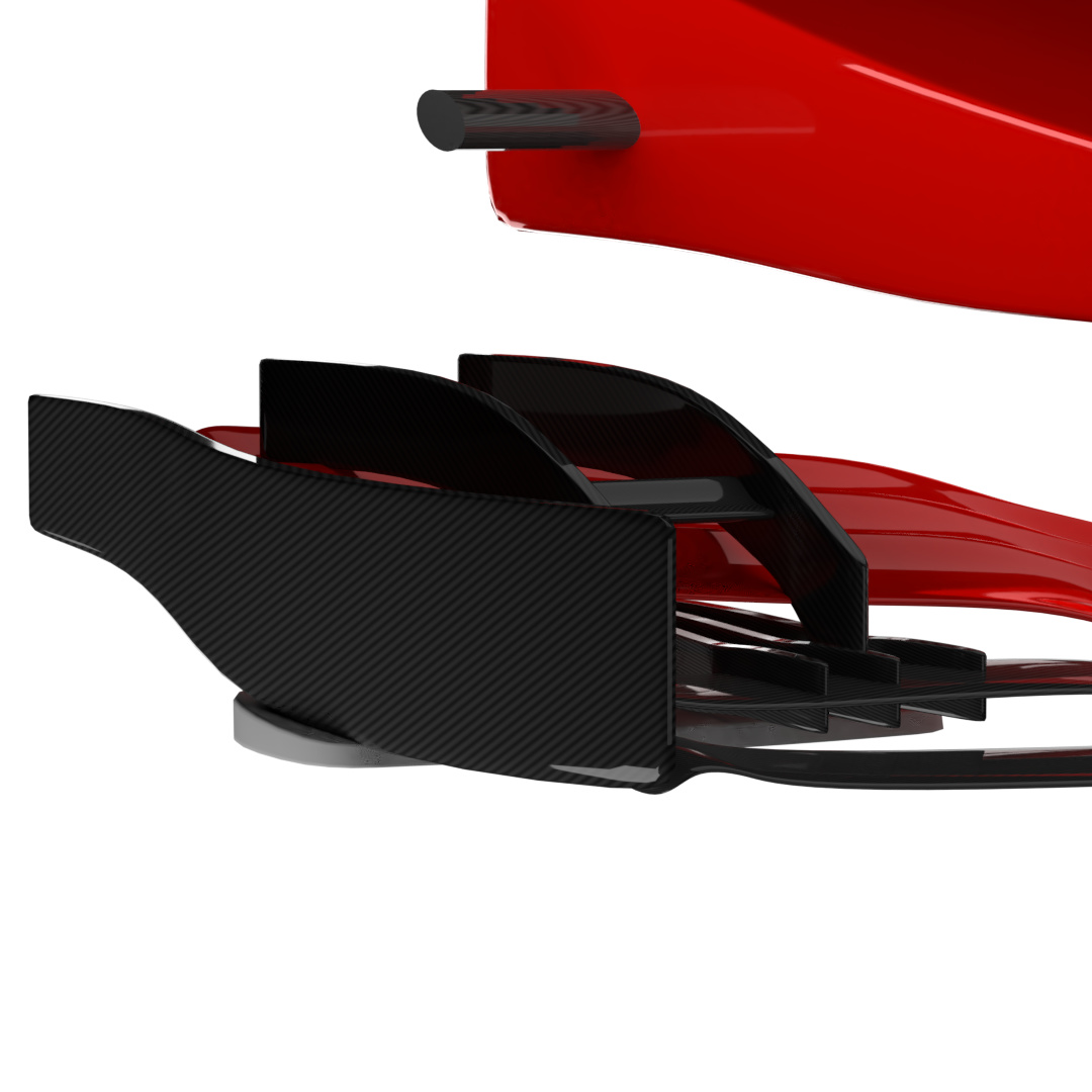
The front wing has all those complicated parts because the designers want to deflect air away from the tyres, and to help manage the airflow in other ways (which I cannot even begin to explain). There’s a very good video that demonstrates the purpose of all those bits here.
This post has become longer than I expected, but hopefully you can get the gist of why current F1 cars look the way they do. In short you can use the 2018 F1 photos for the shape of the nose tip, but for the elements of the front wing your guess is as good as anyone’s.
2 Likes
Thanks,
I did kind of understand why the FIA did certain things, but you helped me realise it would probably be better to base my model off of a real car, rather than free-styling it.