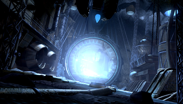
Hello guys. I’m relatively new to Blender and this is the first work that I’ve put some decent amount of effort into.
I’m looking forward to your critiques since I want to improve my future projects.
Hello guys. I’m relatively new to Blender and this is the first work that I’ve put some decent amount of effort into.
I’m looking forward to your critiques since I want to improve my future projects.
Nice painterly style! Keep it up 
Is there any specific critique you’d like? Do you have any reference you aim for?
Thanks!
Any kind of critique is welcomed. I’m curious what I could’ve done differently both from a technical and compositional standpoint in order to make my end result better.
Ok, let’s see ![]()
You have a nice strong rim light around the portal indicating a light source behind to the right. It’s a good compositional technique to make the silhouette visible. The problem in this case is that the light contour is very even and straight on the left hand side. It gives the illusion that the rough hewn stone is actually very flat. Try break up this contour, more like on the right side. I think it’s a good idea, though, to keep the right side rim light contour more “broken up” than the left side since contrast is starker there.
I also believe that the light source causing the rim light should also light up the right most stone block closest to the viewer. It would at least help making it pop slightly from the dark grass, which I personally think would be good.
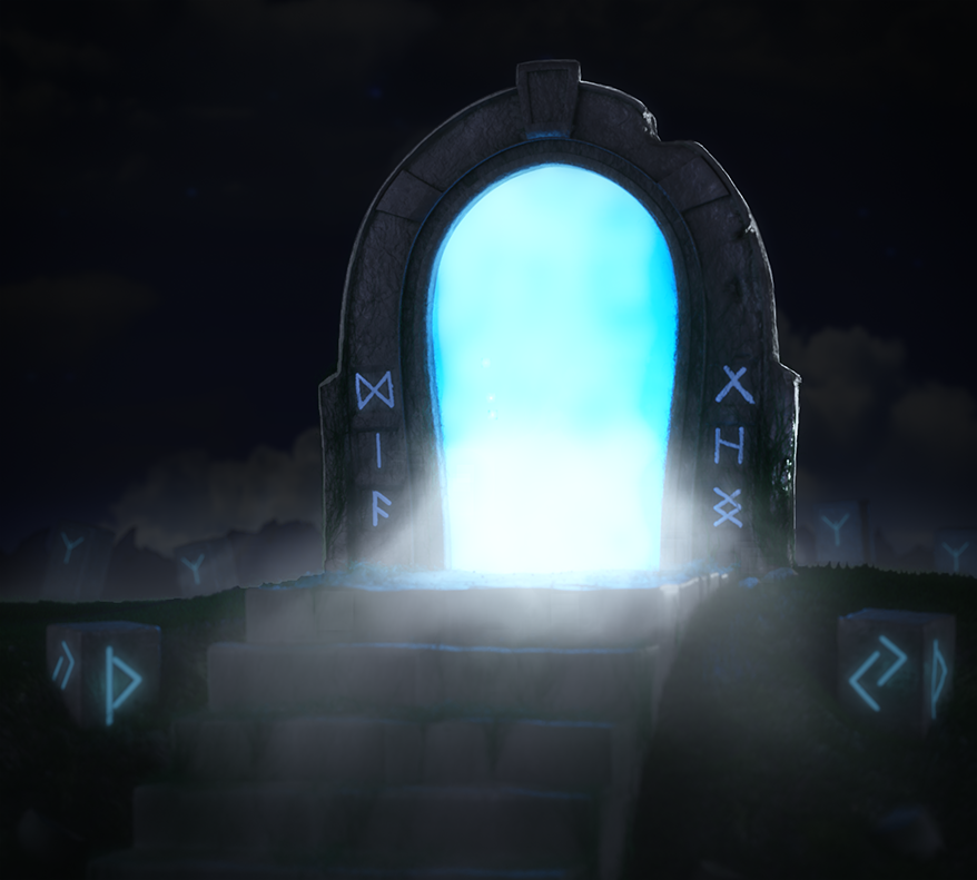
Unless you know of the method already, try squinting at your picture until you basically see only two colours, light and dark. Do this first on some painting/render you like, I randomly took this from the internet:
I could go on regarding abstract shapes in pictures, but I’ll let you digest this first. ![]()
I like your analogue colour scheme and I think it works well. It will get stronger though if you work with the light pattern design a bit more.
I think you have a very good foundation there, but you can make a stronger picture with some more work! ![]() Just tell me if I should explain something better!
Just tell me if I should explain something better!
If you would like to, please tell me how you have made the picture. As I said before, it looks very painterly to me and its a style I both like and have no idea how to achieve in Blender.
Cheers ![]()
Wow, that’s a lot of critiques, thank you!
Yeah, I definitely had some issues with the light pattern there. I thought it was a good way to indicate the portal as the focal element, but I ended up making everything else dark for no reason.
I did some editing in Photoshop, like drawing the fog, rim lights and glow effects, maybe that’s why it looks so painterly.
Glad to be of help! 
Yes, that’s probably how you got that look! Looks nice!
nice work !!!