Feeback on composition

Hello.

I have been working on a redo of an old project of mine called “Avoid the light”. This work had a lot of problems, I wasn’t planning on reworking it but I quite like the creature and it wasn’t too much work to remodel it. I do want to try a scene at dusk/night, but it won’t be a riot of emission shaders like the original.

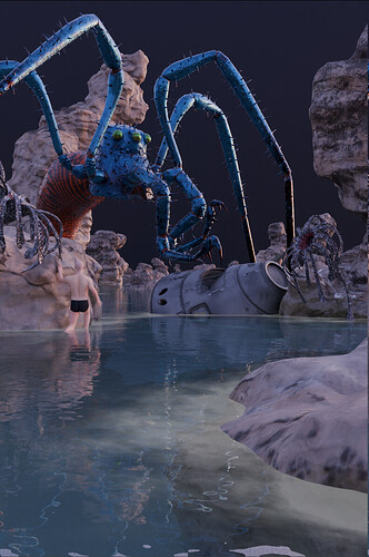
I wanted to ask for opinions on the composition of the work mainly. My original intention was for this to be in poster format.

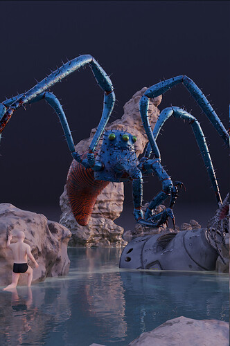
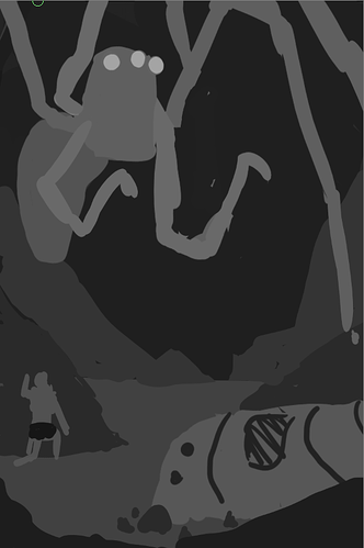
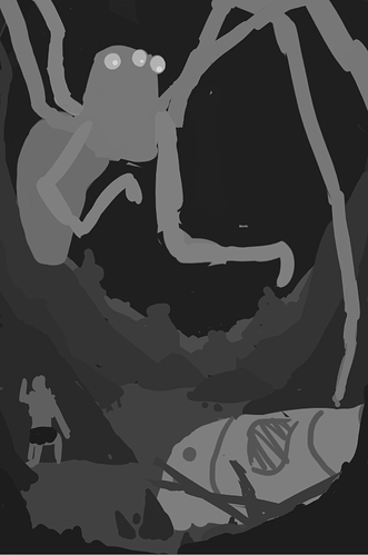
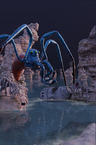
Obviously there is still work to be done (more anemone trees, make the character model, etc.), but I would like opinions on the framing/composition of the image. Which one do you like best? What do you look at first? Any comments, suggestions, etc. appreciated.


With this one, I would move the rock position so it does not lie directly behind the stilt creature. I think I like this one best, but I would appreciate comments.


1 Like

I think the last one is the best. The spacecraft and character are bigger and closer in the image, which makes them more easily noticeable, and the camera’s position makes the spider look huge and intimidating, like it’s coming right towards the viewer.

Like you said though, the rock should be moved so it doesn’t overlap the spider’s silhouette so much.

I’m imagining a dark scene where some carefully placed light rays fall onto the character and capsule, bringing more attention to them, and the spider is a dark silhouette against the background with an ominous rim light shining on its legs.

But whatever you do, I’m sure it will look neat with those models and that composition.

1 Like

I think that you need to very clearly separate the creature from the background. I feel that the 3D illusion is lost because of the close similarity between the two textures. Also, if you want to draw attention to the space capsule, you need to add some point-lighting i[/i] to subtly focus on it, and also provide a “catch-light in the eyes” to show that the creature is looking at it. Upon very close inspection as I write this, I just now notice a human figure which effectively “is not there.” If you want him to be seen, and to play any role at all, the composition and camera position must be entirely different.

2 Likes

Hello !

I agree with what has been said, to dive a bit deeper I played a bit with the image :
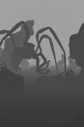
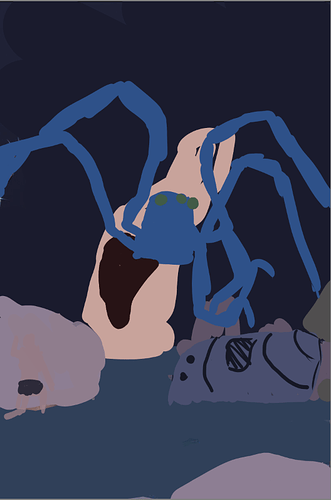
First thing I did was to simplify it so it’s simpler to analyse and manipulate :


Colors are picked from your render…
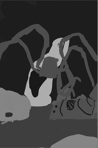
Some issues are showing up but it’s even more obvious when we turn off the colors :


Basically readability can be improved a lot, it can be argued if that’s part of the composition or not… To me lighting and value control is part of the composition, since values/light help to define the form and composition about moving forms to control the eye and readability.


By tweaking the value the composition is much more readable even if we didn’t move anything… again it’s up to you to consider that a later step in your workflow, but you might consider paying attention to shape separation from the beginning and push things even further when getting into lighting.

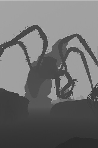
Now, I think the overall composition work, but it’s a bit sad that nearly everything interesting is in the center of the image, you don’t take much advantage of the vertical frame. Therefore we can try to exaggerate things a bit…


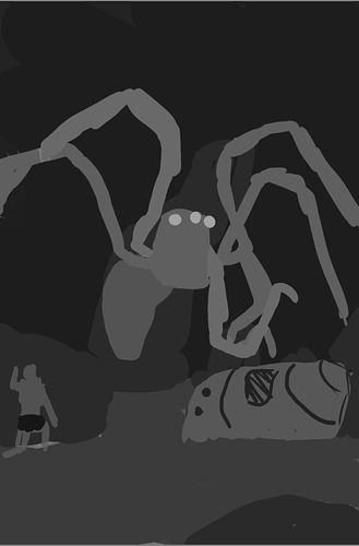
Here I got rid of the background to work on the main elements and how they play in the image, trying to occupy as much space as possible.
It’s not always what you want to do, but in that case I think it can work…


Now that the main elements are there it’s easier to add rocks and secondary elements in a way that help readability…
The main idea is to lock access to the border of the frame, and to add leading lines, it’s not perfect yet but it’s a basis…


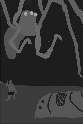
Then I keep working on it, adding more elements to lead the eye to key points,
and now that I took a stepback while writing all these I would probably go back and keep tweaking, probably the arms of the creature to start with…

Anyway, hope this will help you to spot a few areas of improvements !
It’s a pretty fun subject you’ve got here, I’m sure that will lead to a pretty cool image !

Have fun !
3 Likes

Thanks all, some good tips and points there!

The human character is a placeholder until I finish sculpting the actual character. I also decided on a different pose which I think will add to the story of the scene. I’m also going to use a darker skin tone (probably) to furher differentiate from the rocks and water.

Luckily it is rigged :smiley:

1 Like