Hello,
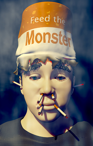
I’ve been using school as an excuse to start and gasp…finish blender projects. :rolleyes: Here’s an interesting one. The assignment was to create an interesting concept to the words “feed the monster”. We were free to interpret the meaning as we pleased and the size had to be 7in x 11in.
My “feed the monster” is about smoking addiction. It is simply a man who is having a few too many cancer sticks at a time  The process was difficult, especially trying to get the colors the way I wanted them (darn you cmyk shakes fist). Also in the few days before the assignment was due blender was crashing over and over again, especially when I pressed ctrl+z
  . Overall I’m pretty happy with how it turned out except for the eyelashes and lack of skin textures.
So now the million dollar question…What do you guys think?


