
Working on my first scene using geometry nodes to populate the environment. Not satisfied with it. Any advice?
It is supposed to be sunrise/early morning in a fairly dense jungle. For this reason, I’ve kept the sun fairly low and not too bright.

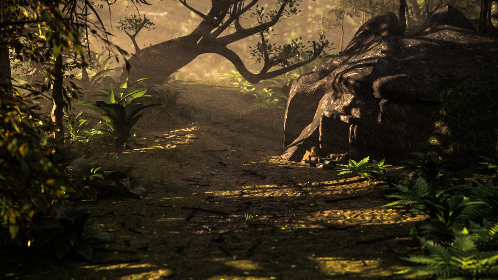
This is how it looks now after some initial feedback about the lighting and focus.
2 Likes
in terms of modelling layout camera composition it it a good example
textures and lighting is bad
1 Like
Thank you. Any tips on improving the lighting? I want it to be sunrise in a fairly dense jungle, so it’s not supposed to be too bright. A lot of the plants were taken form the Blender Online Asset Library, so they have included textures. I know they look a bit … off. I can’t quite put my finger on what’s wrong with them, so I added some fog to try and hide them a bit haha. How do you think I could improve them?
ask yourself what is it that differentiates the foreground and the background, what you wanna show and how??
Interesting. Unfortunately, I have no formal artistic training, so that’s a hard question for me to answer. The main focus is going to be the cave, as the camera moves in. I wanted the light to streak through the fog, mainly onto the cave, but too much light would be unrealistic ( I think) for a fairly dense jungle with a low angled sun. Thank you, though. You’ve given me some things to think about.
let me give it a try please
you just focus on what you wanna show
and throw the viewers attention towards that
washing the hell out of the scene will be a bad idea
1 Like
As say @hrijul_dey, you should know what you want to focus on.
If you want to focus on the roc entrance, you should create a depth of field with the camera, it would give a far better render, and maybe try focusing the light too on the entrance.
Actually my eyes, (and surely the ones of others) are focused on the vegetation to the left
1 Like
Hi there,
Exactly as the others said, I just wanted to say the same. The fern and bushes are pretty OK, I would say, but the trees seem a bit cartoonish. The bramches lack depth, so is the rock.
The viewer is concentrated on the vegetation line in the left, that curvy edge of the forest, meanwhile the cave thingue is lost in the background.
IF you were to expand the scene and add vegetation on the right, the view would be balanced.
Also, a path can help, that leads tonthe entrance, drag the eyes, so to say.
Overall it is a nice scene, I want to enter it, there is a lot of work in it, you just need a but more of precise compositioning.
Also, I like nature scenes and nature is never purposeful. I dont like scenes where the focus is radically forced. It is OK to break the focus. So the viewer can be lost in the scene the good way, look here and there, look for hidden things.
Pop an orchid on the tree, more geometry on the rocks, moss, whatever, break it up then give it a story. The path to the entrance would be a solution in that regard.
As for lightning, volumetrics should be used IF your PC can handle it. Anyways, drag a sun way up above the scene, and tweak it, let the math do the work, it is OK if the scene is dark someplaces, we are talking about a rainforest anyways right? 
Oh and yes, fauna! Snakes, spiders, whatever!
1 Like
plus the sense of scale, at what scale did you make your things, how much light interacts with it also matters. just throwing other peoples assets into a scene and not thinking about whether they belong to the place or not
1 Like
Thanks very much, that’s really useful. Actually, the camera is focused on the cave, but I didn’t adjust the F-Stops, as I don’t know yet exactly how that works. I will do some experiments with getting the light to focus on the cave a bit more. But thank you, nonetheless. I will mess with the focus a bit and try to blur out the vegetation.
1 Like
Great feedback! Thanks very much. Originally, I didn’t want to start adding flowers because I know I will get too carried away and the face count of the scene will explode, but I’ll go in and add a few flowers here and there. There is a little path next to the cave, but, you’re right, I should have the camera aiming down the path (or bring the path more in line with the camera). I’m planning to add ivy over some of the rock face, and up the trees, but having fun/trouble with the Ivy Gen addon. Might just add it manually with curves, convert to mesh and add a hair particle system for the leaves.
Adding some wildlife is a great idea, but I’m a bit hesitant, for two reasons. The camera is going to be animated, eventually, which means the wildlife would either require some extra (realistic) animation, lest it appear too static. Then, with animated wildlife, the viewer’s eye might be distracted. I guess the solution for this is to keep the camera static for a moment, allowing the viewer to take in the whole picture (and movement therein) before starting to move the camera.
1 Like
It is to be a prehistoric scene, so I wanted some slightly larger vegetation (as it’s my understanding that prehistoric flora was pretty big). I spent a long time making my own plants and selecting a few from the Online Library. I tried to avoid anything that looked out of place, like cacti, rose bushes etc.
This is what I have now after all the great feedback I’ve already received. I still need to do some adjusting so that the cave is not in so much shadow, but I think the advice about the path leading the eye, and adding the depth of field really helped.
Added some moss to the side of the cave, changed the shape of the cave a little and messed with the seed of the geometry nodes.
Somebody said about adding flowers, and I think it was a nice idea to get some more colour in there, but after looking at a lot of reference, it seems that jungles don’t have a lot of brightly coloured flowers.
I plan to add some vines strewn across between trees, and some ivy growing in places. I also think a swarm or two of mosquitoes would add some life, but not entirely sure how I will do that.
Welcoming any other suggestions, but still very grateful for those already received. Thanks everyone.
1 Like
ok, this is good, but I just have one question : the entrance of the rock, what scale does she has in real life, can a human fit in there ?
if so, I would maybe try to put light in it so it give the effect that a torch is illuminate the cavern.
Good idea. There is a human sleeping inside, so maybe not a lit torch, but I’ll try to add something which shows the scale or gives the impression that a human could fit inside. Or maybe a tanning rack outside the door.
Thanks again.
1 Like
I featured you on BlenderNation, have a great weekend!
It’s getting better! I really like it overall, but let me try to give a little of my opinions on what could make it a little better.
-
I think that despite the fact that it is early morning, there needs to be more contrast. I think your highlights should be brighter. The low angle and color of the sun will convey the time of day, but at the moment it looks very flat to me.
-
I would also play with the light so that the shadows and the highlights hit the hut in a more interesting way. Either the highlight hits the opening (which is a little lost in your last image) or it doesn’t, but the light that you mentioned shines out from within. It will convey a lot about what we are looking at.
-
The ground texture is definitely getting better, but I think there is just a bit too much repetition still. The dirt could use more texture as right now it looks a little “plasticky” to me.
-
The scale may be a bit off. To me, at first glance, It looks like the home of a little woodland creature, or maybe a fairy lives inside, with the current perspective.
-
Just a little thing that I didn’t notice immediately, but does I think subconsciously register is the seam on top of the hut. There is a hard line where the texture changes it’s mapping, and all of the shadows change along that line creating an unnatural feeling there.
These are a few critiques that I think will help your piece, but with that said, I really think it looks very good! I think it’s coming along very nicely. Your lighting is almost there. Are you rendering in Filmic color space? That could help, as you can play with the contrast later! I like rendering in filmic with low contrast. Filmic Log is just too flat for my liking.
Just for fun, I ran your image through some color correction, just to see how I’d do it. I’m by no means an expert, but to me this added a lot more dynamic energy to the image. The quality isn’t great as it’s obviously a compressed jpg being recompressed, but I think it shows that with just the added contrast and a slight decrease in saturation on the greens, it really makes it pop a little more, without even re-rendering anything. But, just my opinion, take it for what it’s worth!
Over all this image has a very good feeling and a good environment. I think you’re doing great work, keep it up!
1 Like
Good improvements so far.
If you are going for realism, go for realism. If you are going for more of a Pixar look, then focus in that direction. Color, mood and light should constantly be on your mind. It is ok to find some similar piece of artwork and work towards that.
I would go through each object one by one, starting from those closest to the camera and try to improve shape / model / texture.
Good luck!
1 Like
Thanks so much for your feedback. Your contrast adjustments certainly do make it pop that much more. Regarding the seam along the top, that is actually an intended fold in the mesh, to give the rock a bit more “jaggedness”, but you’re right, it just looks like an unnatural break in the texture. I’ll see about making that a more obvious crack in the rock.

Since the last edit, I have adjusted the lighting to be more directly on the entrance, added a creeper vine to the large tree, and some ivy growing up the rock.
But still got some work to do.
Thanks for your sound advice.