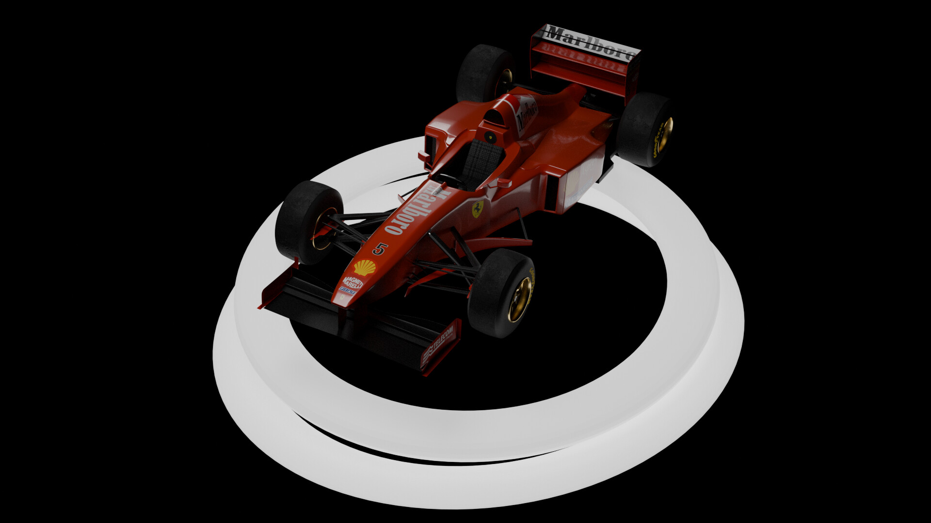

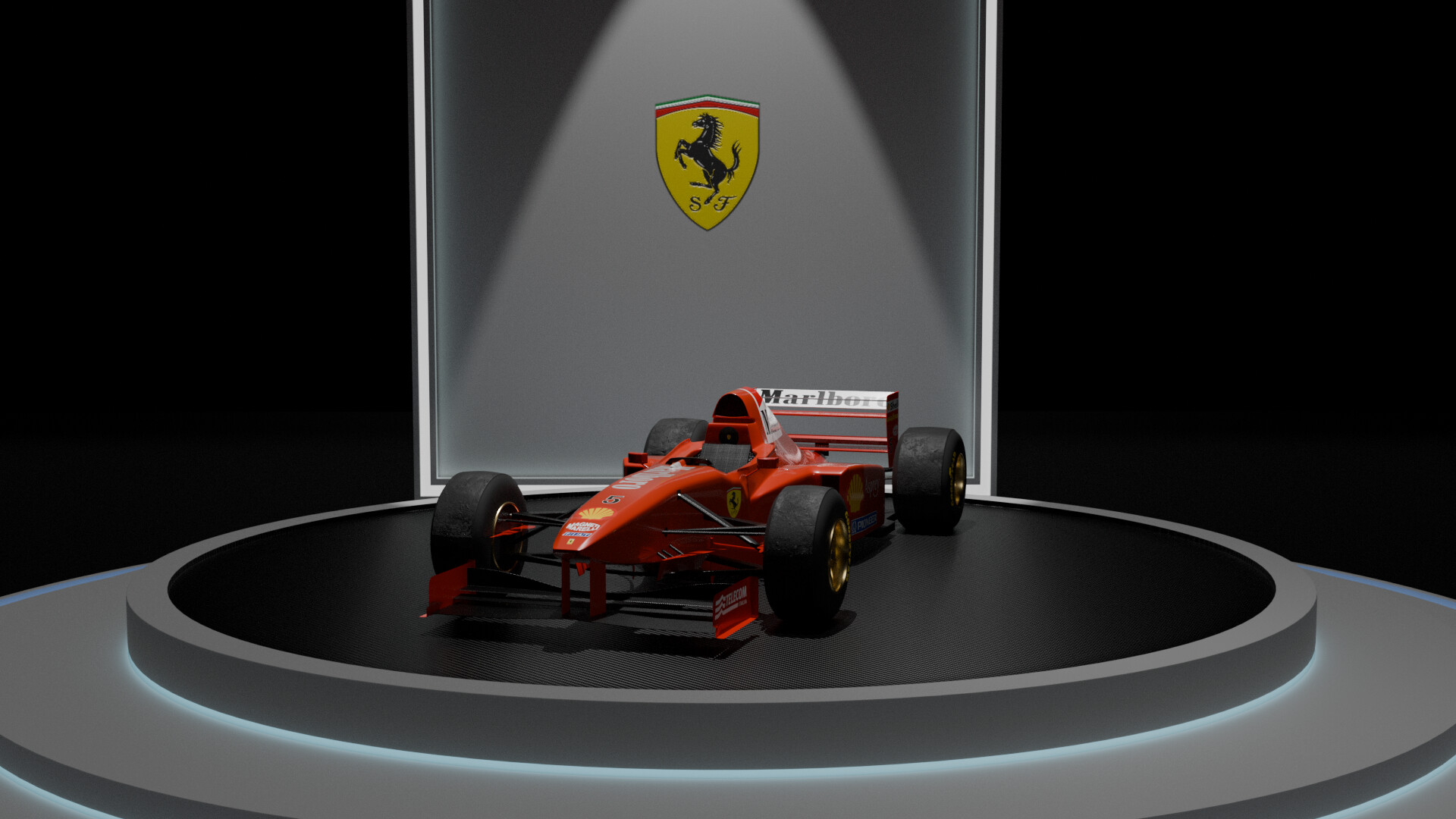
Been working on the model in my free time for a month or so, and I’m glad it turned out ok. Although I’m still planning for a proper setting for the background. Do mention any faults, it would really help me.
5 Likes
I like what you have done with the background so far on the second render, it works well. I would add a bit more lighting to the scene though so you can see the car better. Adding an emission shader to the rings around the circle surrounding the car could be good (image below), maybe set the emission shader to a red or a blue, it might improve the overall atmosphere.
1 Like
Thanks, will try it!
1 Like
Would love to see the results if it looks good.
1 Like
I suggest working on the scale of some of your textures; the cloth on the seat, and the carbon on the floor - far too large in scale. It makes the car look smaller.
1 Like
Crazy, I noticed the seat just now. changed the size for both of them. Thanks!
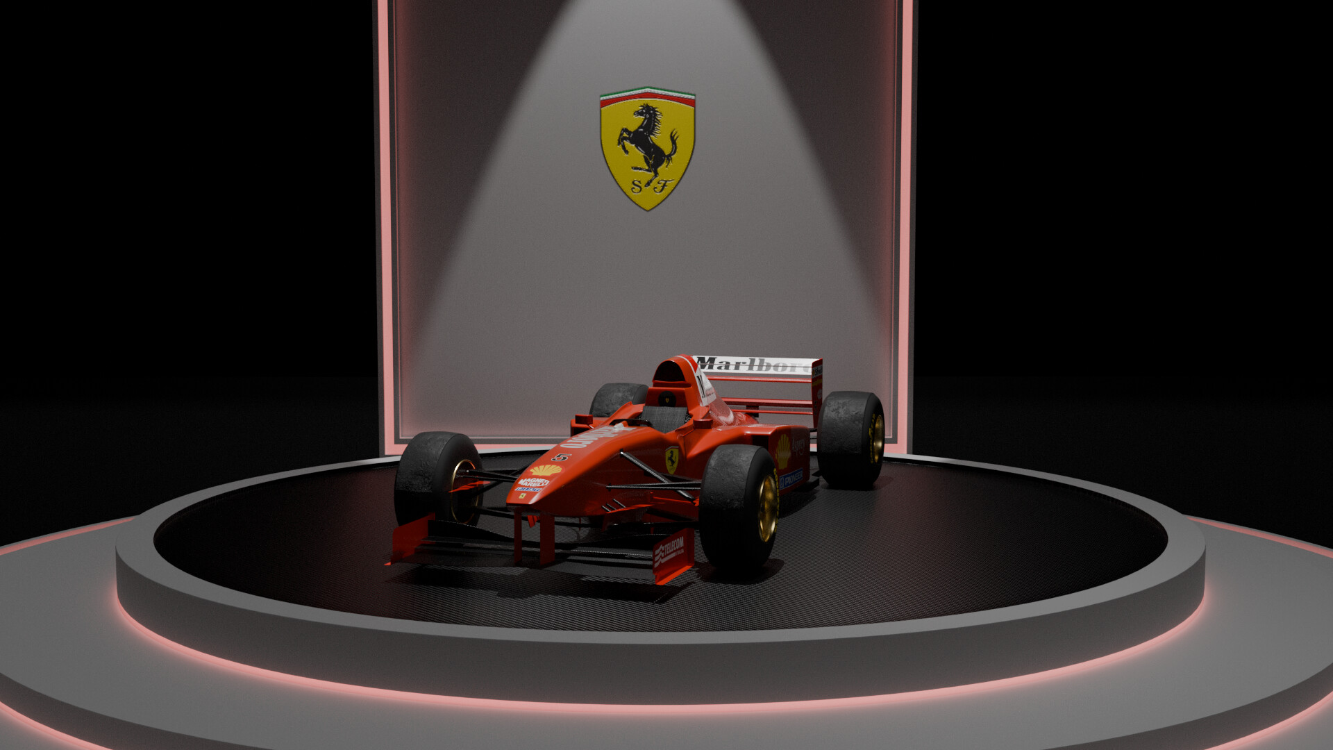
@Withers99 Changed the lighting by adding a small backlight, then arranged the other two lights here and there.
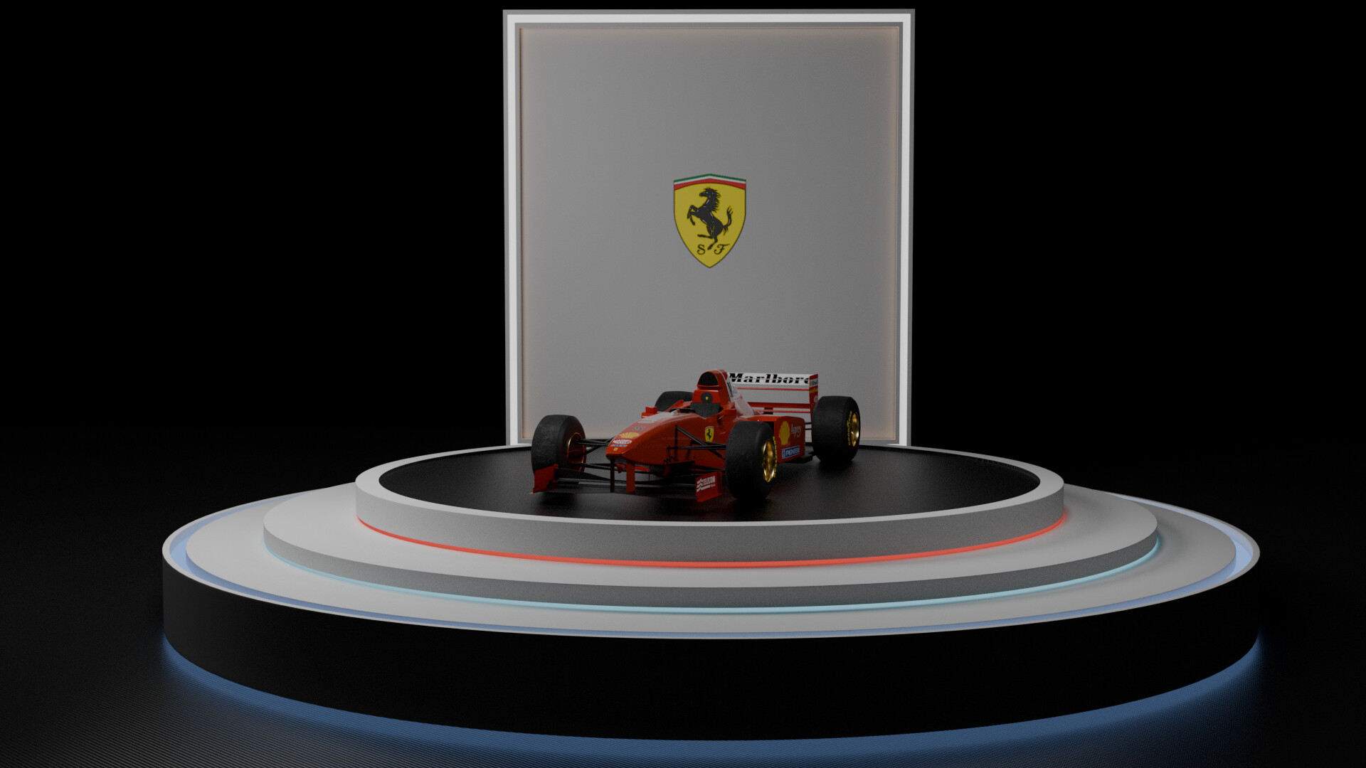
Any better? Would be great to hear back from you guys regarding the changes
1 Like
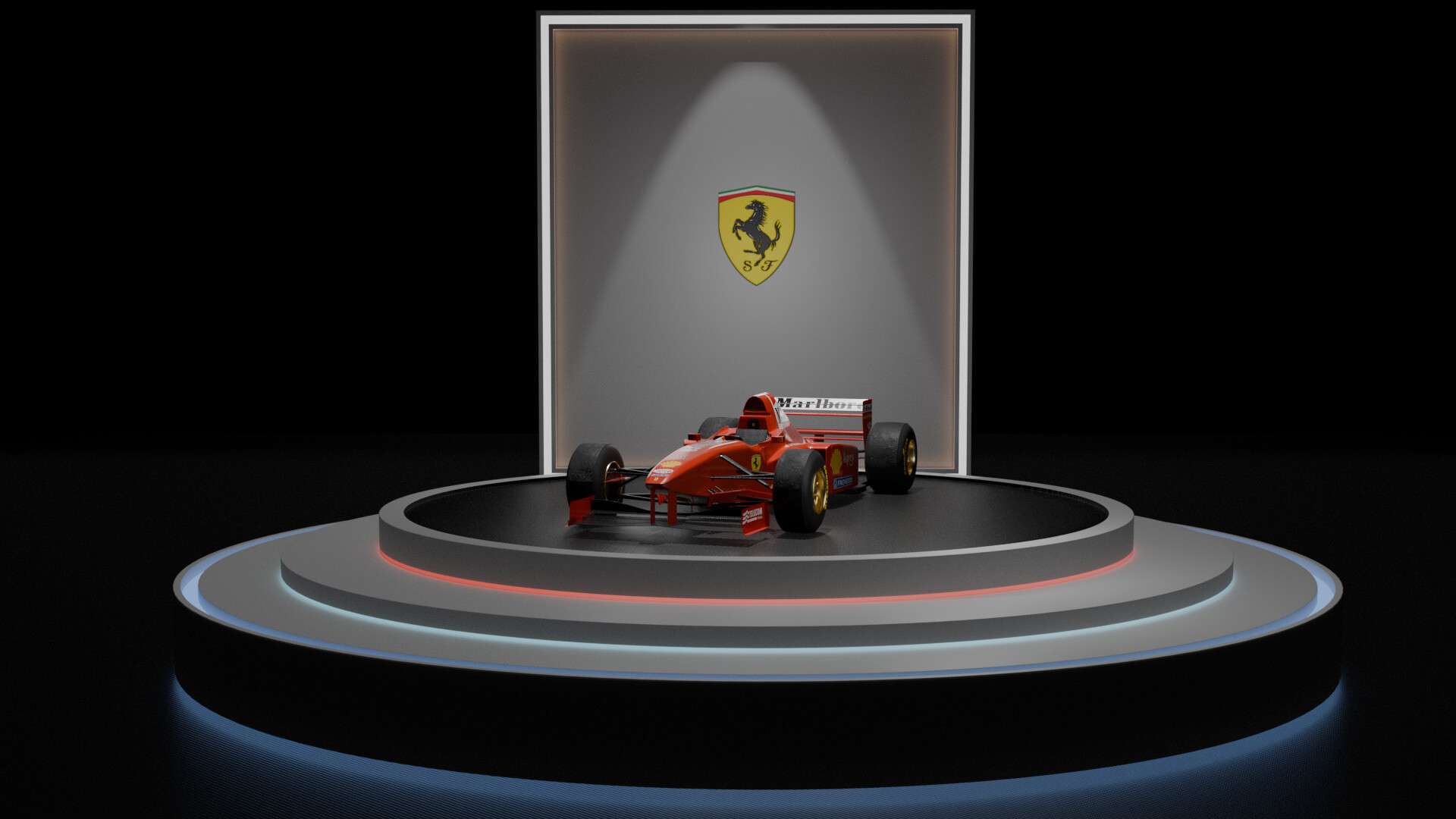
It looks really nice with the changes, the blue around the two circles definitely helps. I am not as sure about the red, it would be nice to have some other peoples opinion on it. You could try changing the red to the lighter blue you used on the middle circle.
Overall I think it looks great, the blue light really adds to the atmosphere.
1 Like
ok, it’s improving.
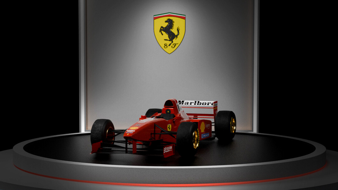
Now, think about what the most important thing in the image should be. Is it the car, or the room and the stage?
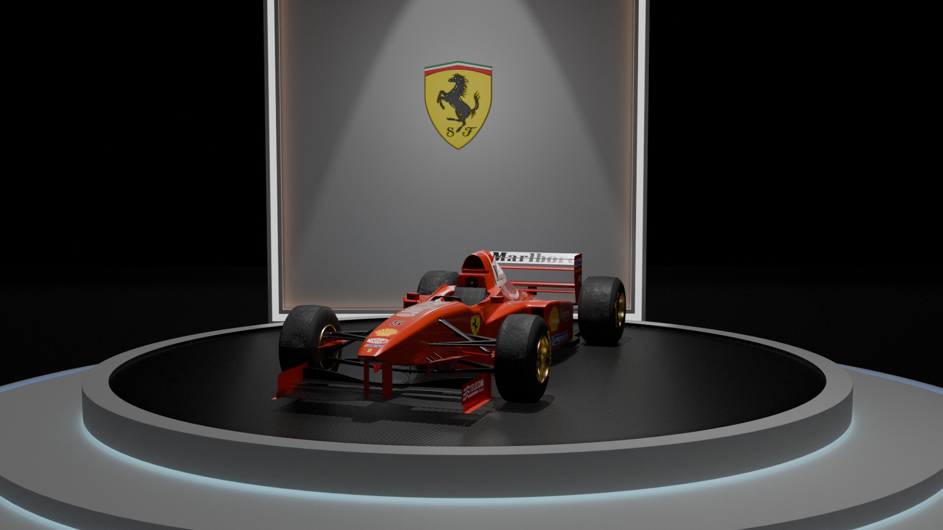
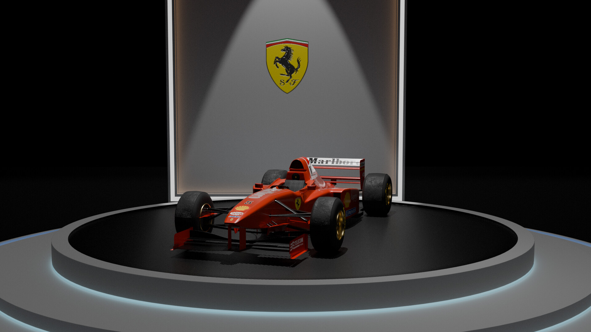
More placement on lighting focus and pushing in the the camera will make a difference.
(Quick mockup from photoshop)
2 Likes
That looks nice @thorn I think moving the camera really helps.
I tried to replicate that as much as I can, here’s the render
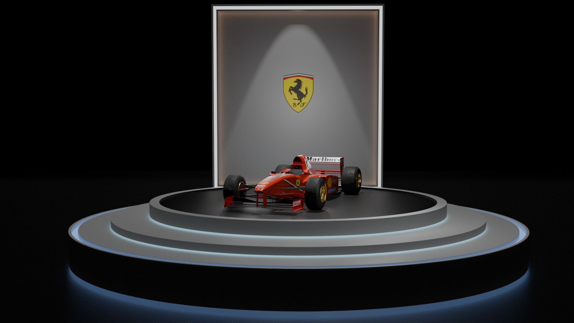
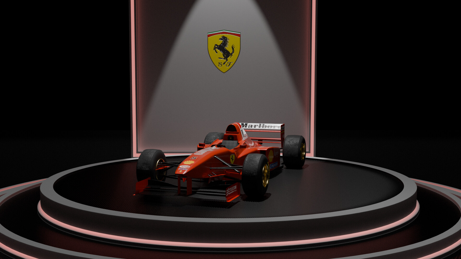
@Withers99 Tried changing to light blue as you mentioned, Now I’m not sure which is better
1 Like
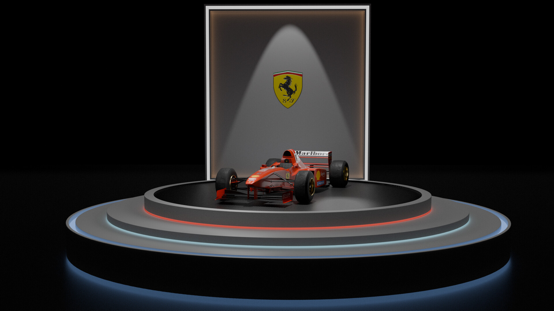
Lighting addition looking better, but try to also darken the areas that we shouldn’t see so much.
I think a singular color for the floor lighting is best. Whether red or blue would be a personal preference. I think red will work well with the Ferrari brand colors, but the light blue doesn’t pull the eye to the floor instead of the car.
2 Likes
I agree with @thorn I think a single colour will look better, and the red could work with the Ferrari brand.
1 Like
tried to add some changes
@Withers99 @thorn I can’t choose, I feel like the blue will be better cuz it kinda eases the eye. While the red represents the car more.
1 Like
Yes I think I do agree the blue eases the eye more. I personally think images one and two are the best.
2 Likes
Know what? I’m not gon think much about this anymore. Thank you and @thorn for helping me.
1 Like
Yeah, definitely not the red. It clashes in an odd, muted sort of way.
1 Like
I featured you on BlenderNation, have a great weekend!
1 Like
Hey, thanks!
2 Likes