A company I do some work for is migrating to a more Blender centric pipeline and I’m running into a few color issues, mainly how push exact colors through a filmic setup.(Yeah I know… but clients)
Coming from an ACES workflow the short story to sidestep any fancy color processing is that one could simply apply the output transform to any input color/texture and it would automatically apply the inverse of this output transform to the input, negating any changes done at the other end. So if you have an unlit surface with this color it will come out with the exact same values when the renders are baked out to deliveries.
For example, for some generic brickwall texture it looks something like this:
sRGB_Bricks_Texture.jpg → IDT-to-ACEScg → [ ACEScg ] → ODT-to-sRGB - > delivery.jpg
And for brand color items it’s something like this:
CompanyLogo.jpg → inverse(ODT-to-sRGB) → [ ACEScg ] → ODT-to-sRGB - > delivery.jpg
And just for technical reasons assume a brand color might be used ‘unlit’ directly on a surface and needs to be the exact same RGB values in the delivery.jpg as in the input logo.
So the question is how to do this using a Filmic setup? Preferably working for both a texture file and color swatch input.
Yes, you would do the same thing. These are the output transforms, available in the input dropdown—choosing the one that matches the output transform will result in colors (more or less) passing through, same as the ACES hack. Note that there’s no accounting for looks—so if you’re using something like Punchy or Medium High Contrast the transforms will no longer match, but if you’re coming from ACES you’re used to only having one base transform with no looks anyway.
If you’re using a pre-AgX config, you’ll only have Filmic sRGB, of course. And I can’t remember exactly when, but they didn’t add the ODT as an input like this until fairly recently, maybe 3.2 or 3.3? so watch out if you’re using a config older than that, you won’t have the option. (Although diving into the config and adding the display as an input is aways there too.)
Thanks good to know! I was testing a few months ago and recently started to revisit the issue, maybe I should have checked the updates first! Anyways, good to see progress in this area.
The issue is that attempting to do this will result in very uncanny looking work, which is almost always unintentional.
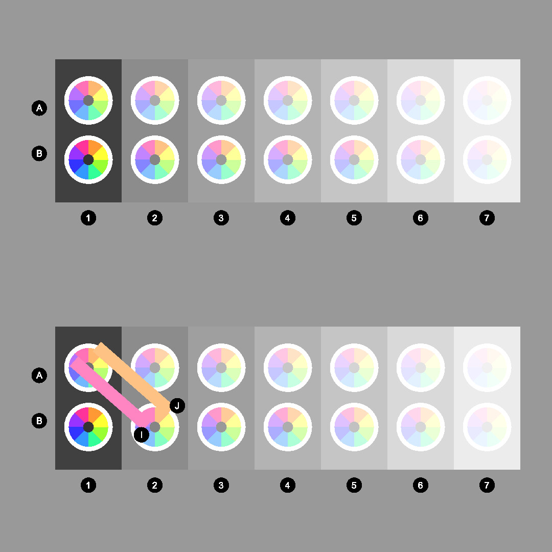
Our visual cognition systems already do this, and fission out the computed colour from the context. So by flatlining a stimuli mixture, it is basically removing all lighting and contextual interactions. This creates a very different cognitive result than intended.
Notice how the effective colour and purity computed in B2 can be interpreted as “more pure” despite being colourimetrically lower purity in comparison to A1.
The key point is that “colour” is not in the stimuli, and as such, if folks arbitrarily force stimuli to some values, the computed colour will end up potentially very different to the brand identity need.
Using the “inverse” will also lead to the wrong computed colour in cognition, but the chances are if folks are chasing numbers, they don’t care about the pictorial depiction.
Yeah, but this particular setup goes around all that. For example we sometimes add unlit colored spheres to renders to verify nothing gets messed up between input and composited output. That same color/texture is also used in normally rendered surfaces but from those it’s hard to to an automated/mathematical check if supplied color matches the final output color. And there are a few other applications as well but it’s not ending up directly in the deliveries.
When the brand manager says “I want the label to be exactly this color purple, which is our brand color of purple” - it’s very intentional.
Can we not turn this thread into another long discussion on cognition, and the theories of how vision works (which apparently know one knows how vision works, so…)?
As I said, what people think they want and reality are two different things. If someone is chasing random numbers, they are so lost it doesn’t matter anyways. Just use MS Paint.
Yep. The moment folks stop conflating what is happening in a picture with brand identity values. I actually had an eight month effort to try and help a company over this hump through their design firm. It was a challenge, and they started at the exact same place.
Brand identity colour ain’t in the stimulus. And if some marketing peep wants that, just key the region and flat fill it.
Theory aside, Standard is the only way to take a hex color from another program and create an unshaded material with an identical color. You can argue the finer points of color and stimulus and be entirely right, but it doesn’t change the fact that if you want #DEAAFF to be #DEAAFF in Blender, you have to use Standard.
I’m not going to fight with you on this, because there’s no fight to be had. Show me an emission shader set to 1 strength in Blender with a sampled hex color identical to the hex color set outside of Standard or don’t- (you can’t, because it’s not possible). Put up or shut up, as they say. I have a lot of respect for you and your knowledge but we both know the only way to get 1:1 hex colors is Standard
Only in an idealized lambertian “diffuse” or “direct” case.
But even under a single normalized energy for illumination, if there is any “focusing” of energy, the idea fails. It also fails the moment we add in multiple energy sources.
And the most important point: it’s not going to “look the same” with the object sitting right there on your desk next to you.
This makes the assumption that the image on the screen actually needs to look like the same identical color of the object physically sitting on my desk, in a completely different lighting situation.
That isn’t always the goal. Sometimes the goal is simply that all the digital assets have the same color on the screen that the consumer is looking at.
And it has nothing to do with reducing the solution to an absurd level of “use MS paint”.
The consumer isn’t holding a box of crackers, looking at the TV screen, seeing a magenta shift, and then deciding this is a completely different cracker company.
I understand your overall point here but you’re splitting the argument into hairs that no one is debating, and no one in any agency wants to hear their graphic designer talk about color cognition and spectrum analysis. They want the color of the logo to match.
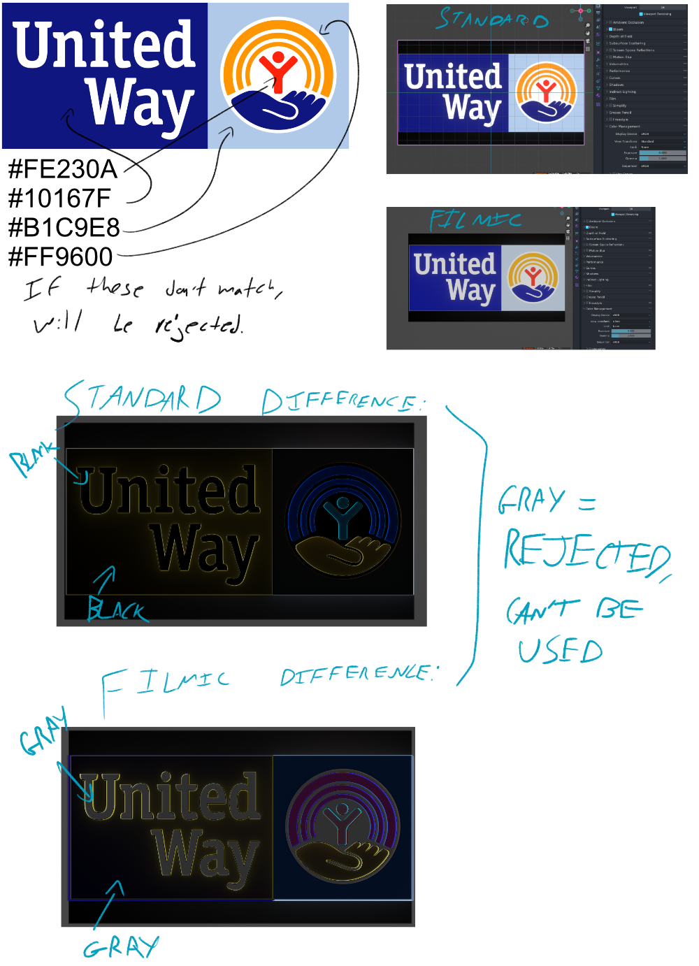
Anyone can say anything they want about color and stimulus and whatnot, but I can assure readers that one of these would be approved by the United Way and one would not.
its has little to do with perception or stimulus… it’s clients, and us, needing to validate the specified RGB values survive the pipeline. it’s just hard A equals B math.
To put some more context to this: We automate the rendering of product lines that could be a few dozen models, that each come in a lot of color variations and will have a few other variable options… having 10k+ different deliveries is not an exception.
At some point the client comes with a list of defined RGB values, and all bio-optical technicalities aside, this list is our ground truth we need to deliver. So if the products would be magic un-lightable self illuminating cubes the deliveries will have those exact RGB values in the png or jpg that will end up in the webshop.
So usually at the start of a project, or when new software is added to the pipeline, we actually add this magic geometry to the scene. A small area that is unlit and will end up with the correct flat RGB values. This render might go through some automated Nuke, AE, photoshop or what ever process and in the end we check if the solid color area is still the same. This is also easy to automate because we can sample the color from a known position. The actual product render is lit with some lights and will have reflections and what not so its a bit harder to judge the color against the RGB values.
The brand-colors thing was more of a reduced example of this that would require the same type of solution.
Just to chime in… I worked on a project for a major printing company who did catalog work for Victoria’s Secret, among many others.
I sat near the web site team that was handling “the details”…, and overheard many conversations about a particular color of purple. I couldn’t believe it - it went on for weeks!
There’s something to be said for garbage in, garbage out.
Sometimes, your pipeline expects garbage. Injecting a step in the middle that slightly improves that garbage can gum up a pipeline that is expecting raw garbage.
Sometimes, Blender is just a step in someone’s pipeline. Sometimes people are doing compositing work in the renderer. Sometimes you want the output to match the input, other than the changes you made along the way.
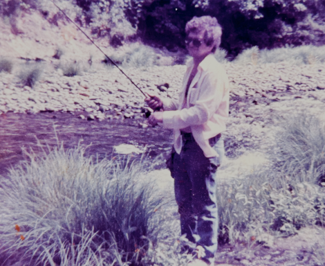
I made a slideshow in blender last week, using some basic geometry nodes and the import images as planes addon, I was able to get a folder full of images loaded with emissive shaders in the 3d scene, then I could move an orthographic camera through them to show one image at a time. animate the camera, press render animation, done. It was hacky, and I’m sure other software could handle that better, but it worked.
I’m now realizing that I never changed the view transform and I rendered it in AGX. credit where it’s due, I guess, that I didn’t notice the difference, it still looked like the photos that I put in. I was able to scission and fission out the images no problem. But when I toggle back to standard and compare side by side, I realize how many details were lost.
Add two images here. Change ‘data-direction-horizontal’ to ‘data-direction-vertical’ for a vertical slider.
I gain nothing by conserving that dynamic range. What am I even conserving it for? These are LDR images, taken with a cellphone, of 40+ year old prints from cheap film developed cheaply in the late 70’s. The output render was displayed with a cheap projector and a cheap screen in a fully illuminated room. State of the art color engineering isn’t gonna help any of that, and in fact hinders the image in this case.
My bad for not switching to standard for this project.
Anyways, as I said, this goes down the rabbit hole of absolute absurdity. And if someone is letting a marketing executive match numbers, it’s already over.
Again, had to deal with this exact thing with a rather massive corporate brand identity colour that was particularly unique because it was a physical paint. After many months of explanations, they all came around and understood the issue.
Chasing numbers is not selling the brand, and it will in all likelihood lead to colours that do not appear as the brand identity colour does.
But everyone is welcome to chase this two hundred year old madness that ain’t colour.
To you. To me, it’s a real-world example of a real-world case. It doesn’t matter in the slightest if it fits your sensibilities or not, it’s the reality that needs to happen for the United Way to approve something. You can have your theory, some of us get paid to actually do things with color instead of talk about it, and I have been paid before to 1:1 match the United Way colors.
I can tell you have no experience in a situation where you must have color precision at this level, so I’m going to use your level of frankness and tell you that since you don’t have that experience, you’re not qualified to weigh in on this discussion. Please stop- especially since the OP has indicated that you’re not being helpful.
Also- if you can’t express yourself without resorting to middle-school level profanity and insults, are you sure you have anything worth expressing? Because adults can talk about things they understand civilly and constructively. I find that profanity and insults are generally the tool of the uninformed. I know you’re not uninformed, so you should consider how you present yourself and how that affects your credibility
It’s not. It a confused application that proves nothing. The logo is an already formed picture. That means you don’t run it through a picture formation chain.
This is the same confused stuff that comes up again and again.
Happy to have a directed discussion about how to use CryptoMatte or EXRID to key for the marketing dorks, but man… so out there.
What part of multinational corporation with a very unique brand identity colour means I am somehow lacking qualifications and experience to speak to this?
And I have an uncle that works at Nintendo doesn’t matter, I got paid to match the United Way colors by using Standard. You wouldn’t get paid by using Filmic. Not theory, just reality