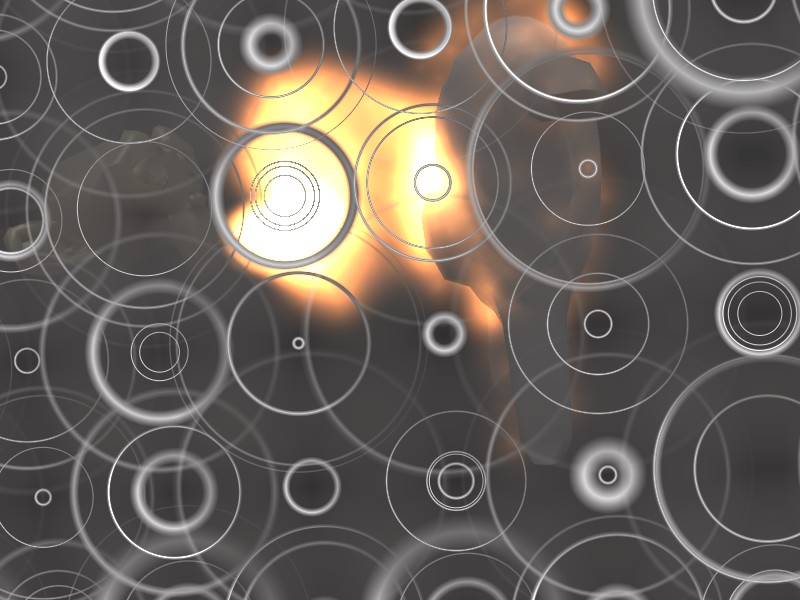
Tell me what you think the reason this is in wip forums is because the work in progress part is the fire look/material
The fire material looks good but the way suzanne breathes fire and how it distributes over the body just looks wrong. You should get more distance between the two and make the firebreath expand more along a line instead of suddenly expanding.
Like this simple drawing I attached.
Attachments

Changed a few things rendering right now
EDIT: Well the particle timing was off so the flame on the character started before the flame from the monkey re - rendering
Woah thats cool i was messing with halos and i came up with this well anyway back to work
Attachments
Finished it Uploading to youtube now
Uploaded
The fire still looks pretty weird. Give more force to the fire. Also the smoke looks completely out of place…like it’s just completely random.
Well personally i like the look but thanks for your opinions
Just realized but the game oblivions fire : http://www.youtube.com/watch?v=nUxJOY45sWQ My Fire: http://www.youtube.com/watch?v=HdGBkt_aXkE
Look similar
