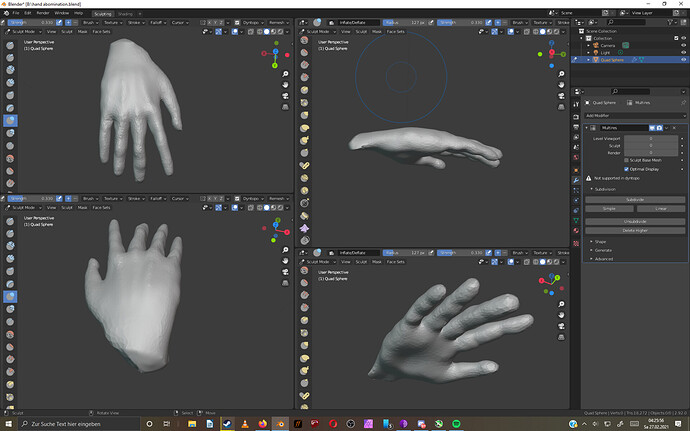
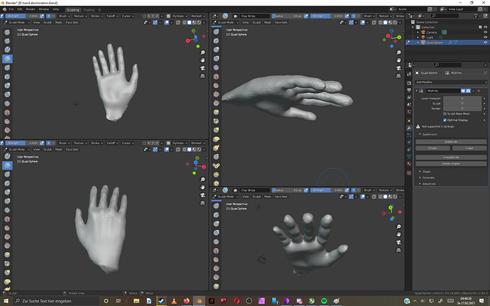
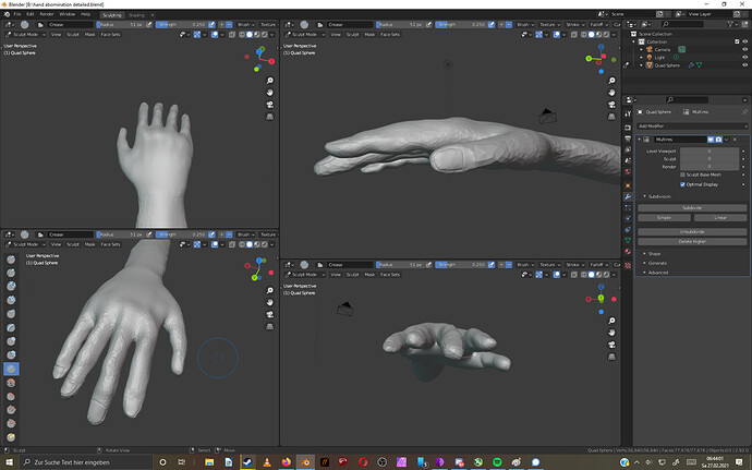
Hello everyone! I am tinkering with this hand and could use some fresh eyes and constructive critique. I am using google images, as well as my own two hands as reference. Am still learning to work with all the sculpt brushes, so I do not go for absolute perfection, but at least I hope for some good anatomy.
Your off to a good star. Overall proportions are almost there. The top section of the thumb seems too small, and the upper palm is usually a tad taller at the base of the fingers. Also the top of the fingers are more flatter.
Not much of a palm where the thumb attaches. I think you get close to a 30-45 degree angle there usually. And the thumb is lower from a front view.
It looks really good. Especially if you’re just sculpting it from scratch with dynamic topology, which is what it looks like to me. I definitely can’t say that I would do better, but since criticism is easier than creation, I do have some input.
The tip of the thumb still looks a little small to me. I’m comparing that to my own hand, though, so check your references again before changing that.
The end of the thumb should be twisted more downwards. Right now the thumbnail is directly opposite the rest of the hand. It should be facing more upwards.
The knuckle where the middle finger joins the rest of the hand should be higher than the index-finger knuckle.
The pinky looks a little too long to me.
I think you should sculpt just a little more of the wrist to give the hand a more solid base. Cutting it off that close to the hand looks kind of odd. Try giving it a little more room to breathe.


