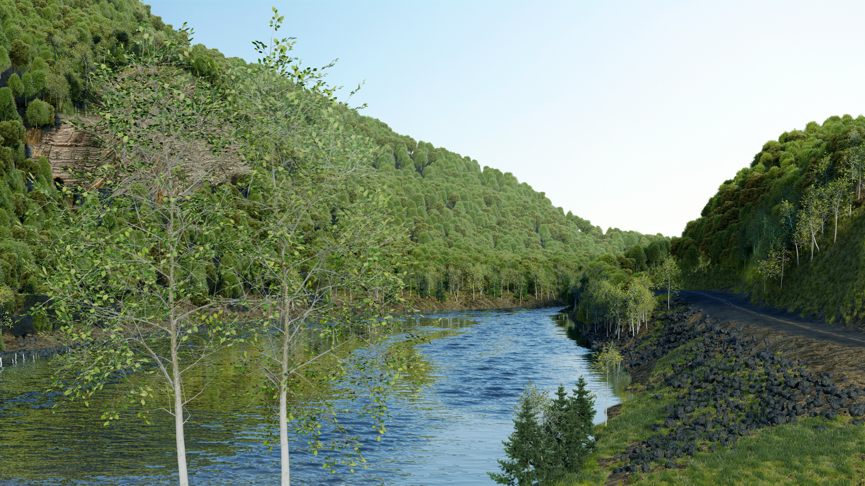
Hi everyone. I am new to the forum, and I wondered if it was possible to get some feedback on a project I published a few weeks ago that didn’t get the reception I was hoping for.
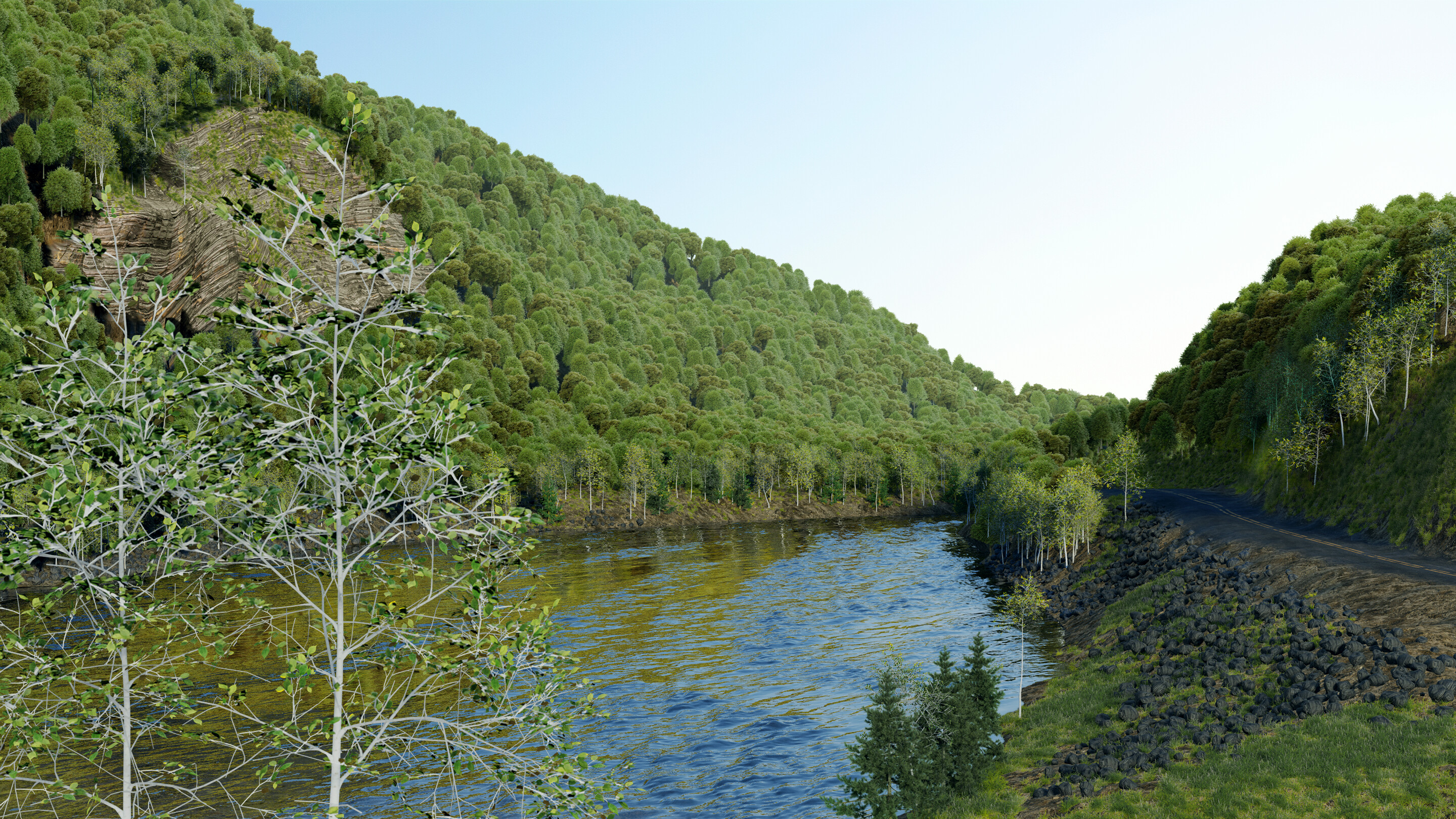
It’s a mid-scale environment with a ton of assets. Some of the nature is high poly, while the background trees have been optimized into planes. Even with optimizations it’s a difficult scene for my computer to handle, so I tried to just render it out and try to fix it in compositing.
A few points I am worried about are that the plane-trees don’t really mesh well with the ground, even though a lot of the bases are covered. The planes also seem more saturated than the mesh trees, and I am wondering if there is a way to blend them better.
I tried a mist pass for depth, but I think it came out to strong even adjusting it with a color-ramp… ideally I could find a method within Blender to control it even more. I ended up saving two versions, one without mist, and then pasting one on top of the other and going over it with a soft opacity brush in Photoshop. The result is fine, but maybe there is a more realistic way to do it?
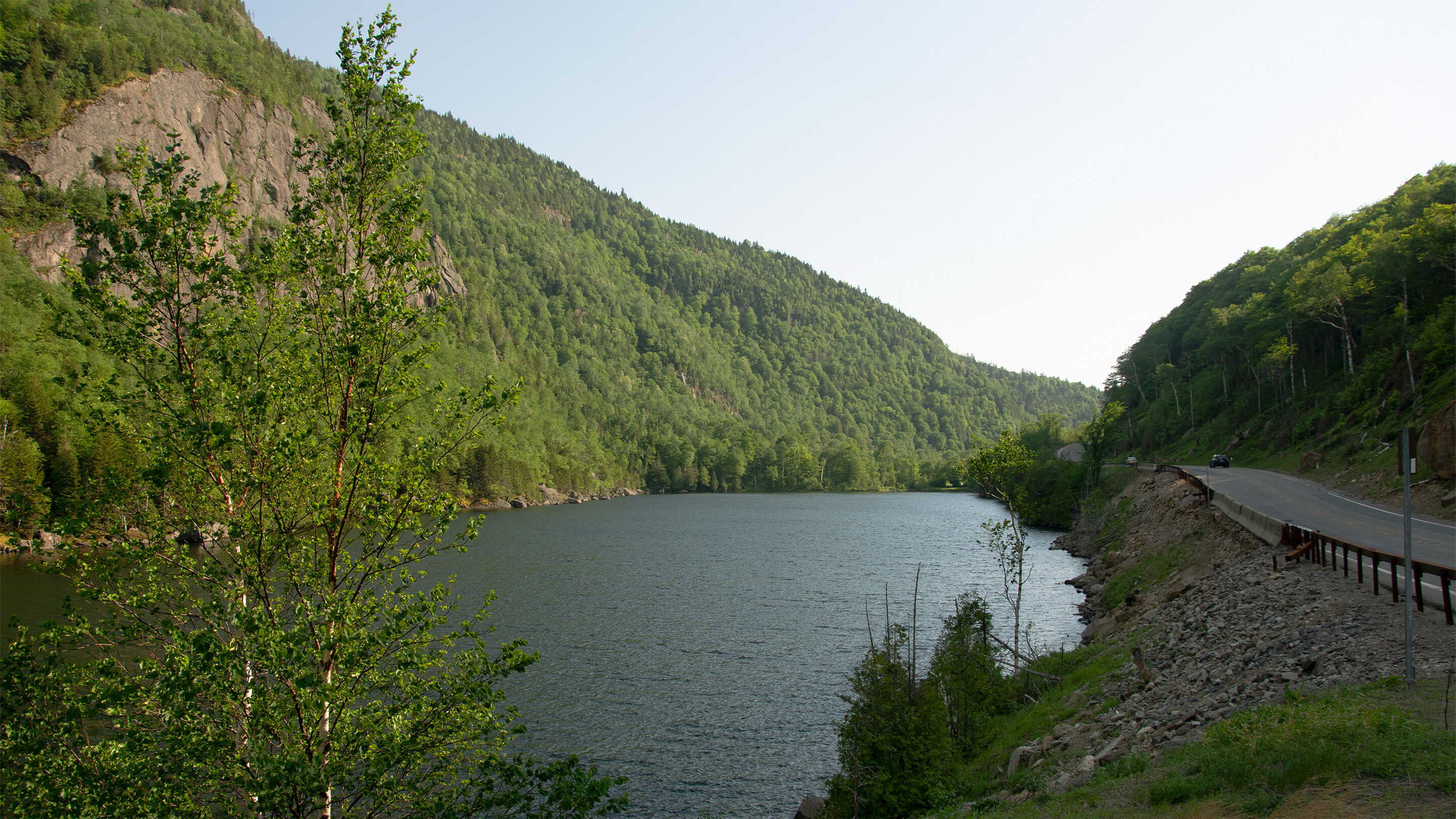
I really love it, especially the water looks just amazing, but the trees on the left side have very few leaves it doesn’t look natural all the other trees if they look great, still the exposure doesn’t seem very natural to me: / but in general it looks very well
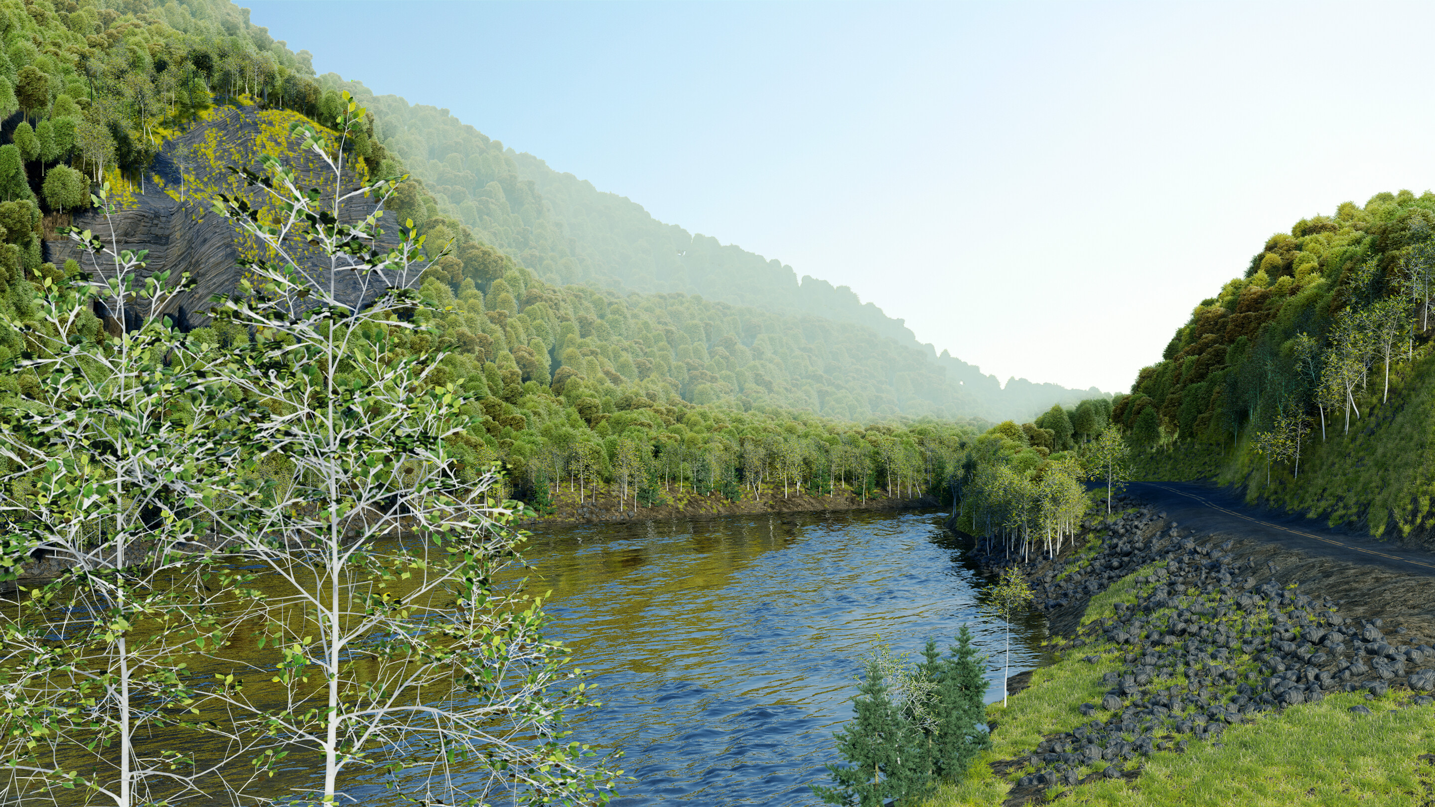
Looking at it again though you are definitely right and I added some more twigs. I also went back to the grading to get a more uniform look by grading each of the individual layers. I think for the original post I focused more on grading the overall image which threw some layers out of whack.
It looks much better, but now looking at the reference image, the grass that is near the road is very light, I mean, it does not look natural, try a darker color
What you’re seeing with the trunks is a white birch bark texture. I tried lowering the highlights so they don’t stick out as much.
I turned down the opacity of the fog to better match the original image.
People seem to like the waves, even though they don’t match the original image. I might turn them down a bit, but for now I think I will leave them as an artistic choice.
I changed the color balance of the cliff to a lighter brown. The texture I have is not ideal, but I think this matches better. I also think better color helps with the distortion, but let me know if you think the topology needs to be changed.
Looking better . I respect that you want to go for more of an artistic interpretation. You don’t have to use my suggestions if you don’t want to.
That being said, I do have some further suggestions.
There’s something unnatural about those two trees in the foreground. Looking at your reference image, there seems to be way more contrast in the bark. Color-wise, I think they’d do well with some brown mixed in there.
If you want to deviate from your reference a little, some wind effects would look nice. Realistically, if the waves were that intense, the trees would bend a little and there would be leaves flying around. Hey, if you want to go crazy with it, you could wet everything, add rain, splashes, and mist everywhere and make everything dramatic. That way you could get away with the atmospheric fog you had before, while still keeping it grounded in reality.
Ok, I tried changing the trees in the front and mixing in a darker bark texture with a noise factor. You are right, in the picture it looks like the paper part of the bark is peeling off toward the front. They don’t stand out as much in this version… hopefully the issues people have been having with them are more a matter of texture and not placement.
I also turned down the water displacement just a hair. My idea with it was more to show a current, rather than wind.
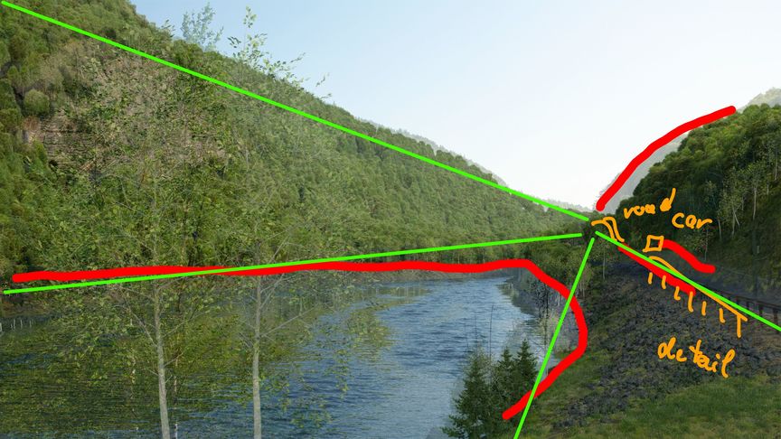
I think the composition could be improved. You have a lot of lines (river edges, road) leading to a point where there is nothing particularly interesting. Sometimes it’s best not to stick too close to a reference image. Feng Zhu says that one advantage of painting (and by extension 3d) is that you can put more in the frame than you are likely to find in nature.
Indeed the higher water level does rise the POI and the detail: car 1 and 2 show the ongoing way. Maybe the photo is not the best composition… maybe more ligth on the street, another angle…
Nevertheless nice progress @yo_johann and i learnt: the devil is in the detail (and i missed the traffic sign).
Thanks for that breakdown. Your explanation also go me thinking about the weight… maybe with the foreground trees so prominent on the left the right feels a bit sparse. Barriers and a car could help the balance as well as reward the lines.
Thanks everyone, all the feedback has been incredibly helpful. I think I will give this one a rest for now and think about adding detail to the right side at a later date.


 . I respect that you want to go for more of an artistic interpretation. You don’t have to use my suggestions if you don’t want to.