I would like to know if there could be something I can change, a way to enhance my scenes.
For example in the scenes below I wasn’t going for something interesting or with a story, just for something you would see in an IKEA catalog for an instance. For interior design purposes.
If you want results to look like it could be in an Ikea catalog, check Ikea catalog. In the catalog (US/english) furniture pieces that have a surrounding they’re in an actual living room and lit appropriately. Yours lack this, they don’t seem to be in an actual environment as lighting goes.
This is the closest composition I found quickly that is similar to the first render
It’s a product showcase shot with centered composition, but it has asymmetric elements added to break some of that unappealing quality.
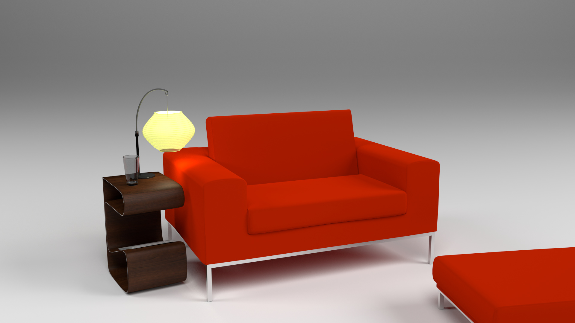
Light comes from right and creates a gradient from right to left, there are two light colored pillows on the darker side and creates contrast with the couch. Stool on the right is necessary to bring visual balance back, otherwise it would look empty and visual weight would be on the left side because of the contrast from the pillows and the curtain in the back. The couch is on the foreground and further away the wall/window, and it’s also separated from it by values/contrast.
If you want to showcase furniture that could sell in 2015, think modern, young, fresh, as opposed to old and dull. It’s subjective and people like different things, and I’m certainly not an interior designer, but to me your first render shows something that no one would ever put together in their homes, let alone Ikea showcasing one. Ugly brown wallpaper with beige details, beige couch with brown details, beige rug, beige lamp, and then someone had a bright idea to buy two red lamps and an orange pillow to emphasize the color beige.
By old I mean time period, not old people. Old people I know all have living rooms more modern than that.
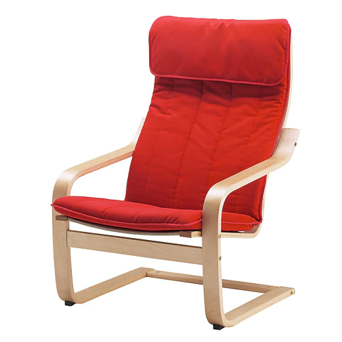
The second render should probably be in an actual living room to have a setting for the light that is on and for multiple furniture pieces. If it’s supposed to be a photo studio shot, different lighting. This is the brightest red one I could find quickly from the catalog. It’s lighter image overall but it’s lit so that the forms and materials show up.
The second one also has colors that might not go together. Placing them in an environment would give more clarity. Google image search for “modern living room red couch” shows examples where bright red is either
contrasted a lot with white and black or otherwise contrasting colors/tones, or
it’s toned down by spreading more red around and/or bringing the colors closer.
If the armchair and footstool has to be bright red, the yellow light doesn’t fit for contrasting environment like that. Or if it’s for more balanced surrounding, then the white/gray environment and white chair legs don’t fit.
Perhaps these could work for you: use references, don’t forget there is an environment outside the camera frame when lighting things, model furniture that you would pick for their purpose and use colors you would choose. Or if you think you’re the wrong person to trust with these things, back to research and references to find out what the target group of people would choose.