A recruitment poster for the american military (the Elite) in my film Resistance

looks interesting, kinda looks like plastic though.
The character looks good, however I can hardly read the text at all… Maybe try making the text shadeless and 2d. (since it is supposed to be a poster)
Model looks, under-detailed. The design is great, but the actual texture is pretty bad. Work on it. 
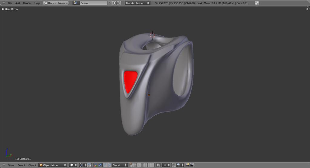
I’m having trouble adding details to the armor… I cant think of anything to add!! I used an old toy as the reference when I was designing the armor, and it was very basic… I’ve attached screen shots of the main part of the armor…
Attachments


If you want to keep it simple, then why not a normal map for some scratching?
I’m working on texturing it better… There are alot of textured details that will be added. I just made this model yesterday, so it is a ver early work in progress lol


Text on the original could till do some work. Maybe the red on red and white isn’t such a good idea. The blue and white writing is fine.
Nice second poster design, I like it heaps.
oh, and if you are looking for things to add to Armour, try looking at the short film “Azureus Rising” He has buckles, air hoses to his helmet etc.
look here For images from the clip.
Im trying to keep the armor a little streamlined… The film is set in a sci-fi 1950’s style future. Kinda like what people used to envision the future as. So there will be alot of older looking stuff, and the military has alot of chrome and smooth surfaced stuff, where as the other faction the SRC is very steampunk.
GAHHH!!! Why did I look at that Azureus thing!! Now I’m compelled to go back and rebuild all the models with more detail!! My models look like game models!!


Sorry for lowering your self-esteem with Azureus, I had the same thought (about my work, why do I even bother trying…)
Pistol is looking good, but I think the trigger bends a bit much too forwards. Also not to sure I like the sudden narrowing of the handle. Otherwise it looks very good.
I await further updates.
try making the armor look more like metal, work on the specularity, and might be a good idea to add a slight mirrior to it.
One problem you’re encountering is that it doesn’t look very much like a poster… posters of that kind are usually in portrait-orientation. The text also is somewhat hard to see because it tends to blend into the background. Take a look at the classic Uncle Sam poster and see how it is put together:

And while most people wouldn’t recognize that he’s standing in front of a Jasper Johns painting, anyone with knowledge of modern art will see it immediately.
I’m getting ready to rebuild the entire character from scratch… I used some very low poly stuff I’d made previously as a guide for this character. Now I’mgoig to add alot more detail and build it from scratch.
And so I have completly remade the character!!
http://vimeo.com/23047887 this is a turnable of the new design.
The remade character is a huge improvement. I wanted to make a create on the texture, basically things to consider. When thinking about texture think of the material, it’s colour and it’s properties. Not everything is a simple solid colour, there are slight colour modulations in everything which if applied to this character it would really bring him out. With metal there are blues, greens, pinks all very subtle of course, but it will make it more lively in the long run.
Another thing to consider is how each material reacts to each other. It seems like you have glowly bits, but I really don’t feel the glow.
Anyway things to consider, good luck with your new character 
That isn’t a full render… It’s Open GL