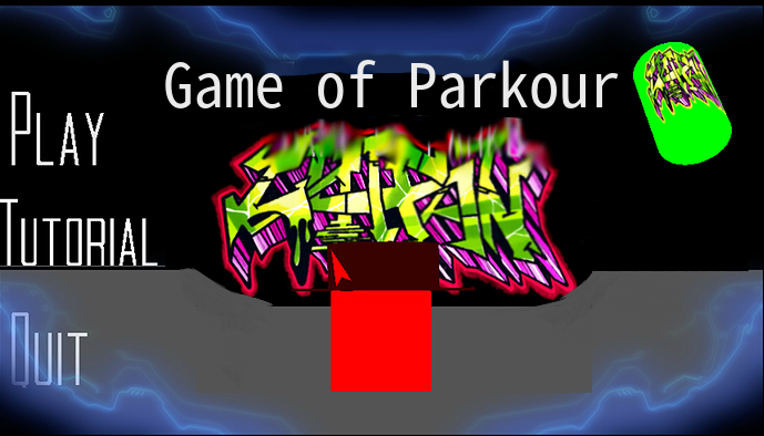
Hi guys,Iam making a new game called Game of Parkour.You can suggest what should I add in this game.
This game is just a cube with his dumb cowboy hat jumping,running,escaping and dies at the place.
Screenshots
Hi guys,Iam making a new game called Game of Parkour.You can suggest what should I add in this game.
This game is just a cube with his dumb cowboy hat jumping,running,escaping and dies at the place.
Screenshots
Now its on level 6.You think how many levels should I make?
add Physics + Dynamic Motion Actuator with Force and Linear Velocity. So the character has to fly by making some pulses and try to go through loops. Also to try to combine this game with your first game to have enemies on the parkour
Whats new
New main screen
Rank system
New HUD
Gameplay tutorial
Intro
Whats next
A few more levels
Customizable hat
Bug fixes
Adding sounds
can i play your game ?
Sorry,but the game size is too big (49.7mb).
Sorry,now I find a website to share this game @PRO_GAMER
http://www.mediafire.com/file/hku46edvsqre4qa/Game+of+Parkour.blend.exe
It was a pre alpha game.tell me if the game has any bugs
The use of the light green and pink/ purples of the graffiti go surprisingly well with the the black and blue. However, I’d suggest making the fount used for the title bolder, moving the title closer to the right of the screen, moving the graffiti art down some (makes it easier to read the title), and moving Tutorial to under Play.
I tired to make a mock up with Pixlr editor to show what I mean, but please forgive me for my photo editing skill their not the best.

Yeah that’s a little better. Before the buttons were scattered all over the screen and the title seemed like it wasn’t here. (imo) I think the menu screen now looks much more uniform. 

Keep up the good work, and thanks for the like on my project it really is nice to see that someone finds it interesting. Can’t wait to see more of your game in the future!
its “too” big, nope its pretty small
What about the title is on the bottom?
I just meant that the title was on top of the graffiti art, and that moving the graffiti down a little bit might help make it easier to read the title. Before, the title was so thin that the art behind it began to make it hard to read, the white color font also didn’t stick out from the bright greens and pinks so some of the letters where difficult to see (the 1st ‘A’ and the ‘O’ are an example of that) . Now that the title’s font is larger it’s not as much of a problem because the letters can stick out more.
Now I want to remake the level 9.Can you suggest the enviroment for the game?
I don’t have access to a computer that can use blender right now, but when I do I will download the file and check out the rest of the game to get a feel for the themes so far. I wouldn’t wan’t to tell you a techno/ Tron theme if the rest of your game is very natural. lol