I kinda like to do architectural / interior design pictures. It’s purely for fun, but as I want to get my pictures better, I would love to hear focused critique from this work I just recently finished. No model-banks used, so all is modelled by me (except the top part of that small seat, it was modelled by my brother who said that do something with it if you like. And those photos are also taken by him:))
Looking good :yes: , some points/comments:
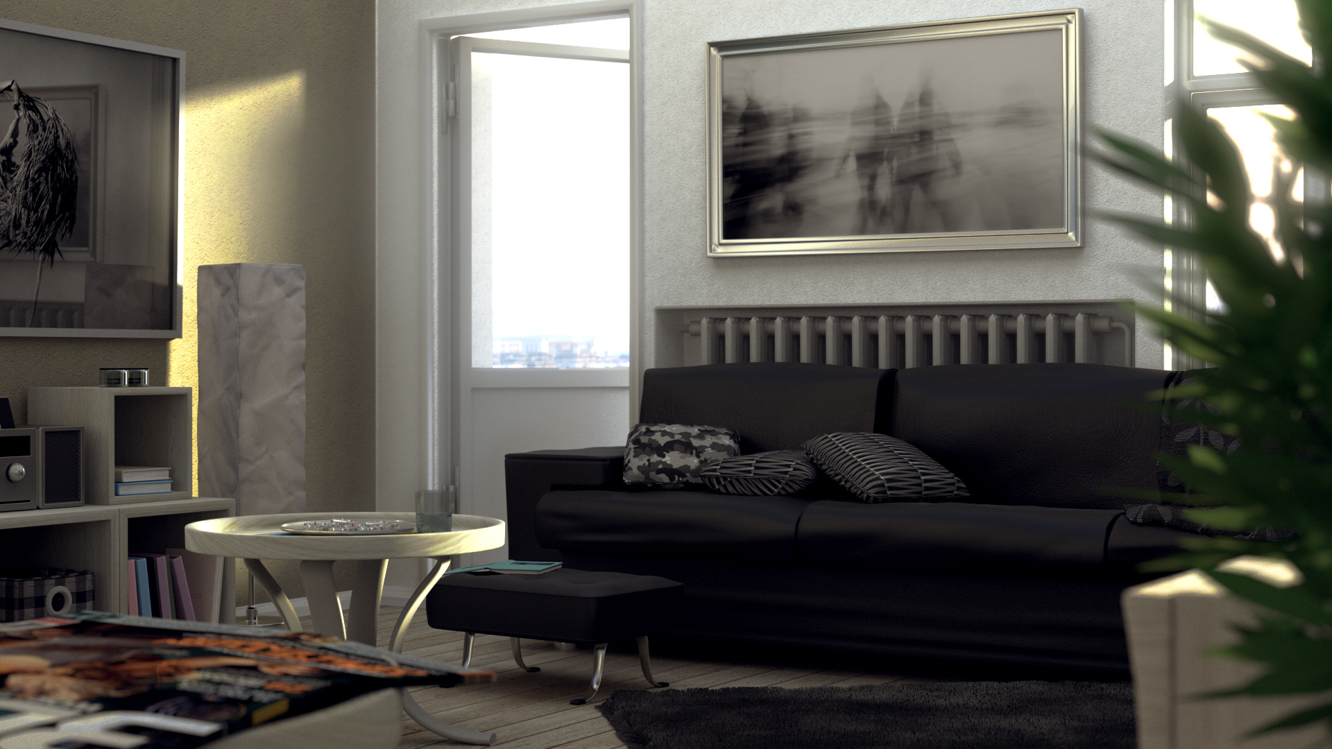
the leather bump on the couch is good but you can notice some stretching and is visible only on the backrest; you can try adding, or strenghten, that bump on the other parts.
You can try changing the color of the couch, red or brown at example, so the eye will focus there 
It’s not clear what’s on the plate, a bottle or some flowers would be better.
I would bring away the door/window at right and cover it with the wall, so light will enter only from the left one (and a lamp over the sofa,right?). Lighting will be more interesting but scene will be noisier.
Cushions have a very different style between them…you can try bringing more visible the cloth that seems like having a good pattern.
What is the thing on the left of the image, in front of the mirror?
Hoping this is useful
edit: i know is not easy but the sculpt on the couch can be improved, maybe some flatten/polish will do the work.
Thanks mik1190, you sure gave some good points to consider!
I have received quite alot of feedback in facebook already from friends and they did share many of your points. I personally find it exciting how people see things. I mean, for example: many people have had problems to see what the left image is -and it is just a big framed photo of dried flower with a glass over it. For some it looks mirror and yes, it does have elements similar to mirror (mainly the reflection/frames).
So I am thinking it quite alot that how clear and obvious things should to achieve realistic look.
To add more bump to sofa is quite good idea to test. Its the same now in all parts, but not that visible but in the back. Also still having some difficulties to figure out when i have sculpted too much bumps or not.
i also think that changing the color of the sofa could sure be visually more stimulating, but i chose black becouse I imagined that this flat would be owned by single male in his 30’s. And when deciding the color palette i tried to keep that in my mind. But you most propably are right that it would do good for the image to have some stonger element for eye to focus.
And btw the small things on the plate are small candles. Once again your comment rised a thought that how clear things should be in 3d.
I will try some points suggested next week when I have time again.