Hi thanks for your proposal, very appreciated! 
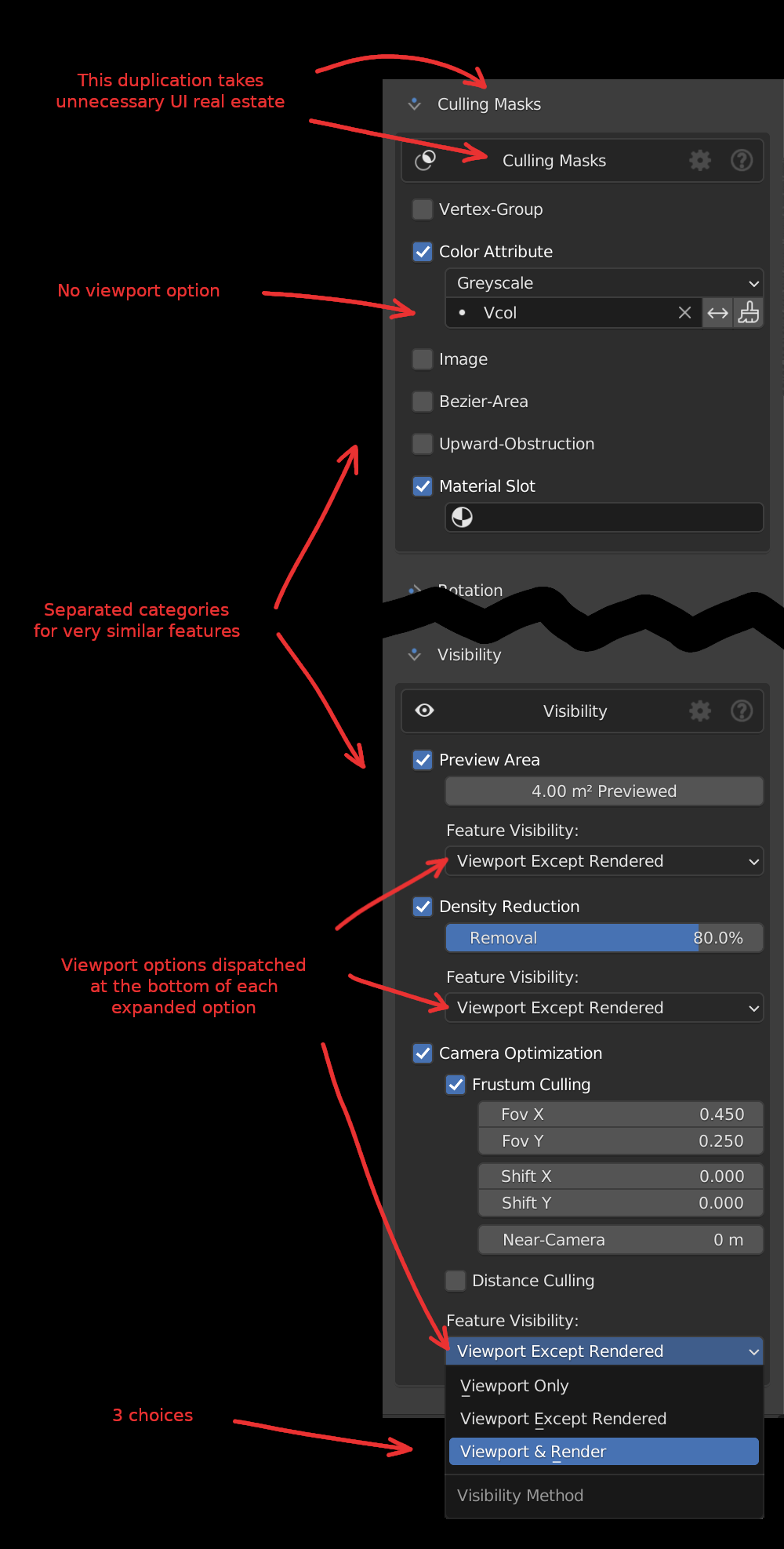
“Un-necessary dupplication”
Actually, we just got rid of the double panel structure in 5.3
This is what the UI currently looks with the “dark box” UI option disabled
Note that the features indentation is an important part of the interface look, we gave a shot to a panel with an indentation structure, just like native blender, following their GUI rules, and it looked quite odd and very messy in the N panel, this kind of UI structure only works on the properties editor IMO
That said, we still consider that opening/closing per predominant features might be a good idea, we just aren’t sure how to implement it
We tried this, which might take too much space in the interface
or this,
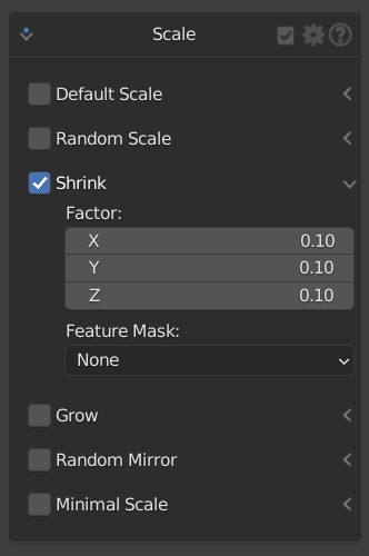
and there’s a BUT
not not sure how the arrow would be elegant in combination with our icon GUI option (yes we have this option for the more visual users)
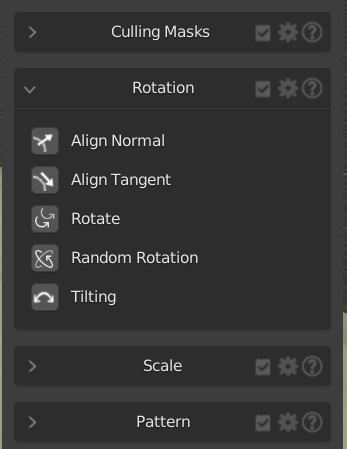
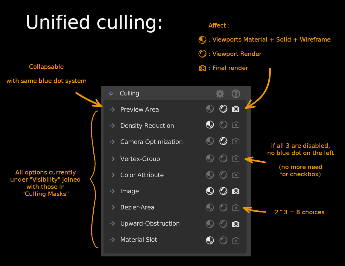
“Separate categories for similar features”
The viewport method options only makes sense for the features designed to optimize the viewport,
while i agree that “face select” could also be in the culling mask, i hardly see how a vertex group could be useful for viewport viz
The whole mask-culling category is a little strange tho, because at some point we could introduce falloff distance to let’s say a bezier area mask, which could also have an influence on the scale of the points
also one of the specificity of masks is that you might want additive or substractive ones, by changing order ect… which is basically a modifier stack and we’d like to avoid this logic. If users want the ultimate flexibility he should jump in the nodetree right? assuming the nodetree is easy to understand which is why we are currently doing some large cleanup in our geonode engine noodles
“Viewport options dispatched”
It is needed, because you might want some optimization features only for the solid viewport (ex display) some everywhere (like camera culling) and some only for the viewport (ex face preview)
 | Part 1 - Overview (NOT a tutorial)")