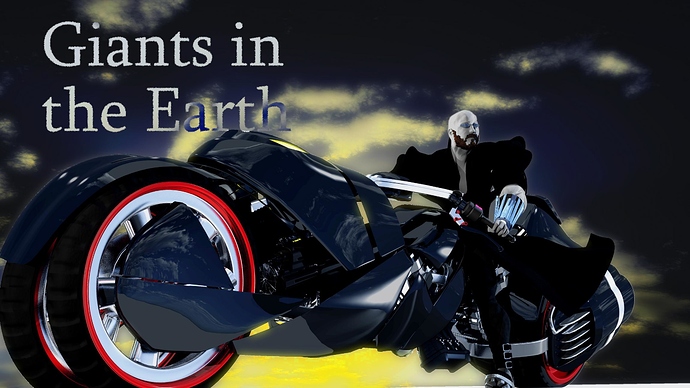
worked on a poster for my film (see my signature)
Wow very nice bike, really different and with an unique stile, I really liked it, about the guy on it I think that his skin is kind of weird.
thanks for the comments. His skin is very puposeful. see the last 4 minutes of this for an explanation:
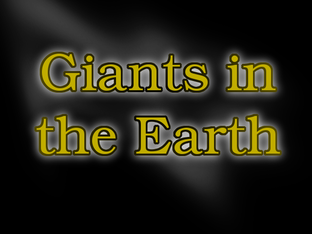
The text doesn’t pop out from the background enough. The color inverting on “a” and “h” shows that you anticipated the words conflicting with the clouds, which is good, but while the solution makes it readable, it doesn’t help extract it from the background. I threw together this little mockup in about five minutes in Gimp, so it’s not awesome, but I this is what I would try.

It’s not much, here are the layers:
-Text
-Text border
-sharper glow
-soft, distorted glow (for fun)
-dark background
The glow and border colors create the contrast, regardless of what background you’re using. If you don’t want a text border, then the text and glow colors ought to contrast to accomplish the same thing.
But this is just one idea…
[Edit] Forgot to say, cool tank… bike-tank thing.
Nice job! 
Xabo – you always have great advice. And always catch the things I was hoping everyone would overlook. I’ll post an update with a text variant soon, but I am torn . I don’t want the text to be the focal point. I am quite proud of this bike - not tank - bike thing. The tank-bike… let me digress…
this bike in this image, Lance won’t ride for 6 years in the story . As of right now I am working on scenes G-1 through G-4, in which Lance ages 6 years. At the end of which he will build this bike, because the tank bike he “got bored with it” (that will be a humorous point in the film when you see it all work out.)
anyways… thanks for the comments
I have to say, I love your models on Blendswap and I’ve noticed fantastic improvement in your art abilities. Best wishes- I know I can’t wait to see how it turns out.
