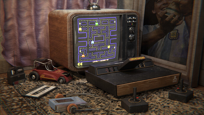
glance of 80s
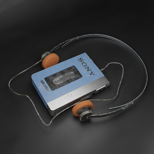
my latest personal project for experimental purposes
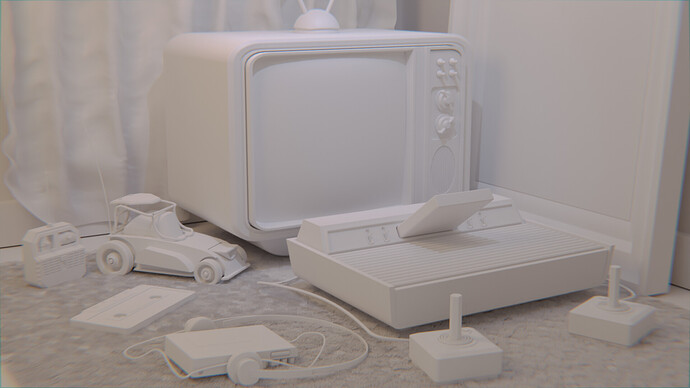
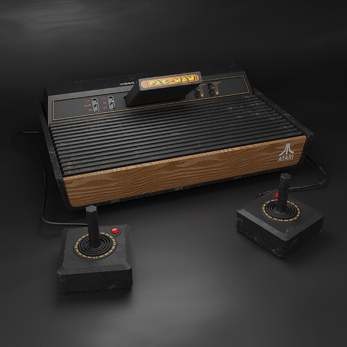
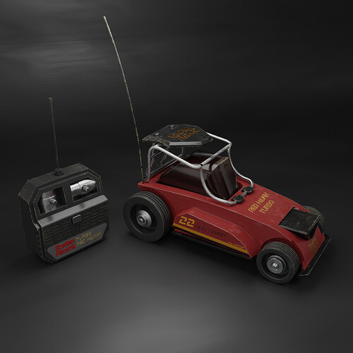
work done in blender( modeling-rendering-composite), textured in substance painter
Behance: https://www.behance.net/gallery/116465339/Glance-of-80s
Artstation: https://www.artstation.com/artwork/zOeYNZ
I love the vibes, and the style, great job!
thank you pal, glad you like it
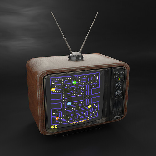
Wonderful rendering. Only problem is that the picture on the screen is what we wanted Atari PacMan to look like. Look up a picture of what it really was…it was so bad…lol. Not a dig on your work, just reminded me of the disappointment I felt as a kid when I got it.
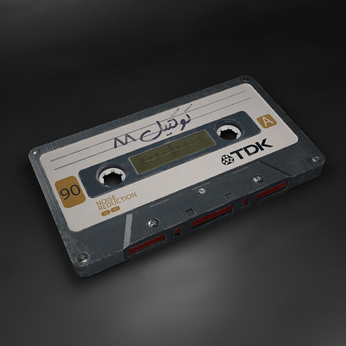
Very recognizable nostalgia, well done. Just a minor remark: the cassette tape seems slightly too flat in the main rendering. It’s too light to be sunk into the carpet like it is.
Yeah. ![]() I had Ms. Pac-Man on my Atari 2600. It was slightly more fun to play than the regular Pac-Man, but the Atari 2600’s resolution and specs didn’t allow for arcade-quality audiovisuals.
I had Ms. Pac-Man on my Atari 2600. It was slightly more fun to play than the regular Pac-Man, but the Atari 2600’s resolution and specs didn’t allow for arcade-quality audiovisuals.
thanl you bart 
you know what… you are right but i really need to do it as much as it can be beauty more that what it was  glad you like it pal
this right, i figure it wrong a little a bit about how the tape interact with the carpet 
Your models are great, but your presentation and atmosphere are even better. How do you give it that “feel”? A lot of people just put dust on everything, and you did, but you also did something different. What was it?
Nice textures and mood.
thank you first of all
you know lighting is the most thing that maybe give that feel, light distribution across the scene, light temps also give the mode, using cool and warm temps make the atmosphere more natural and more moody, light sizes also make a huge impacts on surfaces and shadows… and don’t let very dark spots in the shadows by add small lights to lit the very dark shadows.
and in the second stage we have to good compositing, i did in blender, dispersion and curves to remove washed out render from many lights we add before  but with more control and tonal hue to give a tint across all the image after render plus vintageing and every thing of those are very slight and huge sliders… almost what the image need but not more
and still have many thing to learn, it can be much much better
Love your work! 


(PS: Did those left-handed joysticks exist? )
)
Great picture, brings back childhood memories. It’s one of the rare images where chromatic aberration actually adds something to the composition. Two things that I think could be improved:
- I think the grime/dirt should be dialed back by about 30-50%. Now it’s a bit too “videogamey” and hyperrealistic (although maybe that was your intention, and not photorealism? more like how you “remember” the past than what it actually was?)
- The plastic of the casette tape doesn’t look too realistic, and again, there’s too much edge-wear. I never saw a casette that looked like this

Otherwise, very cool work. The slight CRT glow effect is also quite convincing.
there are always some thing to improve, yes dirt is over a bit yet i’m happy my added painting to it break the procedural look SP create ![]() but it need to be lower,
but it need to be lower,
thank you for you notes, i really appreciate it
I’m guessing that your childhood was in the early 1980’s?
yes, it was 
