Hi everyone. I’m a new member here in the forum and a relatively new Blender user (3-4 months). I’d like to post some of my projects here. They’re mainly exercises that I do in order to get used to Blender and Cycles. I’m not a professional 3d artists. I do this as a hobby in my free time.
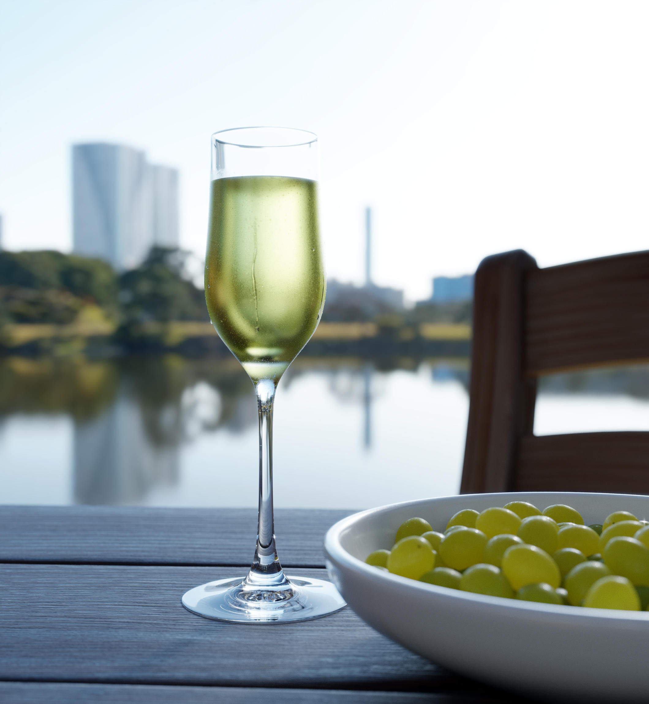
This is my latest project. A glass of cold wine surrounded by a very simple scene setup: some grapes and a nice background. My main target here is to learn Cycles shader’s system better and create more complex materials.
Hope you like it. Any comments/advices are welcome of course.
Thank you very much for your comment. That’s exactly what I was looking for: fair critique and advice. I need both of them to get better.
The link you posted is very useful. I’ll study it and try to apply these principles on my glass model.
I’ll post an improved (I hope) render when I’m ready.
PS I think it’s better to post any attempt I’ll make in the future at the “Focused Critiques” section.
What i see clear now is the top of your liquid, try extrude this and scale it inside or play with the crease. Add some particles, not many as this is a wine as you said and not a champagne.
Well, thanks again. I’ve already played with the liquid’s top surface shape and there are some “bubbles” inside its volume and at the top surface, but nothing is clearly visible because of the blurriness of the outer surface of the glass. If I decrease this effect I will loose this “frosty” look.
I like it. I love the grapes. However, the wine looks far too saturated to me. White wine tends to have a hint of colour, but just that, a hint. Almost clear.
I had to reduce the glass’s “frostiness” a bit, in order to make the sparkles inside the wine slightly more visible. I don’t know if the result is very convincing though. I’d like to see more comments on how to improve this scene, if this isn’t too boring for you guys. Thanks again.
One thing you could definitely do to improve the render would be to fill in the empty space on the bottom left corner.
My suggestion: Add some grapes on the table, like three to five. This might help to get a better balance for your composition.
This is a difficult camera angle to work with. As you can see, the top of the glass is not clearly-defined: it blends into the sky. I think that it would work better if you chose a different backdrop.
Your vertically-symmetric treatment of those silos is interesting.
Remember that the human eye is always attracted to the brightest and most-contrasty part of the picture, and generally wants to follow a closed path as it explores a scene. The horizontal line produced by the lake’s boundary cuts the frame in half and thus “loops you down” to consider the grapes, but then your eye returns to the glass, goes up and out and flies off into the sky at the top of the frame.
Cut a couple of L-shaped pieces of cardboard and use these as cropping frames to see how much of the shot can be “tightened.” My eye says that you can basically “lose” the left edge and quite a bit of that sky. I think that a little more sharpness is needed on that chair.
Thank you so much for posting here. Invaluable advices, indeed. Unfortunately I’ve already hit the “Render” button when I saw your message. I will definitely try out with a different background, a more suitable one for defining the glass’s shape and not so confusing about what’s the object in focus, if I understood correctly all your points (feel free to correct me anytime).
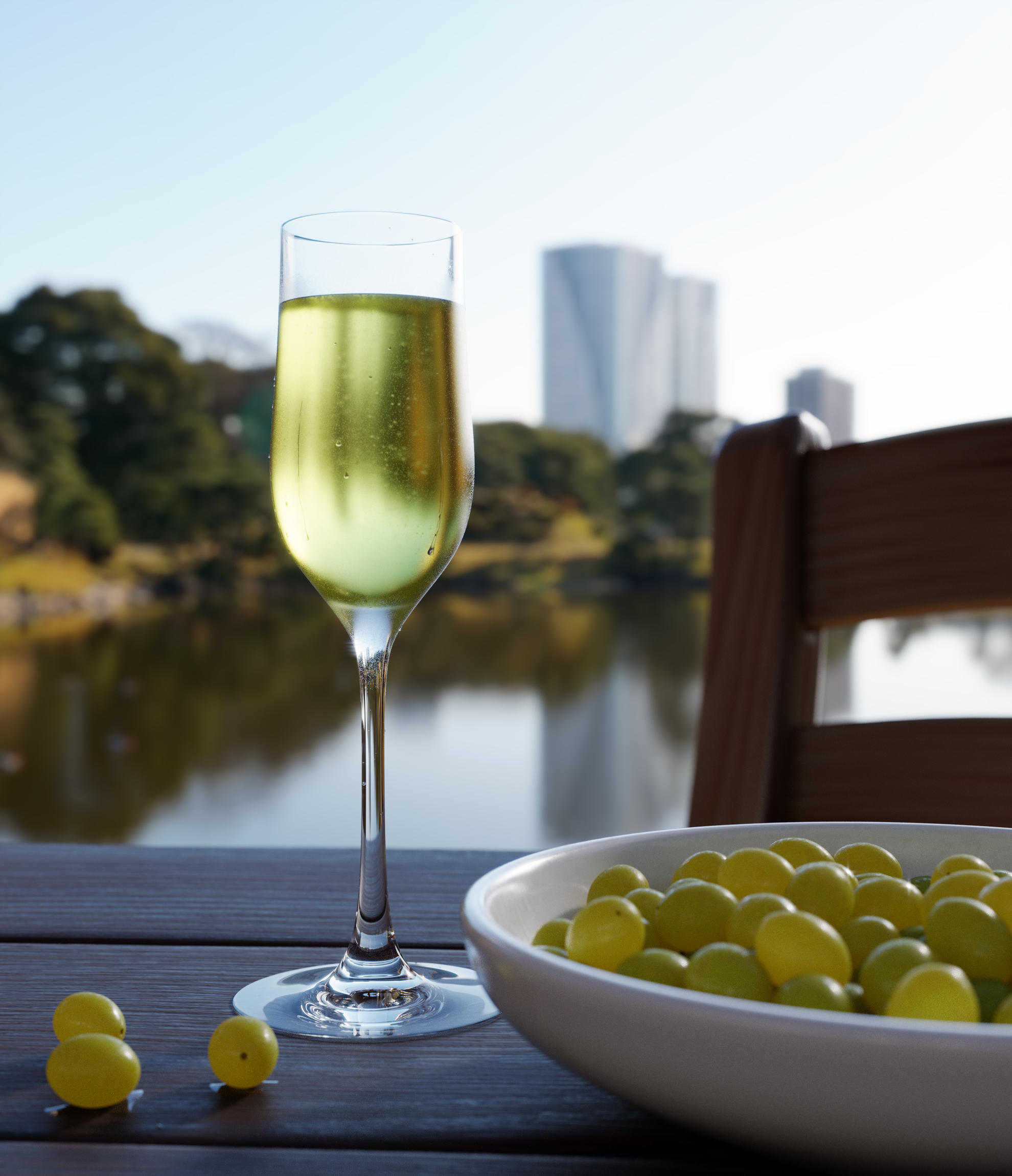
So, I’ve already added 3 grapes on the lower left side, as @Triastase suggested, and slightly rotated the hdri behind to make the wooden chair slightly more highlighted and better defined, without losing the vertical shapes of the buildings in the background (I knew there was something wrong with the chair before seeing your post, but when I saw your comment I was more convinced about it). I also recalculated the wine’s normals. Inversing the normals except for the top surface (as the link in the 2nd post suggested) gave some strange results (wrong colors) and the sparkles weren’t visible at all in most cases.
Please, tell me if it’s better or worse compared to the previous versions. I’ll try to find a different backdrop image to see if I can make a better statement with it.
(At last, I really feel at home in this forum. All this input/feedback with so many details and advices is something I never thought I’d find anywhere else :). Thank you all again)
This looks much better, in my taste I would put the color of the background the way it was at first because now it looks too dark and there is a lot of background distraction with such an intense coloring.