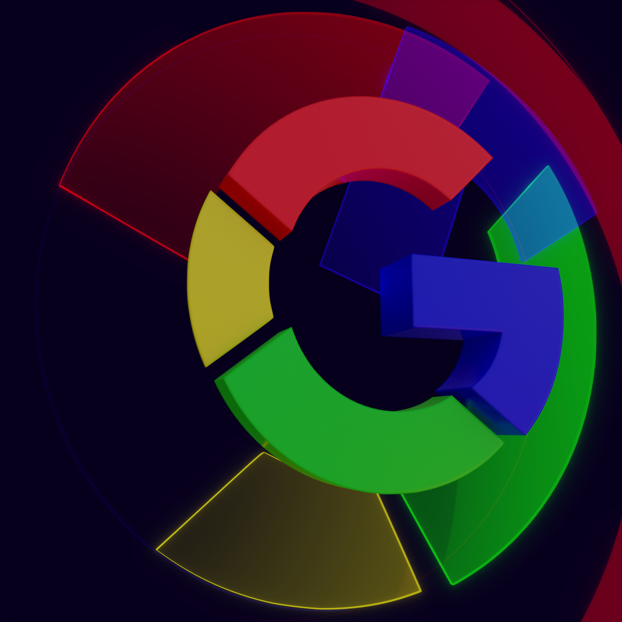
Been busy with a animation of the current Google logo. I used animation nodes for it. Rendered at various sample sizes. Four renderlayers, composed within Blender.
Personally I’m pretty happy with the result, there are some small things I might have done different a second time. But I would love to hear what you guys think of it and what could have been done ‘better’.
I was looking at your animation for multiple times and even with .25x the speed and it looks really great and inventive. I have two things though I would mention, that catched my eye.
Firstly, you have this sliight loss of sharpness, that I happen to know appears also in lower quality, illegally ripped movies on diverse websites… which I know from a friend, who knows it from another friend, this is definitely not something I know first hand. xD
Maybe it’s just due to the compression YouTube performs, but I wanted to mention it anyway.
Second, you have the complete animation at some point circling around one specific point and then the Google Logo is not coming out of this point, where you have already drawn the attention of the viewer to, but rather a bit more from the right side. I would not say it is bad, I felt it to be maybe a bit off, if someone, or you specifically disagrees feel free to say something about it.
This is a very decent and great looking work, I like it a lot!
I wish you a merry christmas time and a lot of fun with rendering more pieces in future!