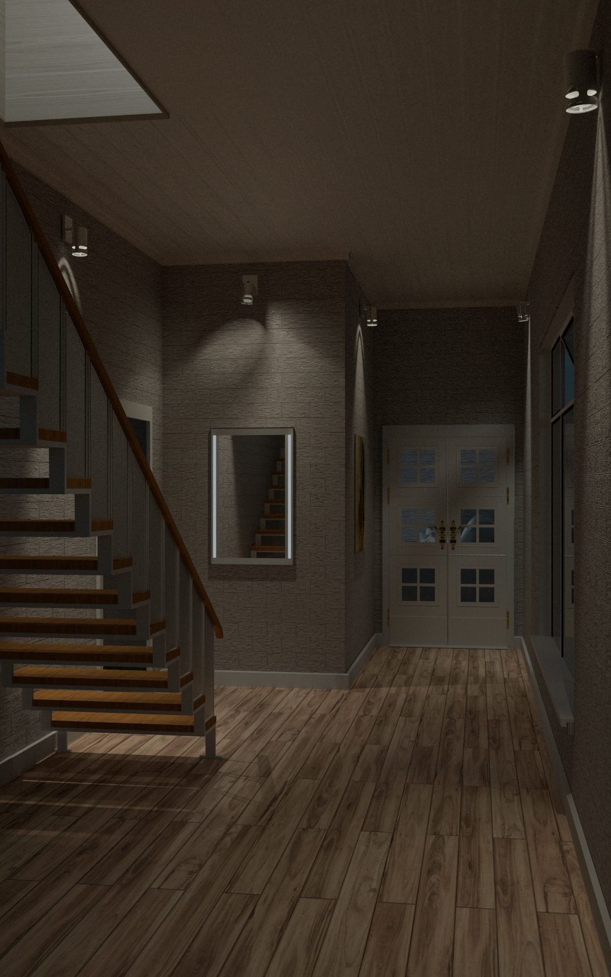
Hi all.
I made this hallway to learn to use ies ligthing but it ended up with a full set up so i will like to know what you guys think.
/Michael
Hi all.
I made this hallway to learn to use ies ligthing but it ended up with a full set up so i will like to know what you guys think.
/Michael
very nice. I’m not sure why this still looks fake to me. Not enough detail?
Perhaps, dont really know what else to put in there. any sugestion?
Maybe randomize the length of the floorboards? There’s a script for that, here it is:
http://blenderthings.blogspot.nl/2013/07/generate-floor-boards-quick-and-simple.html
enjoy
I like the door but rendering is…not nice. Looks like game engine graphics and OpenGLViewport render.
Yeah I don’t have enough experience with trying to make photoreal renders to say what makes this look fake. The floorboards should be staggered. But that’s not it either. The mirror is too perfect. Try adding a bevel to the edges like most mirrors will have. That would help a lot and maybe take down the glossy a very small bit like, .01 mix with diffuse. Nothing is perfectly diffuse or perfectly glossy or perfectly anything in real life. That floor should have more of a gloss to it too.
It’s a good job, but I know you are looking for photoreal so I’m throwing ideas out there.
Some other things: the second lamp from left have a strange ies profile, or is a light coming from another part? I find it a little distracting…i think should be nice more contrast in the image, to “emphasize” the light spots; maybe i went a little overboard but here is your image and 2 min in Gimp:
@Robert: Thank you i will try it.
@Tynka: It is made with cycles 1000 sampels. any ide how to get a nice render?
that does look better. Might want to add some geometry to those baseboards and around the doors and more gloss to the floor. Also if you could map a displacement texture to the bricks that raises them individually and randomly in and out of the wall. Not hard to do. I’ve always liked that look. Maybe even smoosh all the bricks on the z so they are thinner.
This kind of a look, though maybe not that pronounced.
The latest render looks better,
the mirror looks like it is a hol in the wall you could try to tweak that a bit.
and the roof could be with a better bump map or something.
nice render!
Looks like you are close to making this believable, but to me it still looks very unnatural. Here are some issues I noticed that, if fixed, might help improve the scene.
-All the edges and lines are straight and sharp. This makes the scene look both fake and uninviting.
-The materials don’t compliment each other at all. The ceiling looks OK but the floor is extremely distracting, the brick walls make it look like a prison, and the trim is just a solid smooth white.
-The colors don’t go well together. Unless you are going for a creepy or super gritty look, the hallway should be relaxing on the eyes.To do this, pick a colors that complement each other and don’t contrast except for where you want the focus to be.
-The texture scaling looks a bit off which makes the whole scene’s proportions a bit awkward.
Keep up the good work, I hope that was helpful.
I like it but it is a skeleton, you need furniture and interesting models in the scene (plants). Well done but if you want it to look GREAT then you need more things to look at
A good scene with good composition here are my critiques: the diffuse and glossiness of the floor need better balance and you might want to try some bump and normal mapping. The stairs uv mapping looks a little wacky also might want to get some higher res textures. Also you might want to add some post processing: color balance, vignette, DOF etc. I agree that you should add some furniture in to give it a sense of realism like someone lives or has been living in the space. you might already know of this site but I get all my textures from cgtextures.com, awesome site. Also the shadows and lights are a little too harsh and contrasting giving a sort of eyestrain.
thank you all for the feedback. I will try to change some of the things sugested and an new render will come.