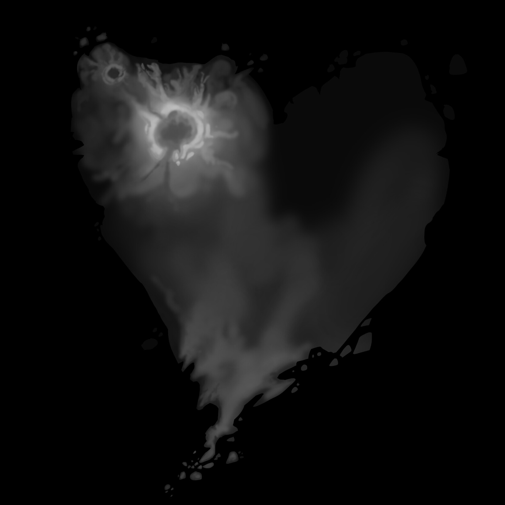
I’m having some trouble figuring out how to get a hand painted height map to be smooth when applied to a plane. In Photoshop, I’ve painted a fairly smooth height map with an airbrush, but when I apply the height map to the plane in Blender it looks a bit more like a topographical map with distinct stair steps between varying levels of height, which is not what I want. I’ve played around with all the settings I can think of in the material and texture tabs. There is a Sub Surf Modifier set to 10 for viewport. I tried applying the Sub Surf Modifier - same problem. I also deleted the Sub Surf Modifier and sub divided the plane to get the same resolution - no luck. Smooth shading also had no effect. Please see images below. Thanks for any help on this! -Scott

Try making the image 32 bit. That apparently helps with this kind of issue. You probably need to blur it / respray after the conversion - I am not sure off the top of my head.
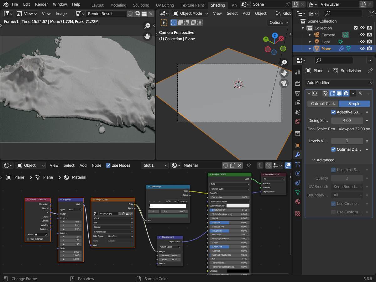
And your settings… if using cycles adaptive subdivision… remember to set to non-color and also cubic interpolation… also the proper displacement node and connectiosn… maybealso lower the dicing scale…
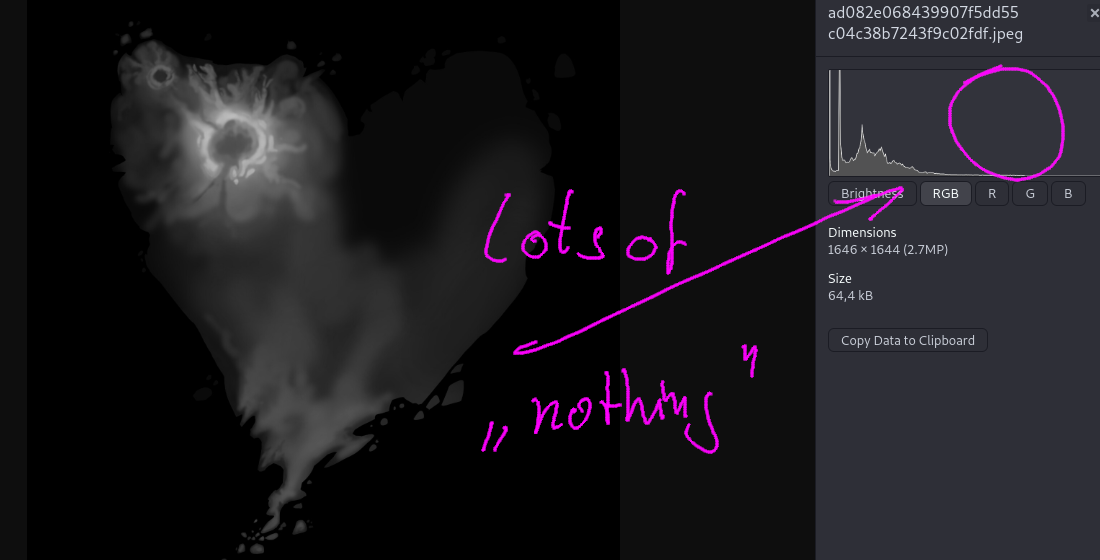
…additionally have a look at the histogramm… the useage of the value range… is… well adding a completely white spot in gimp and selecting similar areas with 65% (!!!) threshold… doesn’t even select the top of you “vulvano” !! I had to set it to 66 %
Ohh… and of course… i hope you just uploaded this as JPG and didn’t used it four your render…
…i was (of course) using your provided JPG… so there are artefacts !!
Thanks for your advice, Matakani! Converting the image in Photoshop to 32 bit and re-airbrushing seemed to fix the problem. Merely converting to 32 bit didn’t erase the gradient banding in the existing image, so I had to repaint, as you suggested. But that’s okay, as I’m in R&D mode right now. -Cheers!
Thanks for all your suggestions Okidoki! I’m fairly new to this displacement thing. I’m trying to figure out if this is a good workflow to create stylized, large scale landscapes, as an alternative to traditional modeling techniques. So far it’s an interesting way to work. I’ll try out your tips and tricks and post an update. -Cheers!
Before you export your map, run a Gaussian Blur over it at least 2 times, that will help to improve your map a lot!
I think the main issue here is the bit depth. When I was painting the image at 8 bits, no matter how much gaussian blur I applied, the banding was still evident. But when I increased it to 32 bits, the banding was significantly reduced - not entirely, but much better than 8 bit. I also wanted to preserve some finer details in the painting, so blurring it was not an option. But thanks very much for the suggestion!
Well with 8 bit you have 256 different values with 32 bit you got 4,294,967,295 …
So if you got “banding”…then you aren’t using them very well. As i said… if the highest point in you island is only 1/3 of the range of 256 … then there there you are using only 85 values… if you expand thsi to 32-bit …then this would also be just 85 values… so you might even have to use a biggere resoltion so that any blurring can change somethign in between those 85 values…
Thanks for the “bit explanation” Okidoki. I have a better idea of that concept now. As I paint my revised height map in Photoshop, I’m using a full range of values now, from black to white, and banding is no longer an issue in Blender.
Take your time… to show us your newly discovered island and ecosystem … ![]()