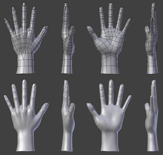
Need fresh eyes, what can I improve on these hands?
They’re looking really nice. I find that it’s easier to model hands in a more relaxed pose, just hold you hand out and let it go limp to see what I mean. It depends whether/how you want to rig it, but I think it gives more natural results. The flat/outstretched pose you have above is good for rigging, but there’s a lot of tension in the pose that makes it look less natural.
Also, on the join with the wrist, the flow of the extensor muscles across the top surface of the wrist extends the plane of the upper surface of the forearm into the upper surface of the hand somewhat. Here’s what I mean:

It’s subtle, but important.
Looks good  . I think the wrist is a little too thin from top/bottom view, but other than that it’s fine :yes:
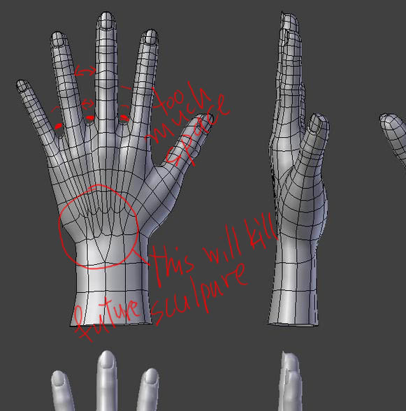
Too much space between fingers. On the base especially.
But this topology could make thing difficult for further sculpture and subdivisions. Too much stretching. Better more faces than stretching. A hard lesson for me.
Attachments
Some of these points have been mentioned already, but the hand is generally too flat front to back, likewise the wrist. The palm needs some attention. The general layout of a palm is there are four areas that need to be clearly defined;
- The base of the thumb, covers halfway across the palm, and goes up to halfway to the base of the index finger.
- The base of the index finger has a pad that covers to the centre of the middle finger. 3) The pad below the remaining fingers.
- The heel of the palm.
Each of these has its own bulge and a crease between it and the next.
I would add more topology at the knuckles generally. When the hand bends you still need enough edges to control the curve. There is a mesh at OpenWorldFilm.com that has a good hand topology for animation.
Go to:
http://www.openworldfilm.com/owffms/FMS/OWF%20File%20Manager.html
and navigate to Characters>Rigging>Nia Rig. There is an animation and a few blend files. Niav5_3.blend is the one you want.
Oh, and the little finger looks like you just scaled one of the others. It is way too thin in comparison to the others.
Looking good generally though.
HTH
Matt
Im interested in this, main issue with hands seems to be, to get from only having a few edge loops on the arm, to all the edge loops needed for fingers and tendons. so you end up doubling up, and if you want the tendons, then youre going to end up placing the double-ups where OP has.
others ignore the tendons, and place the doubleing up just before the knuckles.
notice the last one does this.
Ive yet to see a good hand with all the topology.
Can i use this as a reference for my topology?
Sure but always check more methods ![]()

