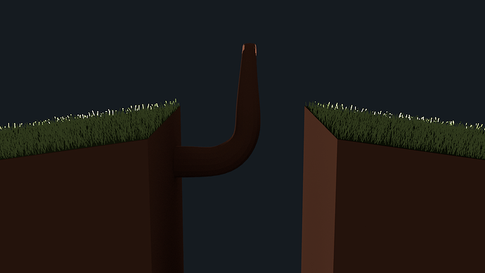
"Hanging to the life"

Hello guys, this is one of my first image with out following a tutorial, and because is one of the first i would like that you people give me a really strong critique, dont worry about hurt my feelings i can resist ir ;).

The image name is “Hanging to the life” and was inspired with the movie “127 Hours”.

http://andrescuellar.carbonmade.com/projects/4210257#1

Pstd: Sorry to link the portafolio, only get error when tryied to upload the image in the post :S.

Pstd2: Im not pretty sure how i got that texture in the rocks, it was like an accident :stuck_out_tongue:

Hello guys, this is one of the first image that i made with out following a tutorial, because of that i want that you people give me plase a really hard critique, dont worry about hurt feelings ;).

http://www.pasteall.org/pic/show.php?id=26990

The image name is “Hanging to the life” and was inspired with the movie “127 hours”.

Im not pretty sure how i got that texture of the rocks and i know that it´s something wrong but dont know what :S

Thanks guys.

The concept and modeling is good. There is a problem with composition though. I was little confused at first glance because the image structure was not clear. Tree and cliff foreground needs stronger silhouetting from the background to separate it from background.

Hi, thanks for your critique :), however im really sorry but im still a noob and im not pretty sure what do you mean with stronger silhouetting? if you can explain me a little i will thank you forever :slight_smile:

Really nice image. :slight_smile:

What he means is the front elements (the cliffs and tree) need to visually separate from the background more to give the image more depth.

It’s also called “Rim Lighting”.

Add a light behind and below the cliff and tree to silouette the grass and tree. Alternatively you can add a hint of fog or mist to the background and this will help separate and push back the foreground elements and will allow the front tree and cliffs to stand out from the background better.


Wow, i didnt have idea of the Rim lightning and you are totally right, this effects actually push the elements and give more depth to the image, really, really thank you very much for the explain and the visual example, boy you are amazing !! :slight_smile:

Here’s another thought. Have a Wikipedia read on “Zone System” and “Densitometry.”

Now, open your image with an image editor (or with Blender) and use the Histogram tool on it. What you’d like to see is a more or less bell-shaped curve: centering on midtones, some moderate dark tones, but really, nothing that is either “blown out white” or “opaque black.”

Oops…

There is, in fact, a great big black space, right there in the middle of your picture, surrounding what you intend to be the subject (the tree). There’s going to be a huge spike in the curve on the left side. Not good.

Now, it is a fact that the human eye seeks out the brightest and the most contrasty part of anything that it’s looking at. Then, from there, it really wants to trace a roughly circular path and be lead right back to where it started. Do you find your eye doing that? Probably not.

So, generally consider the overall tonal range of the picture. Bring the light in that dark area up. If you were standing next to me in the darkroom, I’d be taking a card with a small hole in it and “burning in” that canyon to bring out the detail that must surely be in there somewhere.

Then, consider what I was saying about the brightest thing and the path. Consider what path you’d like the viewer’s eye to take, to properly take-in the whole scene. Then consider what lighting levels (and shades of color!) ought to be here, and there, in order to achieve that.

You might consider using compositing here. It is very handy, I think, to be able to extract the various sources and types of light so that you can then “mix-down” the image, much the way they do in a multi-track musical recording session. This notion de-emphasizes the goal of trying to “get it all perfecct at once,” and instead breaks down the problem into pieces that can be dealt with (and balanced) separately.

If you do the first render(s) to the MultiLayer file format, you will obtain a tremendous amount of numeric range and precision … “whiter than white, blacker than black” … which might greatly simplify the assembly of such a high-contrast scene. (i.e. “oops, it turned black, but the detail is still there.”)

Wow. I just think that this blend is fantastic. Just a thought though, the theme of this CG painting (yeah, that’s basically what I call it!) made me laugh because of its self-explanatory message. Good Job!!!

Oooops, it looks like i post twice the same thing, sorry for that, i think that this post actually was deleted because a bad click when i was editing it, any way to delete this thread??, also thanks Reuben :).

Again sorry for the double thread :S

That looks great! I’d just suggest that you add some roots to the base of the trunk, so that it looks like the tree is clinging to the rock and there;s some interaction between the different meshes in your scene.

Wow, thanks sundialsvc4 for the great info, i didnt know about those theorys and are really usefull, i try to apply to my render, however the result didnt like it at all, maybe because im a noob :S, anyway your critique teach me a lot and i will apply it to my next work, thank you very much guys :slight_smile:

My finishes image:

http://www.pasteall.org/pic/show.php?id=27224