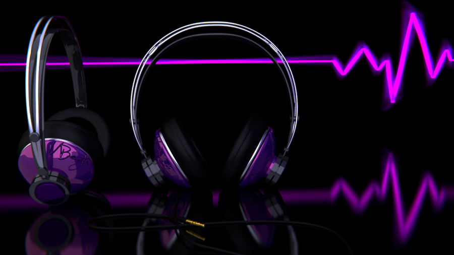
I really wanted a product image that I could add to my freelancing portfolio and I was really hoping to make it look like a professional ad but there’s still something bothering me. I feel like as a product image the product isn’t very visible, I really don’t want to change it too much because I’m happy with how it came out BUT I think I need the headphones to POP a bit more, any advice? Also Any other advice or comments about any other part of it is appreciated. Thanks!
Oh yeah I didn’t even notice the edges on the tubing, I can def fix that right up. I’ll also try some edge lighting and maybe I’ll make the background 90% grey. I have to play around with it. Thanks for the reply
Do any of these look better. I’ve added some lights to the scene the very bottom one is the same and the lighting and shadow are slightly different on the top two. Any preferences?