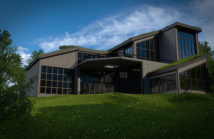
So after taking the architecture academy this is the first exterior render i’ve come up with. what do you guys think? tips and pointers are needed 
That’s actually quite good… I’m no expert in arch viz and can’t really point out anything… Im surprised this hasn’t any comments though… But hey, its how BA works sometimes.
yeah, thanks  for some reason no one every really comments on my work here
hi Mason
arch looks good as well as the grass and little flowers as well as the reflections on the windows. which i would enhance a little.
imo things to improve on.
- the pic looks dull, really needs some colour. i would let the front be fully lit and bring the shadows over the left corner of the house.
- add some colour, rocks or little stones to the garden, there is too much green. maybe a fountain and some other objects to show that people live there, this would make the picture more interesting. (mess it up a little)
- the texture covering the house for me is monotone, i would like to see some changes with varying textures.
- is the grass on the roof on purpose?
keep it up
shaun
thank you. very helpful info and i will keep it in mind. yeah the grass is on the roof on purpose. it’s something you see a lot now.
I really like the design of this house, did you work off of plans or made it up yourself? In either case great job on this. The overhang almost seems big enough that it could require some additional vertical supports.
I’m mixed on the grass on the roof… I’ve seen it elsewhere, but how in the world would you maintain that? That grass is going to grow at some point… hope you have a big weedeater 
just made it from scratch. i have no idea how you would maintain the top XD
Thanks
It absolutely gorgeous. Well done. I’ve wanted to do the architecture academy I just don’t feel like dropping the money.
The three things that jump out at me.
-
Saturation, I would consider running some slight desaturation in the compsiting nodes. And on the grass toss in an odd brown piece.
-
CG perfection. It’s hard to tell whats’ modeled and what is bump, but the boards on the house, the railings etc, try and add some barely perceptable noise, be it a displace modifer or a shape key , or even modifying the maps. Tiny bit.
-
The low light levels under the deck, it just seems too dark. I think that the issue is either that the diffuse material is too dark, or possibly you have a very few number of light bounces and/or clamping. I feel like in reality on that kind of sunny day you would get bounced and scattered light and that area would be much lighter.
But overall a really beautiful piece of work.
Thanks. i will keep these things in mind for the next render i do 
Give us an animated walkthrough!
You mean like a tutorial?
The Architecture of the building is really nice, and I personally like the camera angle looking up at it, gives it that grand feeling. I think turning the sun up a bit to brighten would help make it pop. Maybe some flowers for added color?
Great idea. thanks  and that was the point of the camera angle
