Hello,
i got only few SUBJECTIVE ideas, what disturbs me:
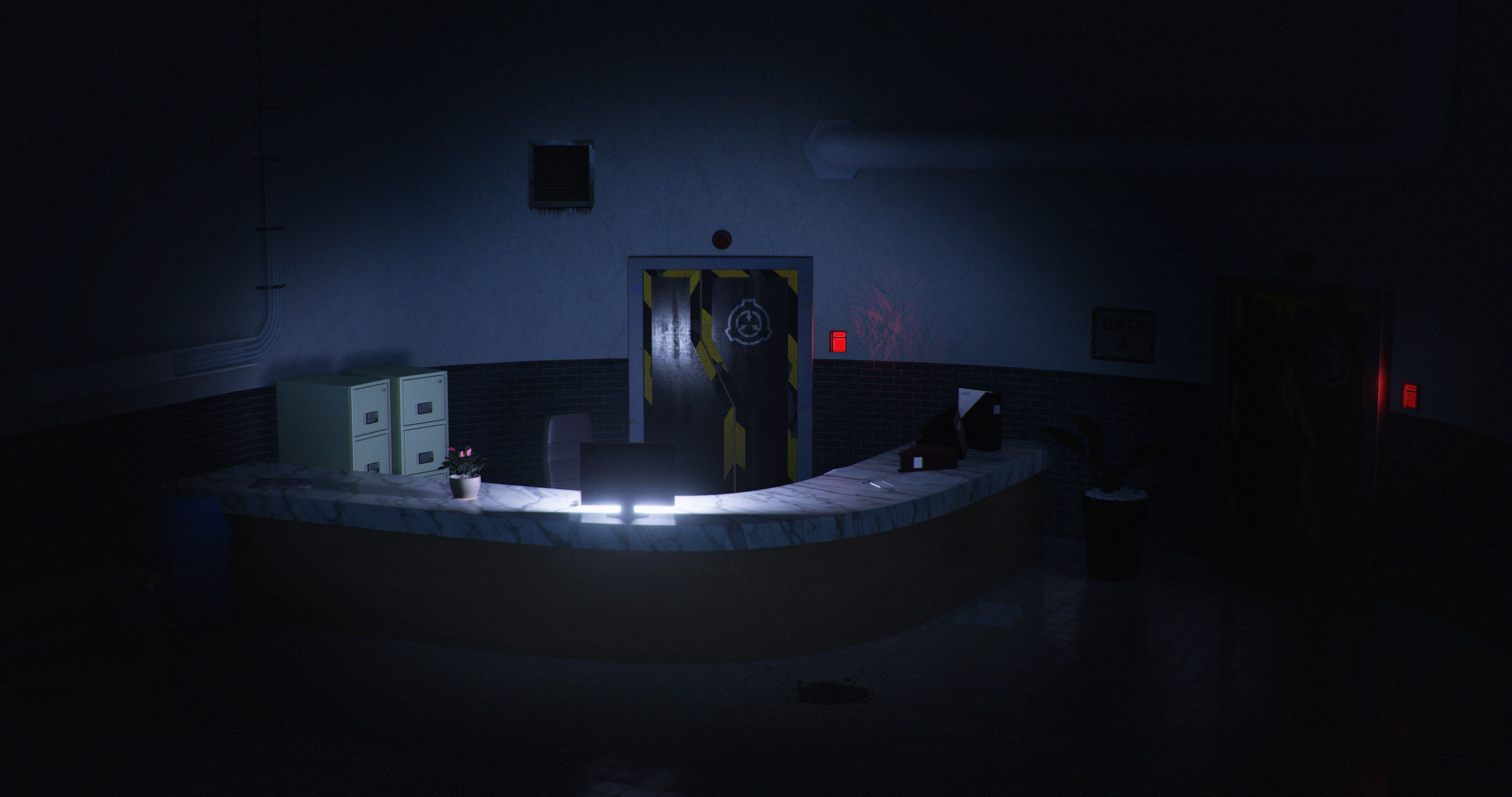
- I think that camera angle is not good, it´s obvious that you are giving attention to safety doors, but they don´t need to be in centre of view. And maybe will be better a little bit lower angle, in height of human eye. Just try it.
- there is no physical source of light, but plenty of light. Maybe monitor supposed to be source of light, but in that example, it´s very strong and shadows don´t correspond. For example the plant in cup…
- dirt leaking from ventilation shaft is weird in comparison of polished rest of scene. As well cover of shaft is rusted for no reason.
- why is cover of big white pipe in hexagon shape? It is usually in circle shape. And maybe it suits more greyish color.
- maybe the desk of counter is too thick.
Like I said - it´s subjective opinions.
I think the lighting is the main issue. I assume it is supposed to be light from the screen but too much is leaking and illuminating the desk and destroying the focus on the door. Cheat a bit with the lighting to make the scene more interesting. Put a soft red spot around the red panel to the right and let some blue light creep in along the floor from the side. That would make the scene more dramatic.
hi! in my opinion it would be more interesting if the high was at human-sized view. It looks a bit higher, like a safety camera perspective, or a “ghost” floating around, hehehehe.
the lights need a fix. maybe you could consider a “window” outside the scene, bringing some nocturnal urban lights (lamp post, cars… maybe a thunder in a rainy night). Your scene looks to be actually a secret place in the underground, in the sewers… but maybe this kind of light from a window will not break the mood.
Its actually a secret place in the underground (but not in a sewers).