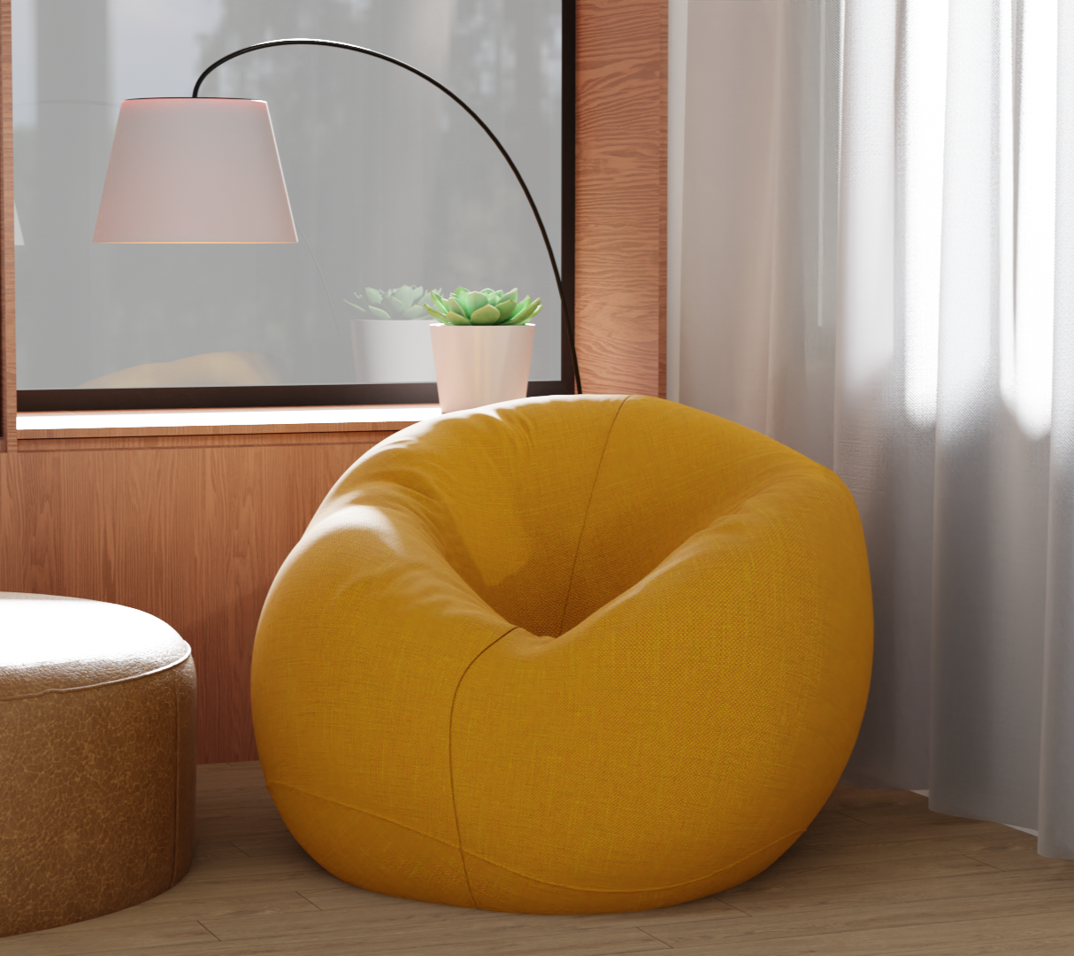
This is my finished rendering does it look like realistic. what are some points that i need to improve.
13 Likes
Hi there,
Good job, the overall composition I like a lot. What to improve? Well, just my two cents here. I would say a bit of everything, since this work for me shows a nice, balanced level of knowledge.
So, def don’t take it too harsh, let me explain ![]()
Floorboards: usually perpendicular to windows, to mitigate the look of crevices (in yout case it should be 90° rotated then.
The wooden side of the window: should also be rotated or maybe just use a simpler texture, not so emphacized.
The two poufs: they look generally good, not sure if you checked real life references, but the stitches on the yellow one seem a little ad-hoc for me. Overall I like the texturing.
The courtain and lamp: I really like them: I love that SSS kinda thing going on at the edge of the lamp.
The background looks a little bit dis-attached, not sure how to say. An HDRI is a good solution, if it should be blurred anyways, but I would use a bigger area light mainly, as a directional “sun” light.
Additionally, you can grab a few cutout trees, and place it further (no need to be seen) to cast shadows in the room (these are called gobos if you want to search for it).
If you have a big directional light you may also play with some clouds (cards or volume, may also be coloured), so that the noise breaks up the “evenness” of the light going in.
Also, you may add some particles, dust as volume, scratches on the surfaces, etc etc, basically details.
So, overall, it is a very nice work I think, it can simply be improved adding more stuff, no need to rip it down or anything like that ![]()
Search for Blender Gurus lightning tutorial, and also in the teddy bear one he has great tips for room lighting through windows, if I remember correctly ![]()
It is always a great inspiration for me to see works like this! ![]()
Happy blending!
3 Likes
Hello,
The render looks pretty good, congrats!
There are a few things I would consider correcting though.
- First of all, it seems like you have the scale of the objects and textures a bit mixed up -
The lamp seems really small, the plant seems really big, the brown leather pouffe seems really big and the texture is a bit too big too in my opinion.
I don’t know if you modeled everything based on actual products available on the market but if not, Ikea website is perfect for reference cause they have detailed measurements of everything they sell. It’s also good to have at least one thing that would suggest the scale (something that everyone roughly knows the size of). In interior photography that is usually a person but if you don’t want to include that you could but a cup, glass or a magazine. - I would play around with the composition a bit more.
In your case I think the brown pouffe is unnecessary. Having two seating spaces like this right next to each other doesn’t make much sense from the design point of view. You could try moving the camera a bit further back and putting the lamp on the left side with the lamp shade hanging above the orange bean bag. I also think that a 16:9 aspect ratio would look a bit better by adding more breathing room to the image. - Pay a little bit more attention to the details.
Both of the furniture pieces look like they’re clipping through the floor.
The place where the floor meets the wall is usually covered by a plinth.
The window frame has much more detail. now it looks like it’s paper thin.
The wood grain goes along the longer end of the board 99% of the time. This means that you need to rotate the wood texture 90 degrees.
I hope you don’t get discouraged by what I wrote.
Never stop creating!
1 Like
It seems to me that you need to change the lighting to one that shows the texture of the materials, because now everything looks flat
1 Like
Thank you for all about your feedback. I can say that the only way to improve myself is by feedbacks, I will post more better projects soon with your great feedback
I featured you on BlenderNation, have a great weekend!
1 Like