After a lot of digging around the internet and experimenting, I have worked out what is going on.
The problem is centred around the different colour spaces used by the computer display, Blender internally, and the saved files.
I am working on a MacBook Pro which has a wider colour display space than the sRGB colour space used by Blender.
So, when the files are saved, the higher number of colours seen on the display are squashed into the smaller number of colours allowed by the sRGB format. The colours then appear less saturated, or vibrant, and more washed out.
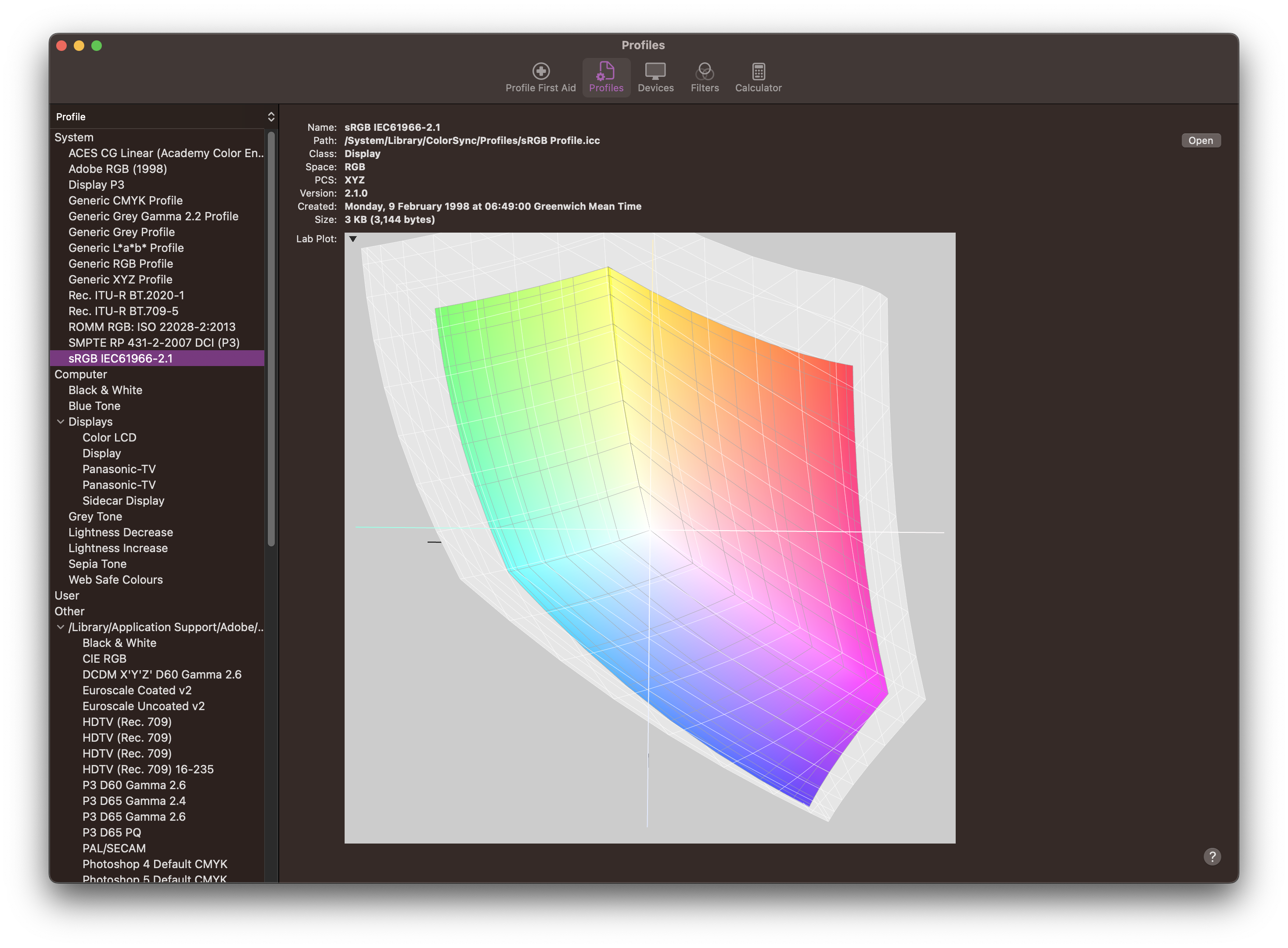
Colour spaces on screen
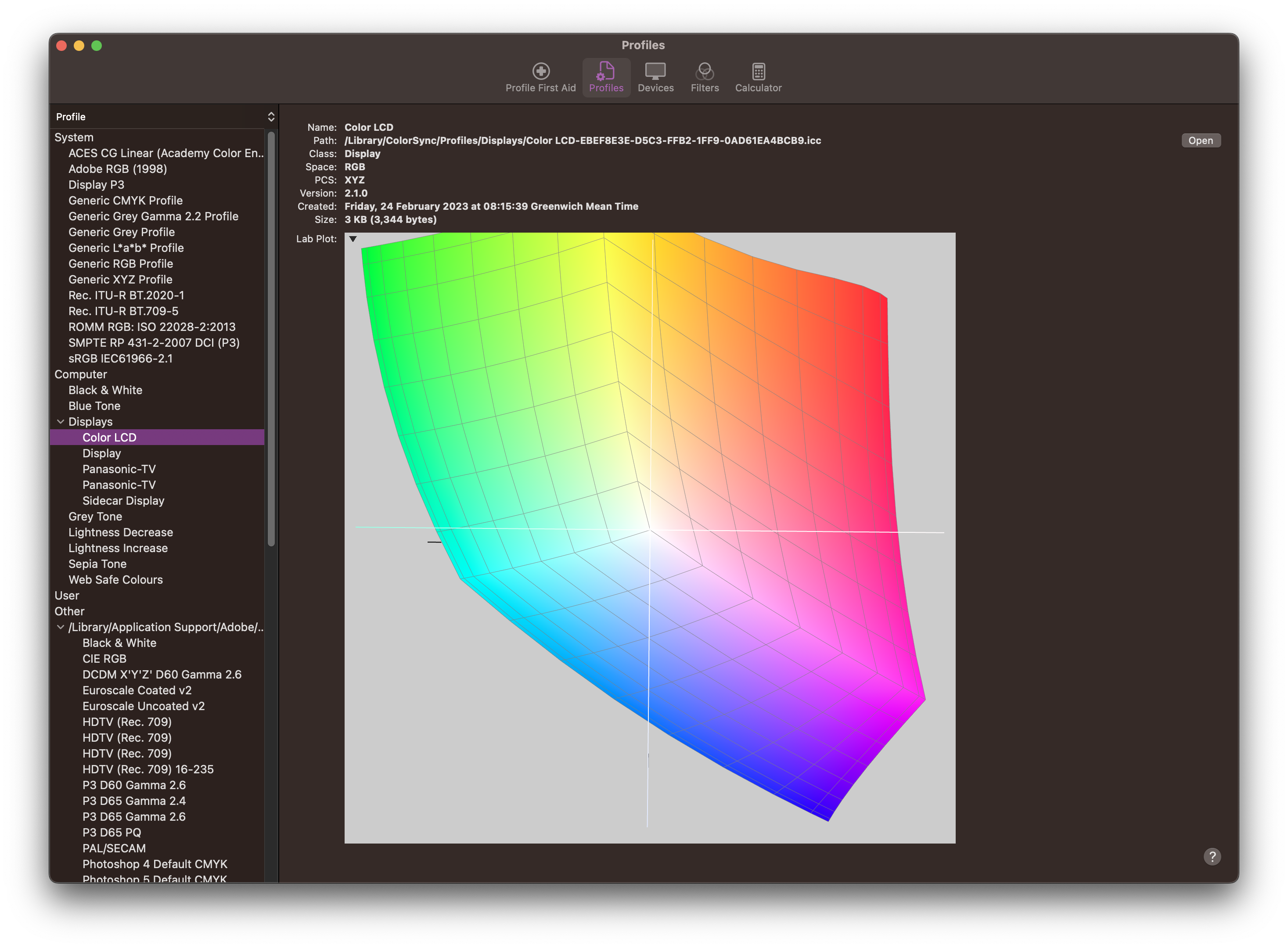
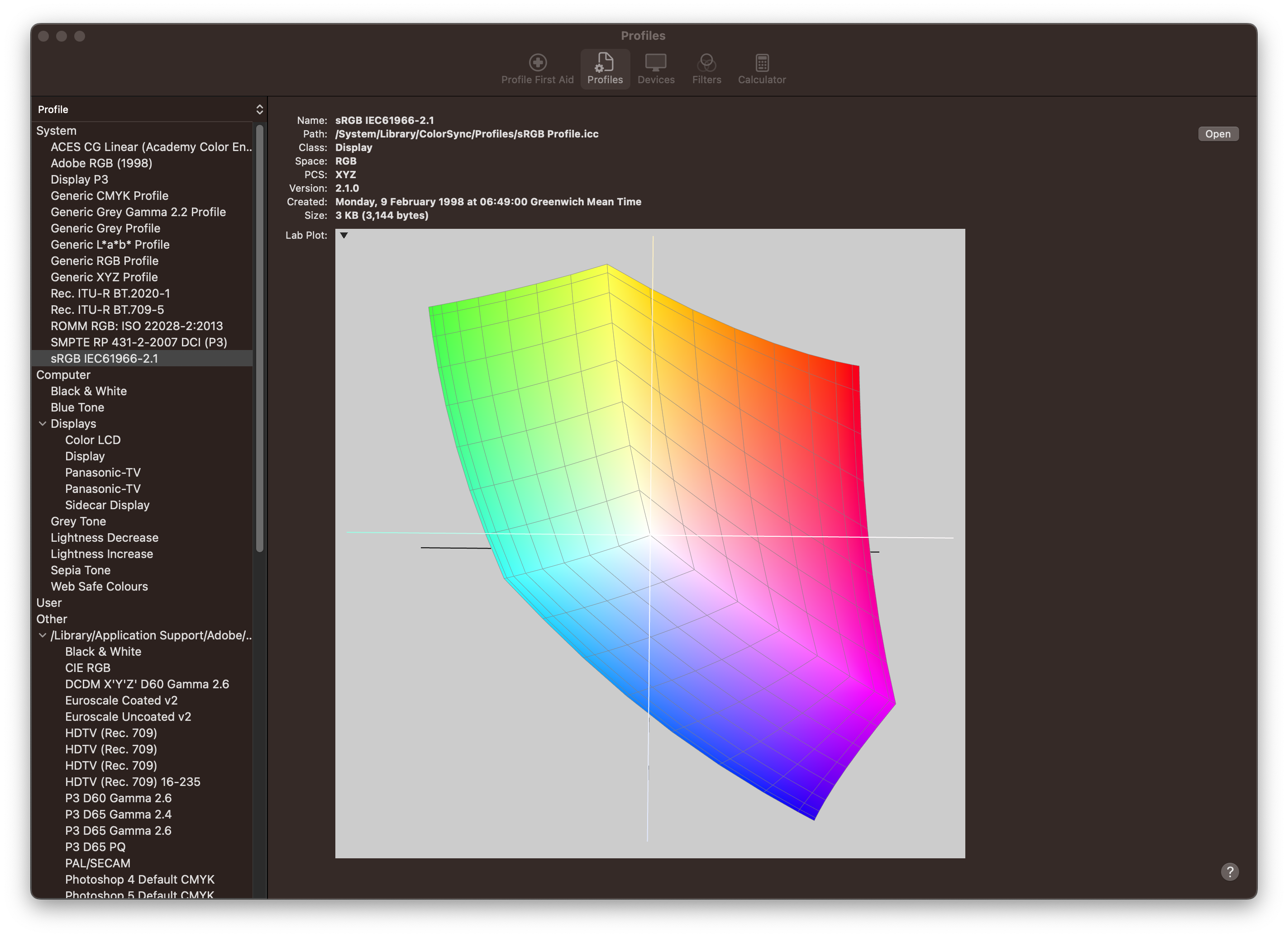
I used the ColorSync app on the Mac to work out just how different the colour ranges are. Here are 2 figures for the full colour range of the LCD, and the sRGB range, plus a comparison that shows how fewer colours are allowed.
What is Blender doing?
There are several helpful articles and forum articles that try explain what is going on. This one puts it the most simply:
Blender does not respect your monitor profile, nor profiles embedded in image files. When you prepare image in Blender viewport you look at it in your display color space, but Blender saves it with regular sRGB.
Blender does not add a color profile when saving an image. When you see the rendered image in Blender, you’re using the monitor color profile to view an sRGB image. When you open a rendered image in another application like Finder, Photoshop, etc. the image uses a default sRGB color profile.
So in summary, what you see on your screen is not necessarily the same as the colours Blender is working with and saving in the file.
Working around the colour problem
There are 2 ways to work around this colour problem:
-
Switch the display colour space to sRGB. This will restrict the colours you see on the screen and it makes sure that you are not working outside what is allowed in sRGB. Then the saved file, the viewport, and the rendered images will all look the same.
-
Correct the colour outside of Blender using different software like Photoshop or DaVinci Resolve.
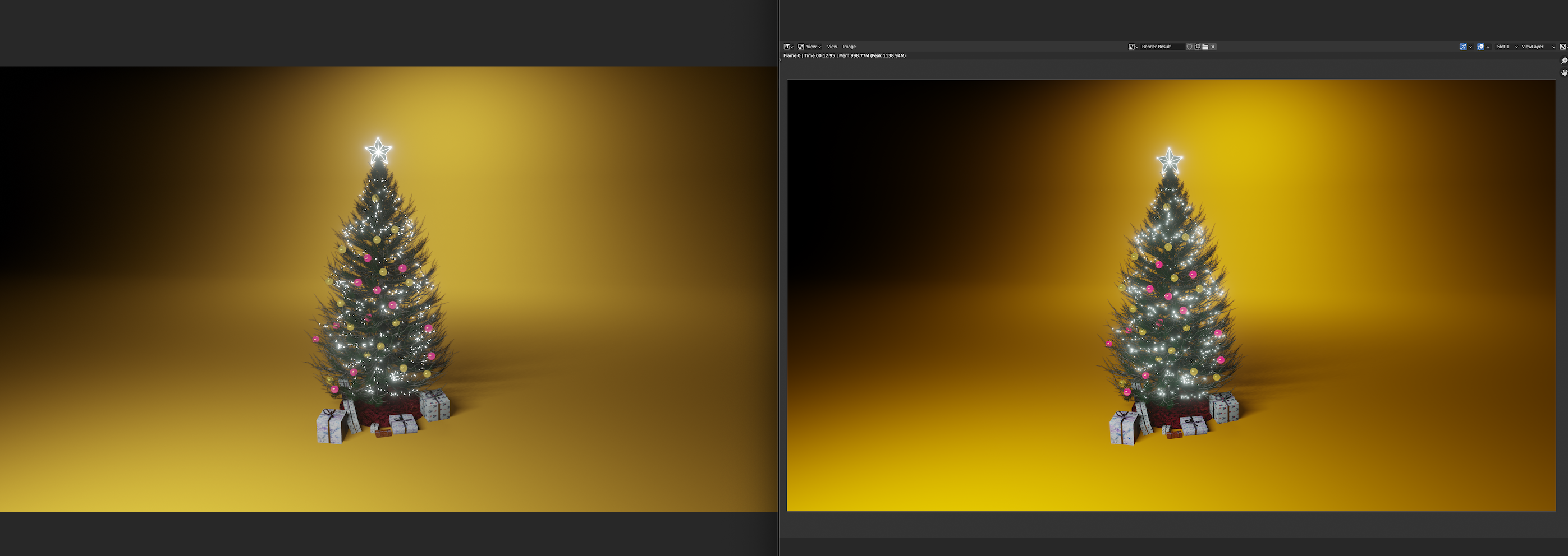
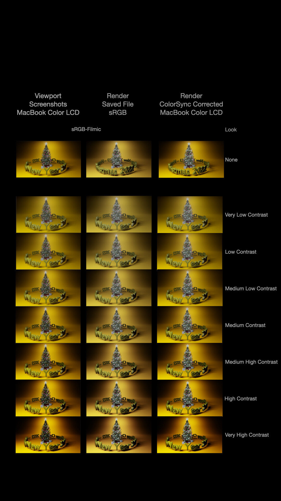
To test this, I checked through the Filmic Look settings.
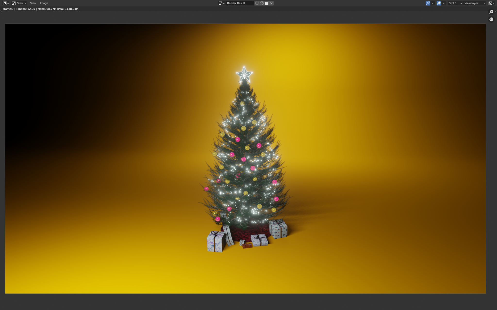
- First I took a screenshot of the Camera View in the viewport - Mac Color LCD colour profile. This had the nice colours I liked.
- Then I rendered the viewport, and saved to PNG - sRGB colour profile.
- After that, I opened the PNG file in ColorSync Utility, applied the Mac Color LCD colour profile, and saved the file - Mac Color LCD colour profile.
With this process, I could bring back the colours as I wanted to see them.
Here’s a comparison showing how the image colour changes:
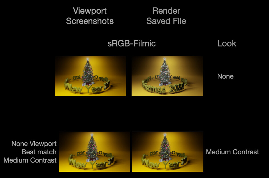
What does the Look called None do?
If you are not careful, it is easy to forget to choose a Look eg. Very Low Contrast etc. If you leave the Look set to None, you still get a look! The closest match is to Medium Contrast:
What Look to choose to match the saved sRGB file?
If you can’t be bothered to deal with the colour space changes, then you can just aim to get it close enough. You will probably need to do a few tests, but I found for this Mac, the closest sRGB saved file for the None/Medium Contrast look in the viewport, is High Contrast in the saved file:
Last thoughts
For something so fundamental, I am surprised it is not better documented in Blender. I hope these notes can help other people, and save them hours of hunting around figuring it out.
It would be nice if there could be a colour profile transform in the Compositor perhaps, to save having to do colour management outside of Blender.
You can also read the Blender documentation on Color Management, which explains a bit more why things are the way they are, and how colours are passed around inside Blender.


 | ACES Part 1")