How to composite render over backdrop with AgX config

@Eary_Chow @kram10321 Hope you don’t mind me tagging you, but I didn’t wanna ask in the filmic v2 thread as I think it will be more easily found in its own thread and a lot of answers tend to get lost there. I have some of questions. If I’ve used wrong terminology anywhere, please correct me.

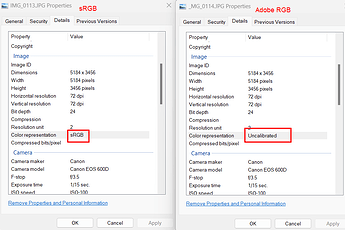
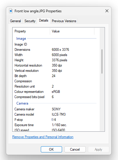
I’ve got a 3D scene in Blender and I’ve got a simple photo in JPG that’s in sRGB according to Windows file properties:

  • Is that the correct way to find out the color space of a photo? Is there a better way?
  • Is that the ICC profile?
  • Is there information missing here and if so, what exactly?
  • Can sRGB mean multiple things?

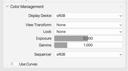
Now I’d like to use this photo as the backdrop to my render. If I understand correctly we start by setting the Color management to none (and the display device correctly to my displays gamma)?
image

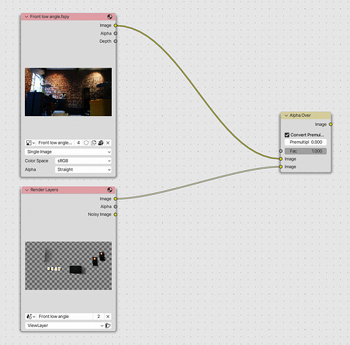
Next, we use the Alpha over node to place my render with transparant background over the photo.

The documentation says the render’s output has premultiplied alpha (like openEXR), so we have to tick the “Convert Premultiplied (to Straight Alpha)” box: https://docs.blender.org/manual/en/3.6/glossary/index.html#term-Alpha-Channel

Alright, so now we have to “manage the colours”. From following the Filmic v2 thread for the longest time I’ve understood that the render output is in Linear BT.709 with D65 whitepoint and we have to move to my (and most people’s) display gamma which is sRGB(1), but through the AgX transform. So we do this:

  • Is the render output color gamma(space?) something hardcoded to Cycles, or does the OCIO config decide that?

Next, I would think we’d work analagously with the photo. I’d add a colorspace converter from sRGB to AgX Base sRGB like this:

This results in very dark colours, so:

  • Why is this wrong and what would be correct?

The solution is likely obvious to many, but I’d really like to gain a true understanding for this mess so I can help others that are in the same position.


(1) I’ve seen the P3 thread, which complicates things because Blender doesn’t have a function to apply an ICC profile to image exports. Mac Users: Let's Solve The Color Problem (Gamma Shift On Mac)
I can’t say I am familiar with OS color management, so I can be wrong here.
AFAIK it’s not. Majority of the JPGs out there don’t even have this line of property in there.
If it explicitly says sRGB in there, maybe we can trust that, but for other spaces, it’s…
These are two JPGs from my canon camera:


The Adobe RGB one just says “uncalibrated” there.

No.

When I import these two to GIMP, the Adobe RGB one shows warning upon import that it has Adobe RGB ICC profile embedded, while the sRGB one just got imported without any warnings and got assumed by GIMP to be sRGB.

It’s funny how the one listed as “uncalibrated” is the one that has ICC profile embedded.

Not really, I believe the general practice is if there is no metadata or icc profile specifying the space, it would be assumed to be sRGB. (I am not sure here, correct me if I am wrong.)

It could mean BT.709 primaries with power 2.2 function or the linear+2.4 piece-wise function. The difference is mostly in the “shadows”, piece-wise has darker “shadows” than power 2.2. But if you don’t care the little difference it’s fine, I guess.

The display device acts as a “folder” to hold the view transforms, so if you set it to None it doesn’t really matter which device it is anymore.
Also the term Gamma is used weirdly here, as the classic meaning of the term is about the power law transfer function only. For example, sRGB and Display P3 don’t have a “gamma” difference, they just have different primaries. Using just “color space” in general here should be fine.

This is probably unnecessary, as if you save the end result to jpg or png etc., it will be forced to be unassociated alpha (aka straight) anyways. If you manually convert that, you risk losing things like glass reflections in your 3D render.

Not that.


This results in doubling of the “sRGB to Linear” transform.

Your imported JPG is also closed domain (from 0.0 to 1.0), it already has gone through your Sony camera’s built-in view transform. So you are not only doing a double “sRGB to Linear” transform, but also doing a “double view transform” here.

Make sure the two footages are the same state, either both linearized closed domain, or both non-linear state like sRGB encoded state, before you alpha over them together.

It’s determined by the scene_linear role in OCIO config. The Convert Colorspace node selects that space by default upon adding the node.

You can manually embed ICC profiles with software like GIMP.

1 Like

Gotcha, I read about it. I believe the piece-wise function is pretty much useless nowadays?

I’ll have to look that up as I previously thought linear was synonymous to open domain.

I think I meant gamut everywhere I used gamma - language issue. Still unsure if it’s correct.

Ok, this is interesting. So this made me realize that the color space input of the image node, is the same as the “From:” field of the convert colorspace node, with the scene_linear set as sort of an internal “To:”. In screenshots and just for learning purposes…

This:

Is the same as this:

It finally SEEMS correct on my monitor and things are starting to make sense, but…

I can also completely ignore “color management” and do this:

  • Why does this work?

    • My guess: because the source image is in the same gamut as my display
  • Is this a safe way to do compositing?

    • My guess: no, because if the source image was in e.g. DCI-P3 and my monitor was sRGB, things would look… off?

I really appreciate your time, patience and work. Let me know if I can return the favour.

The debate is not settled. People don’t agree with each other. There are basically two camps of people out there.

Continuing my journey into Blender compositing, I’ve tried adjusting a shadow catcher pass. Boy, is it interesting. The pass is rendered on a (1,1,1) white background. I assume this is for compositing purposes, but it messes with my goal of being able to composite on top of an sRGB brand color. I can’t simply transform this pass to sRGB as then the (1,1,1) values would get compressed and I won’t be able to use them anymore.

The solution I found was this, but I’m not entirely sure it makes sense.

  1. extract the white values as alpha mask from the shadow catcher pass
  2. apply this mask to the shadow catcher pass and transform it to sRGB with AgX.
  3. Tint the shadows blue-ish for demonstrating purposes. (In a real case I’d choose a similar tint as the background color). I have to be honest I have no clue what the color node is doing exactly here.
  4. Composite this modified shadow catcher pass over an sRGB green background color
  5. Composite the original shadowless render over this.


Image pass has alpha (sRGB through AgX)


Shadow catcher pass does not have alpha (Linear BT.709 I-D65)


Composite (sRGB) Yes it looks horrible, but it looks like I intended it to.

I’ll tag @troy_s as well to slap the nonsense out of me

Never!

The idea of compositing a brand identity “colour” this way for some brain mushed corporate idiot is a very reasonable way, although the alpha segmentation might be more well optimized? Are you getting any peculiar bits at the boundary conditions?

An aforementioned brain mushed corporate idiot could also say ”But the brand identity colour changes in the darker areas!!!1!1”

There’s no end to the idiocy and circle jerking that chasing numbers that does not work in terms of colour cognition, so all one can do when forced to play the game is to mangle things up so that some spreadsheet warrior can sample an sRGB value.

The clueless dimwits sadly don’t understand that colour is cognitive, and in chasing numbers, they actually fu#k up their brand identity colours. But here we are.

Imagine these donkeys with brand identity colours trying to make a case in these demonstrations. Sample the values and it makes it more clear. Your example is deadly close to the scission “layering” impact here too:


TL;DR: Seems pretty reasonable for a really crappy situation that a spreadsheet warrior has implemented. I am sure others might have some other interesting options?

I can’t tell if this car is blue & black or white & gold

3 Likes

That’s just cognition working properly!

A fundamental part of appreciating that colour is cognition, is through that exact mechanic; our cognition seems to modulate in cases where either “mode” could be correct.

Sort of like deciding between two options that are deemed equivalent. Perhaps it helps us discover other facets as we modulate between one to the other. Who knows… but the colour sure as hell ain’t in the damn suffocating scientism of numerical quantities!

EDIT: Good thing the system automatically removed the “whole” previous post quote. Ugh.

1 Like