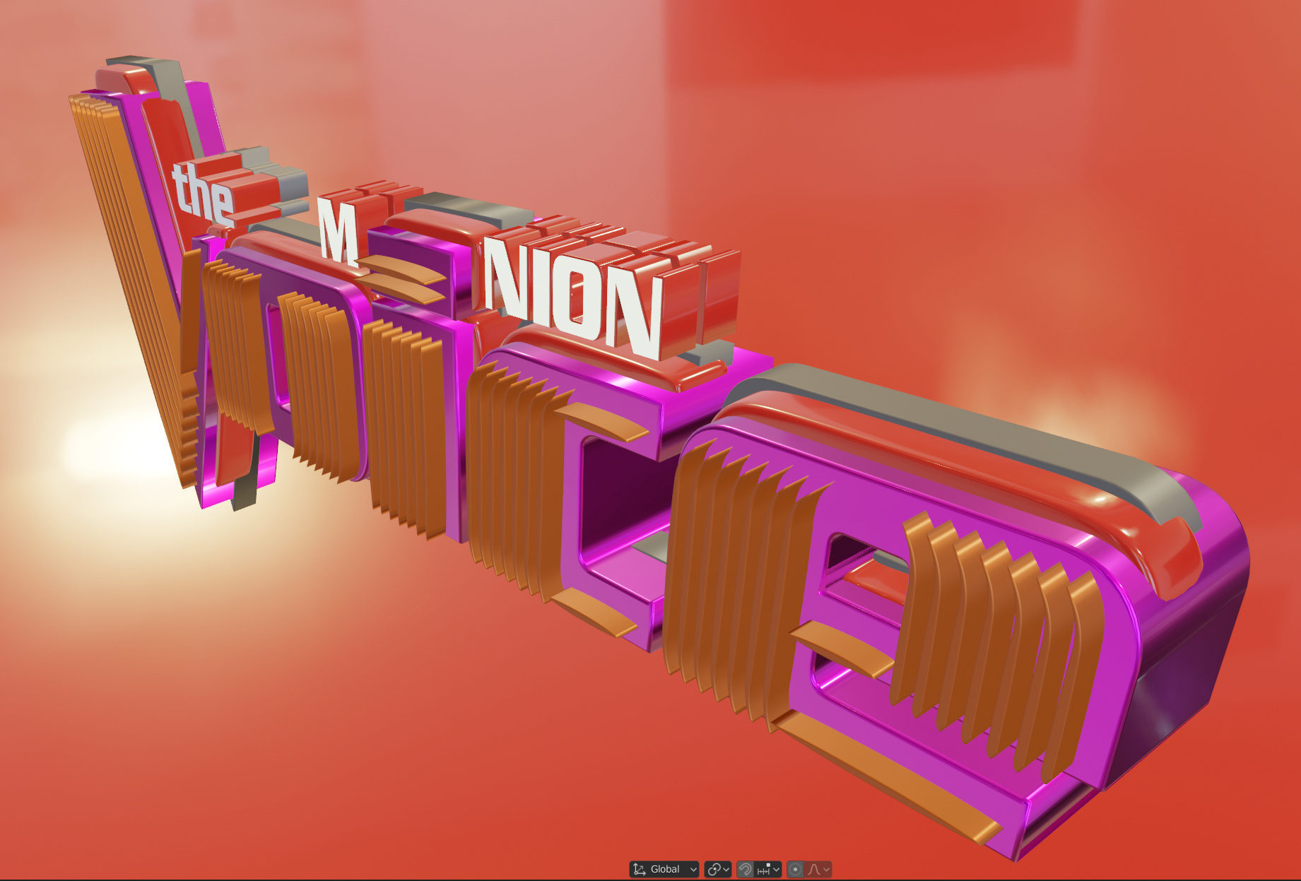
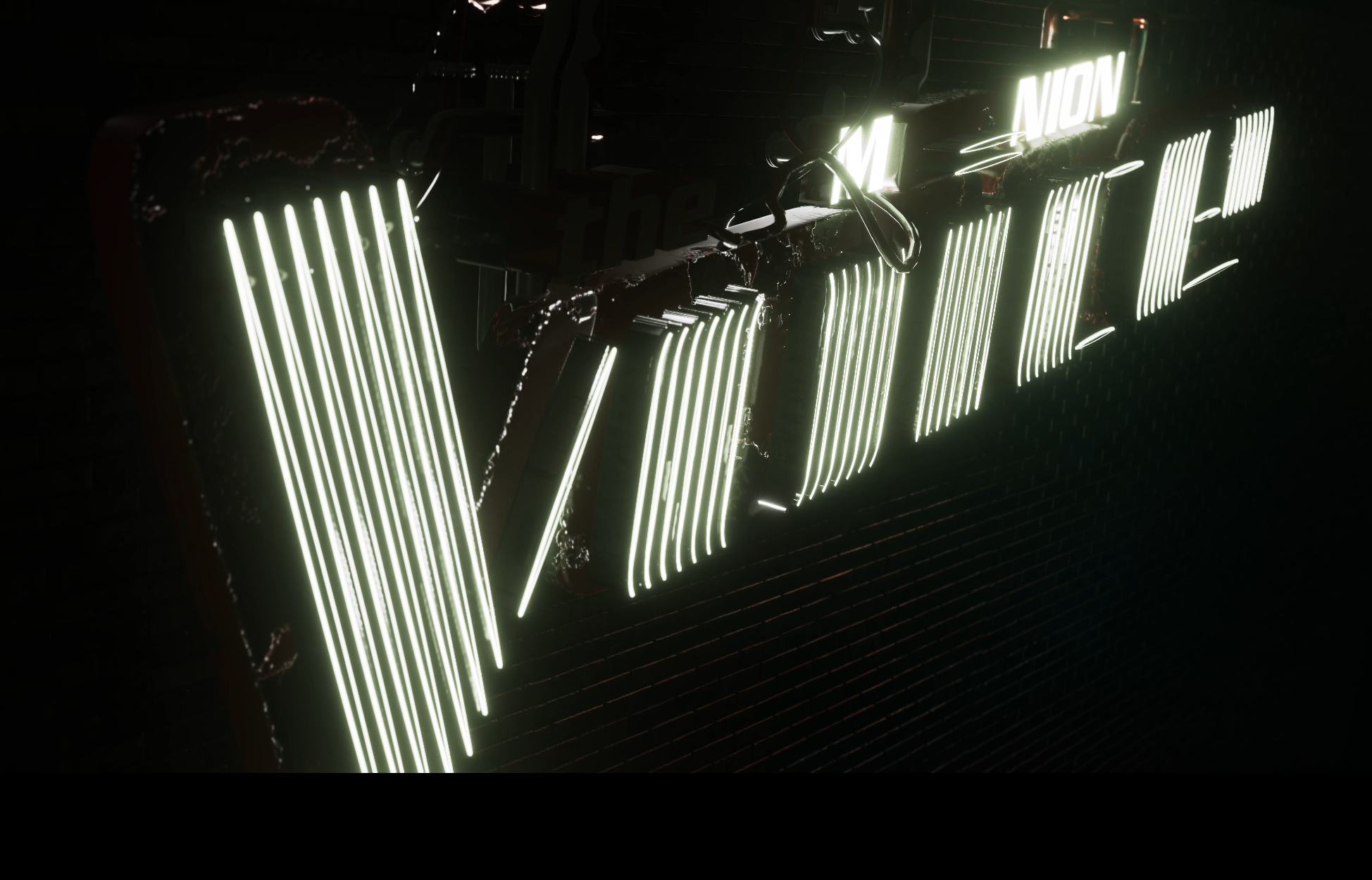
So, here we go. I’ve created that Minion Voice logo not long ago, did a quick 3D flyover animation and it had been used for a couple of promos since then. Now, the question is - how to improve it, make it look more real, interesting and appealing to a regular Joe eye? For now, this is what I got, and I am taking it from here:
2D vector version:
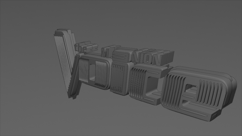
for starters, let’s smooth edges by adding bevels to all objects (as of now, it’s mostly extruded curves and text objects). It looks too clean and shiny, but i get back to that later:
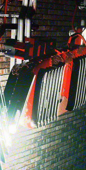
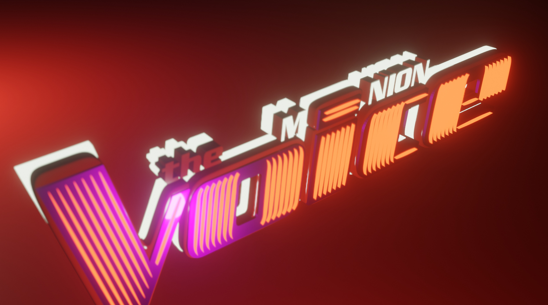
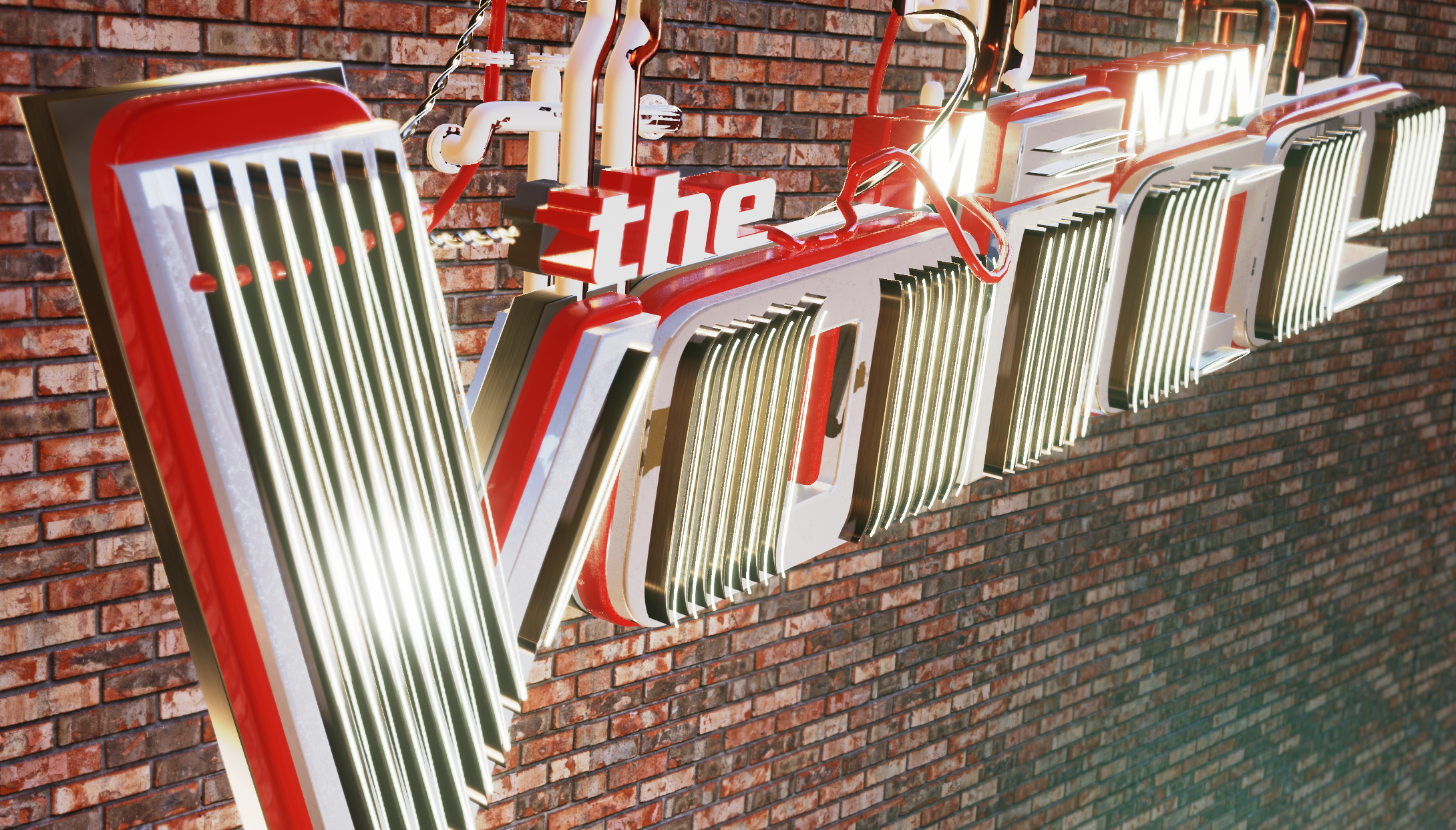
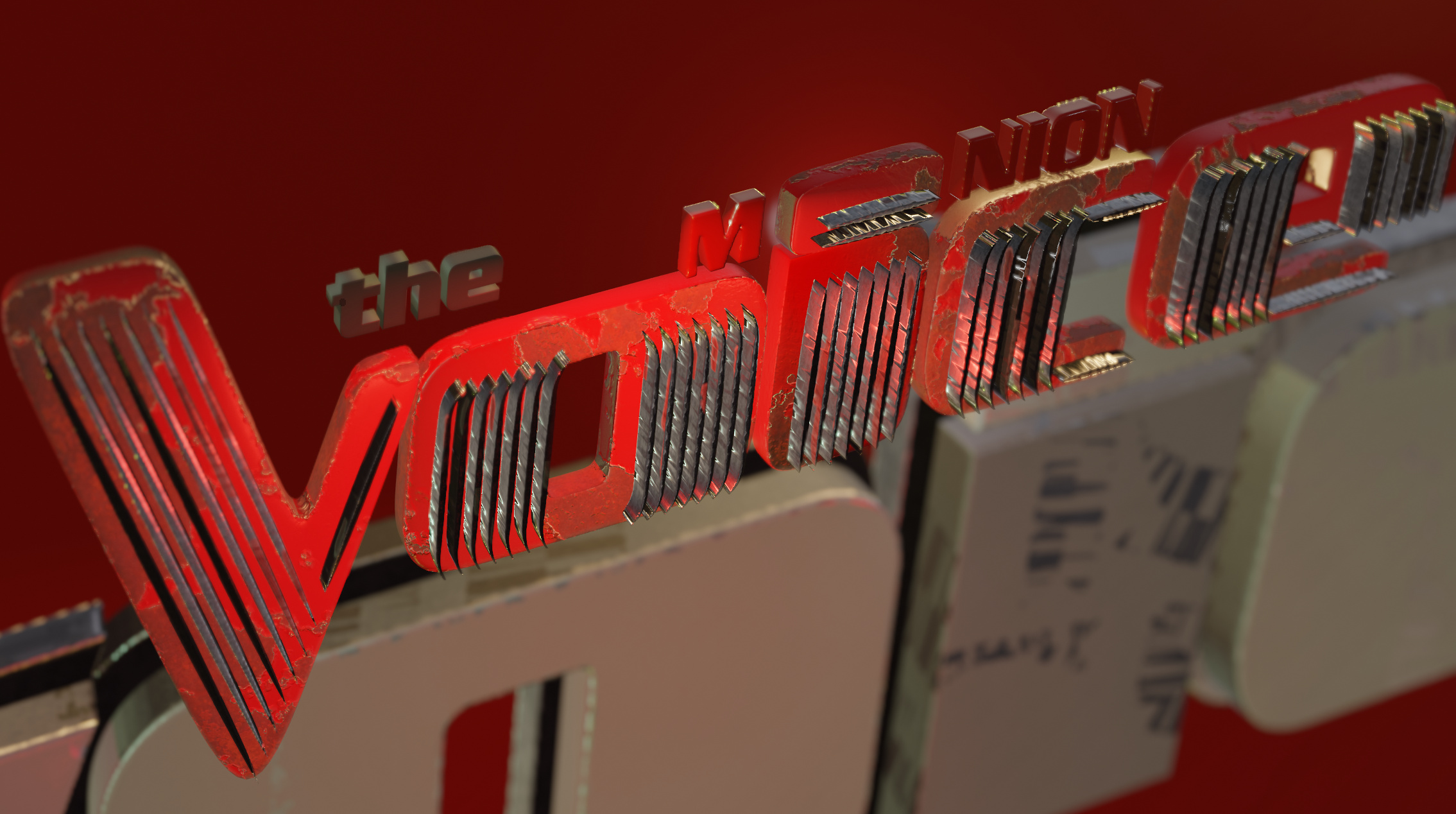
now, let’s add al kind of details to the model. Like a brick wall behind it, a lot of cables, metal pipes for the cables and to hang it on that that wall. Fire red casing is a must. Some texture painting to add that peeling paint effect. Scratches and may be a bit later a lot of screws everywhere.