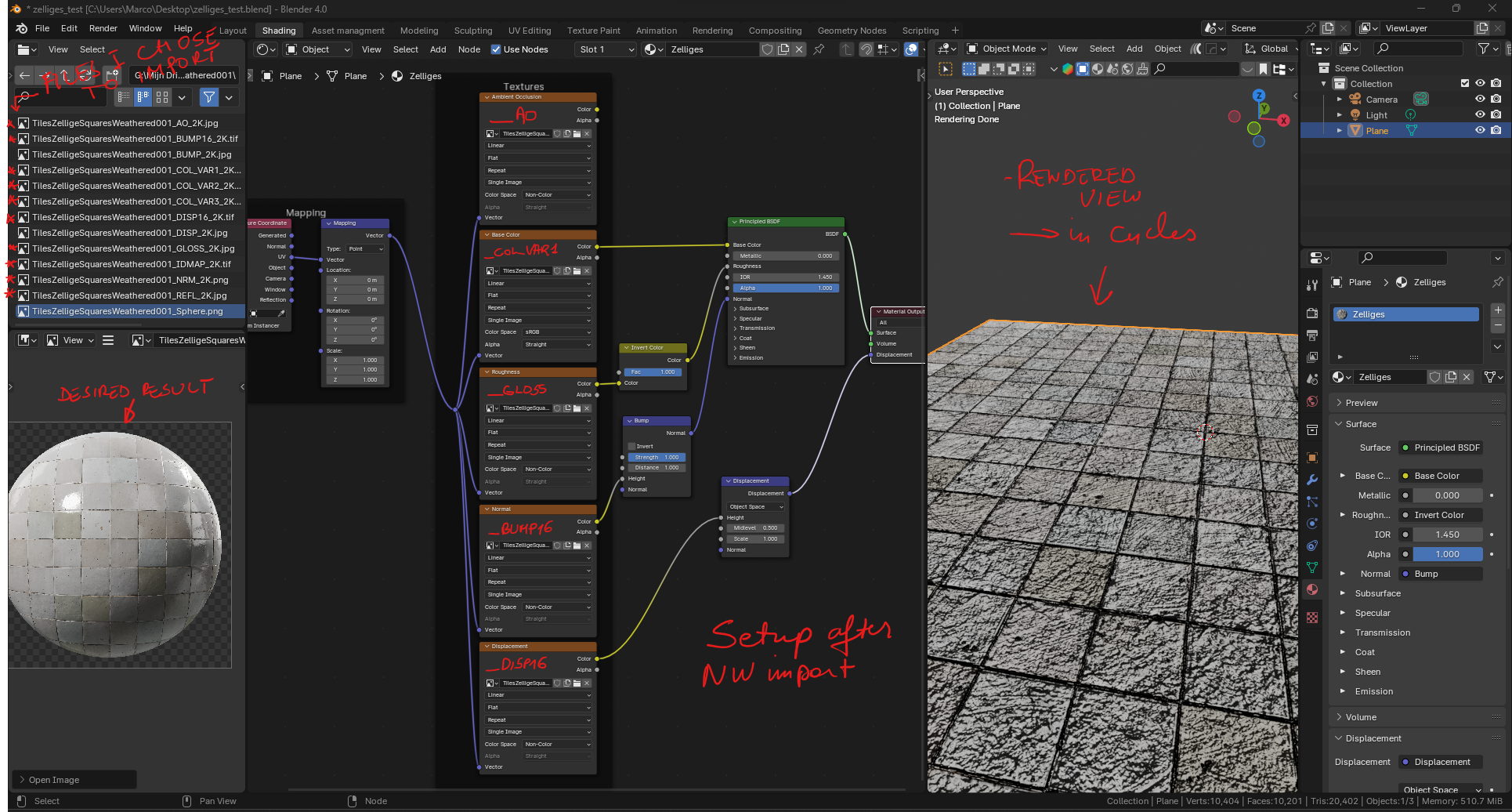
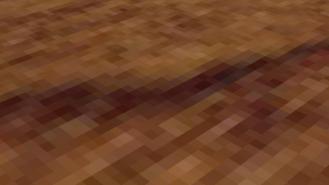
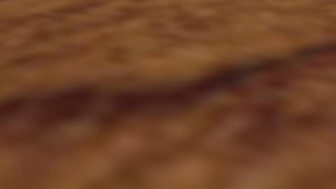
I downloaded this zellige texture from Poliigon, but I’m struggling to get a result that matches the preview.
I imported the textures with node wrangler, but it only imported and connected a few basic textures. I tried to make some manual tweaks, which made it better, but still not the result I want.
So, basicly my question is: Do you have any tips to get a more realistic result, and how would you approach this in Blender?
(And also: what to do with the IDmap??)
More detailed info:
I’m using Blender 4.0 and Cycles for rendering
I selected the following texture maps to import:
° color
° gloss
° bump
° displacement
° normal
° reflection
° ambient occlusion
° IDmap
Node Wrangler only imported and set up the first four (I also don’t understand why it preferred the bump map over the normal map to plug into the BSDF’s Normal input, I thought that a normal map is considered to be superior)
I subdivided the plane for the use of the displacement map and changed the materials displacement setting to ‘Displacement and bump’
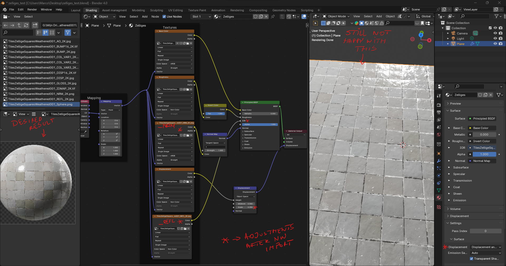
Some screenshots of my setup after import with NW, and after some tweaking:
Your normal map isn’t set to non-color, it should be.
Why is the IOR channel textured? That’s just going to give weird results. I would just unplug that texture and not use it.
If you are seeking the best quality possible, you could change the filtering of textures from “linear” to “cubic”. This is a higher quality option. It looks smoother from up close, though it’s slightly more expensive.
You could pass the roughness texture through a color ramp and tweak that color ramp for fine control over its look.
If you want to use displacement, you will need more subdivisions on your mesh than that. This is the kind of situation where it might be a good idea to use adaptive subdivision.
Adaptive subdivision allows extremely fine detail at lower cost and is perfect to use with material displacement. Instead of subdividing the whole object like you are used to, it instead adjusts the amount of detail to the camera’s position. Polygons close to the camera get more subdivided, even within a single object, while anything far from the camera or outside the view gets less detail.
How to use it:
Go to the render settings and change Cycles from “supported” to “experimental”. The options for adaptive subdivision will appear.
Go to the subdivision surface modifier. Set all the levels to 0, then check the “adaptive subdivision” checkbox. It’s important to set the traditional levels to 0 before switching modes, or else both types of subdivision will be used at the same time.
Once the adaptive subdivision is active, you will see it uses a “dicing rate” setting instead of levels. If you use a dicing rate of 1, Cycles will subdivide the objects so every polygon is 1 pixel in size on screen. A dicing rate of 2 will give polygons that are 2 pixels wide, so lower in quality. As the camera moves in an animation, everything gets recalculated every frame, so the detail is always higher where it should be.
Go to the render settings. You will see there is now a “subdivision” tab. In it, you will find dicing rates for the render and the viewport. Those act as multipliers for the modifiers, allowing you to lower the quality in the viewport. You can also choose to use a specific camera at render time (or leave it blank and it will just use the active camera).
Now, if your displacement is working and has a good detail level, you might want to disconnect the normal map, as it’s redundant. If your dicing rate is fine enough, you could even set the bump method to “displacement only” and let the displacement take care of the bump in full (This should be used sparingly though, for high quality materials.).
Adaptive displacement is cheaper than giving your objects loads of subdivision levels and it looks great, but it does have a cost. So don’t make the dicing rate finer than it needs to be and use displacement + bump where you can, as the very fine details don’t need to be fully polygonal.
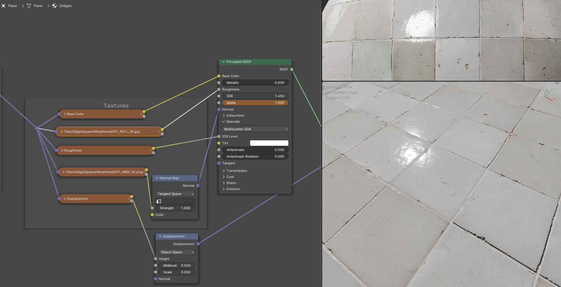
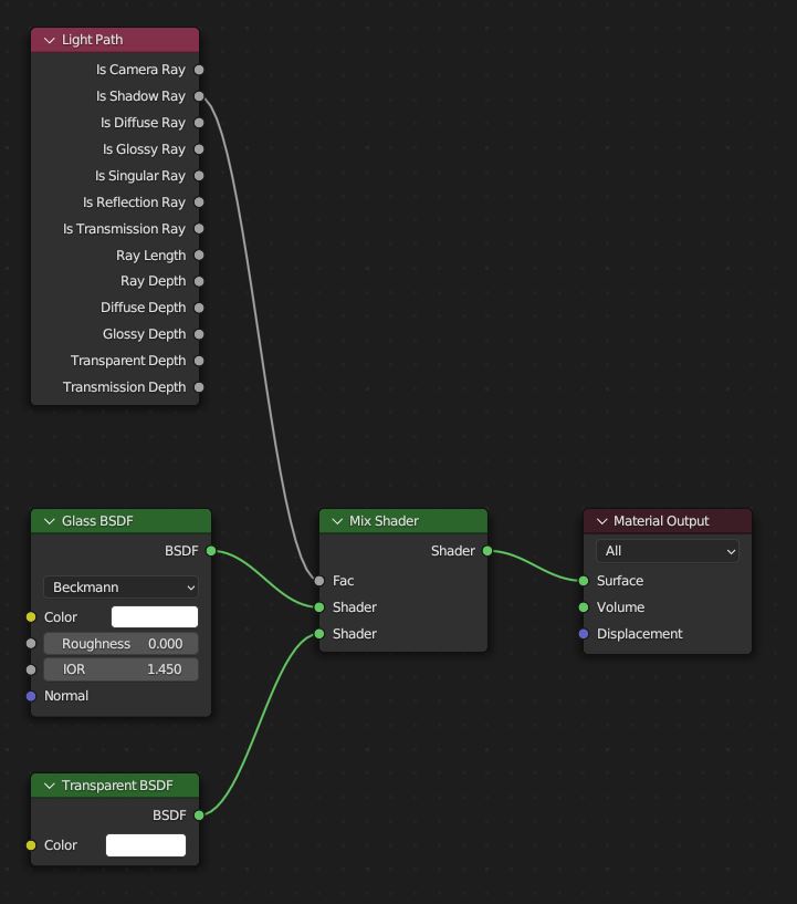
That’s really interesting, Kim. Not a common approach I guess. I spent some time yesterday to search the web for info about implementing the reflection map, but aside from some older posts (back when the principled shader didn’t exist yet), I didn’t find much.
Could you maybe elaborate a bit about the logic of this setup? Why you put the roughness texture into the specular IOR level input, and the reflection into the roughness?
The reflection texture is probably used for old renderers, before the roughness setting was a thing. Back then, you made an object less reflective by actually reducing the reflection. However, that’s not accurate to real life. Rough looking objects aren’t less reflective, it’s just that their reflection looks blurry because it’s broken by millions of tiny grains and facets.
If you have the option to work with the more modern metallic/roughness materials like Blender has, you generally don’t need a reflection texture.
Depends what the reflection map indicates. Plenty of examples from real life where “microtubes” and otherwise porous materials tend to turn bounced reflections into absorption into nothing. On a flat plane, no amount of fake normal modification will simulate this loss of (specular) energy. The ideal theoretic IOR value can only be used as is if surface geometry is accurately modeled on molecular level. Shadow gaps - i.e. gaps between floorboards on a rectangle mapped with a floorboard texture - is another case where you would expect complete loss of energy, which can’t happen by modulating roughness alone.
Not accurate. Rough objects are less reflective, but this is done internally in the Principled’s calculations. Setting it up manually using fresnel+diffuse+glossy, you have to make fresnel account for roughness to avoid “glowy edges”, meaning less reflective even if they are rough. Basically mixing fresnel using regular normal with fresnel using incoming normal, based on roughness amount. I agree with what you say, I’m just nitpicking here.
I am aware of these facts and I have used reflection textures to simulate cracks like you mention. I just think it’s better not to go to this deep when explaining the basics of materials to a beginner. This is the kind of stuff you learn after you fully understand the basic channels of a material.
I am getting rid of the reflection map in this case because I’m pretty sure the one that’s included here is not the accurate reflection value, but rather an old school texture for working with Blinn specular.
If you zoom really close to a texture, you will see that the filtering affects how the texture reacts to being pixellated.
“Closest” is sharp, but gets fully pixellated when zoomed in. Can be useful in some cases, such as making text as sharp as possible in a texture, but be careful that you don’t get too close.
“Linear” is softer, but you can still see a bit of a square pattern from the pixels. This is usually fine, but it can be a problem for bumps.
“Cubic” is the smoothest filtering, you can’t see the squareness of the pixels at all.
“Smart” changes the filtering type depending on distance. However, it only works with OSL, so you will probably never use it under normal circumstances.
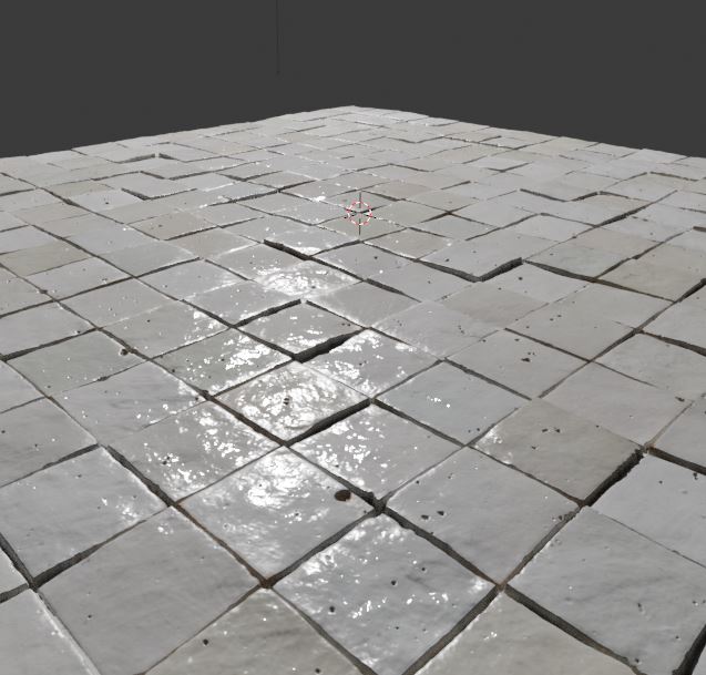
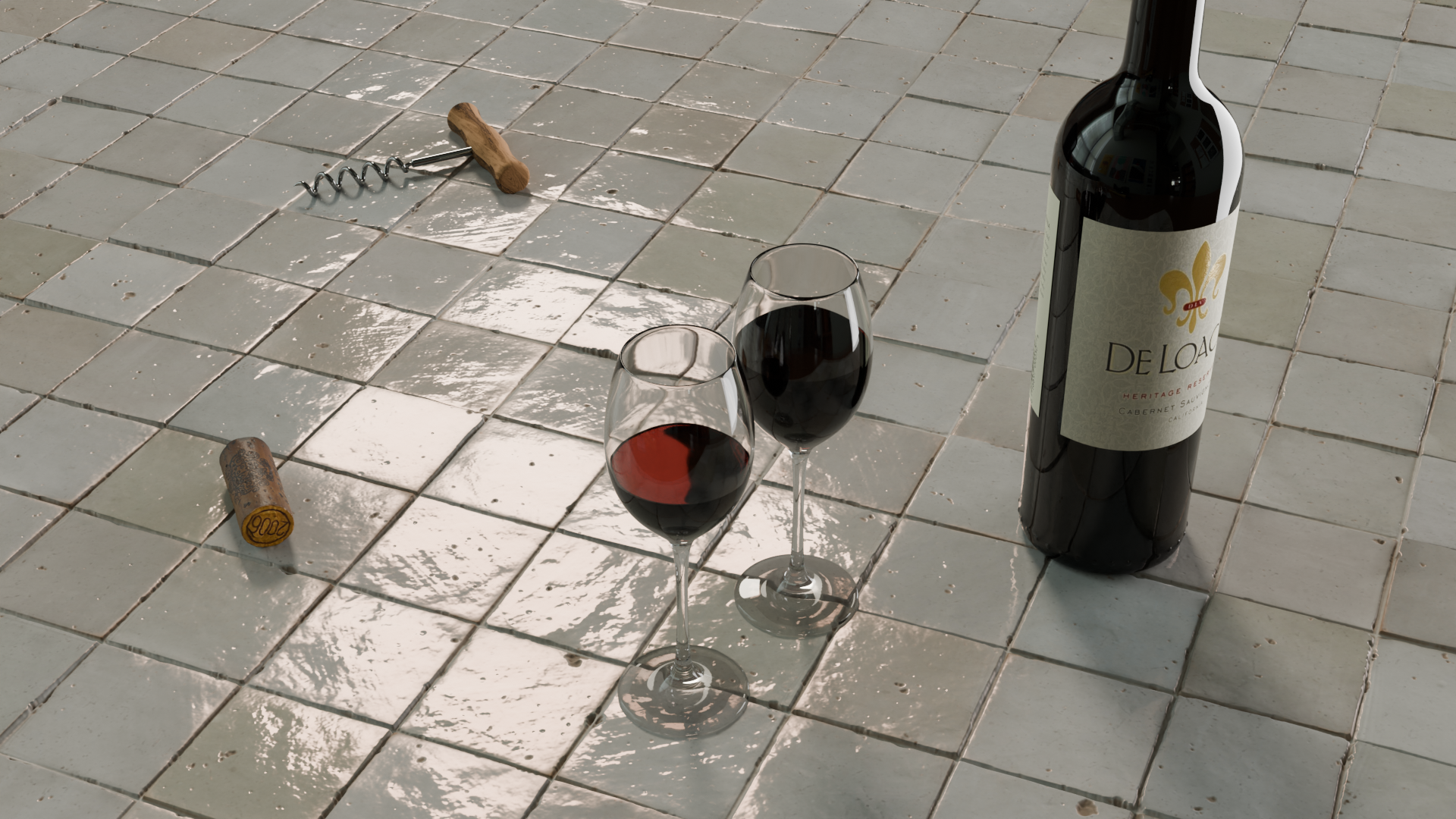
A very big thanks to all that responded. I learned a ton! (But by all means, keep this interesting discussion alive if you like ;-), very illuminating). I experimented with all the advices, kept some changes, discarded others… This is the result
Well, I might have some additional questions about your latest image.
How did you make the wine’s red color? Did you just set the material’s color to red?
If that’s what you did, it’s actually not the realistic way to color a liquid. You see, if you just set the color of a glass shader red, you will get something that’s like painted glass. However, a liquid like wine has its color spread through its volume, not on its surface.
Instead, you want to set the surface of the liquid to white and plug a red principled volume shader into the material’s volume slot. You will also want to go to the render settings, in the light paths section and give the volumes a few bounces, or else the result will be too dark.
While you are there, you might want to greatly increase the glossy (and total) bounces to something really high, like 32. If you are trying to render realistic glass, you need lots of glossy bounces (in this case, the result might be subtle, but it’s good to know for more complex glass or water scenes).
Also, you might encounter a common problem if you are using glass: Cycles struggles with glass shadows, they look too dark. This might be affecting the liquid in the cups.