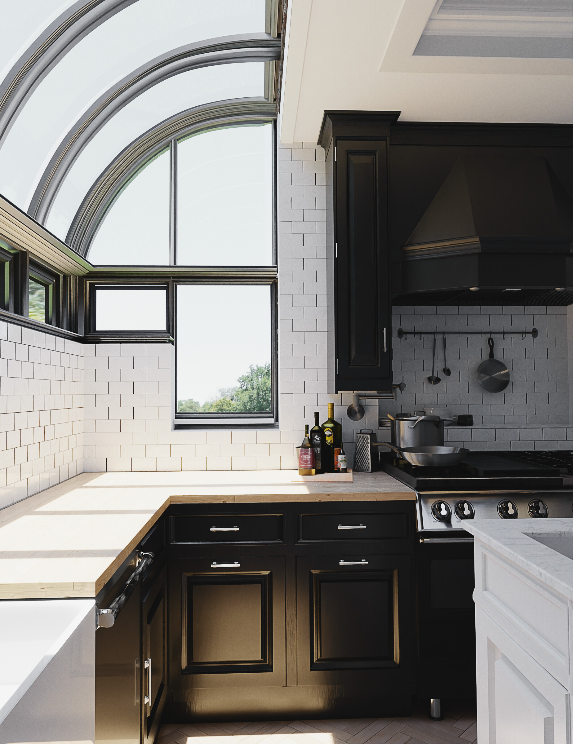
Hello! I’m looking to better my knowledge in photorealistic rendering, and wanted to get people’s opinions on this render! I am currently not finished with the scene, i have yet to add more props, and there isn’t any story, the composition is also bad. The eye is drawn to many different things and is, in all, a very not interesting image. This scene wasn’t meant to convey emotion but instead was an exercise for photorealism.
Rendered in Cycles, 800 Samples with denoise enabled. Light paths maxed at 4.
Just from my own eye, i can tell that there is things that are off, whether thats materials, textures, lighting, etc. But i cant pinpoint the issue.
It still has that “Render” Look to it.
I would love to get feedback to see what people think! Thanks!
I’m using all 8k textures.
Everything is to scale, at least to my current knowledge. The oven is the only thing i’m unsure of, it looks too beveled but I can’t seem to figure out what to change about it, or its material, to make it more realistic.
I’m using an HDRI for lighting, I played with using solid color but i didn’t like the result.
The windows still need some tweaking, but I cant figure out what direction to take them.
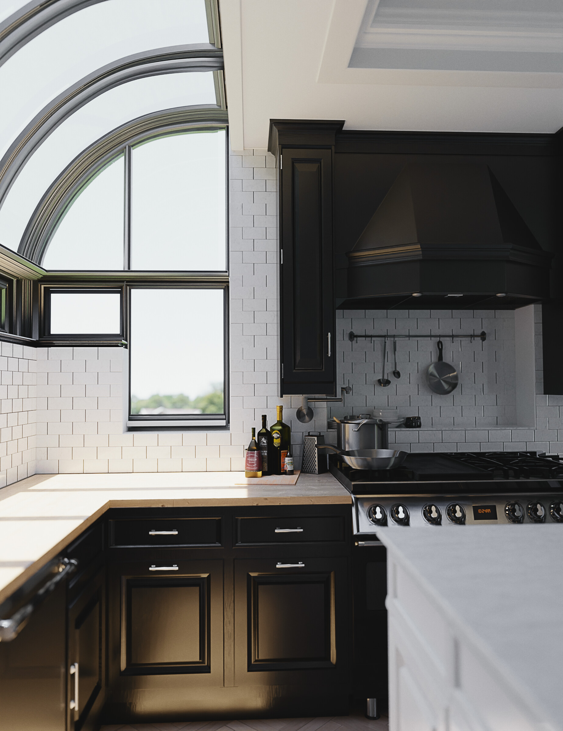
Hm, maybe try a different hdri, with a more blue sky.
Ah, do you have enabled depth of field (the background looks too short for my eye? maybe add custom bokeh:https://www.youtube.com/watch?v=W2mO1KRrzcw
And maybe add some grain
Makes sense, I used a HDR that had a cloudy sky it kinda does clash with the white tile.
I don’t have DOF enabled, it’s one thing i haven’t messed with much due to the lack of focus in my scene. Nothing in particular for your eye to rest on except for the back counter.
But, adding the bokeh to it may fix that problem. I hadn’t thought about that.
Thanks for the feedback! I appreciate it. I’ll mess around and tweak it all and see if i can post a better result later today.
A real-world photo shoot would add additional light below the countertop, on the upper cabinets, and on the stove back-wall to make the latter more appealing. It’s likely also that the camera would be turned slightly to the right on the assumption that the stove should be more the centerpiece. Although “the light is coming in through the window,” there would be a lot more artificial light set just out-of-view.
Thanks! I hadn’t thought of that.
It makes sense that there isn’t a center point to the photo currently, making it less appealing to look at. I’ll build up the scene around it, and mess around with lighting the scene with artificial lights outside of the camera’s view.
I appreciate the feedback!
Added depth of field, changed the rotation and position of the camera to better focus on the stove. I did add some light that shined on the back of the stove, but it isn’t too bright.
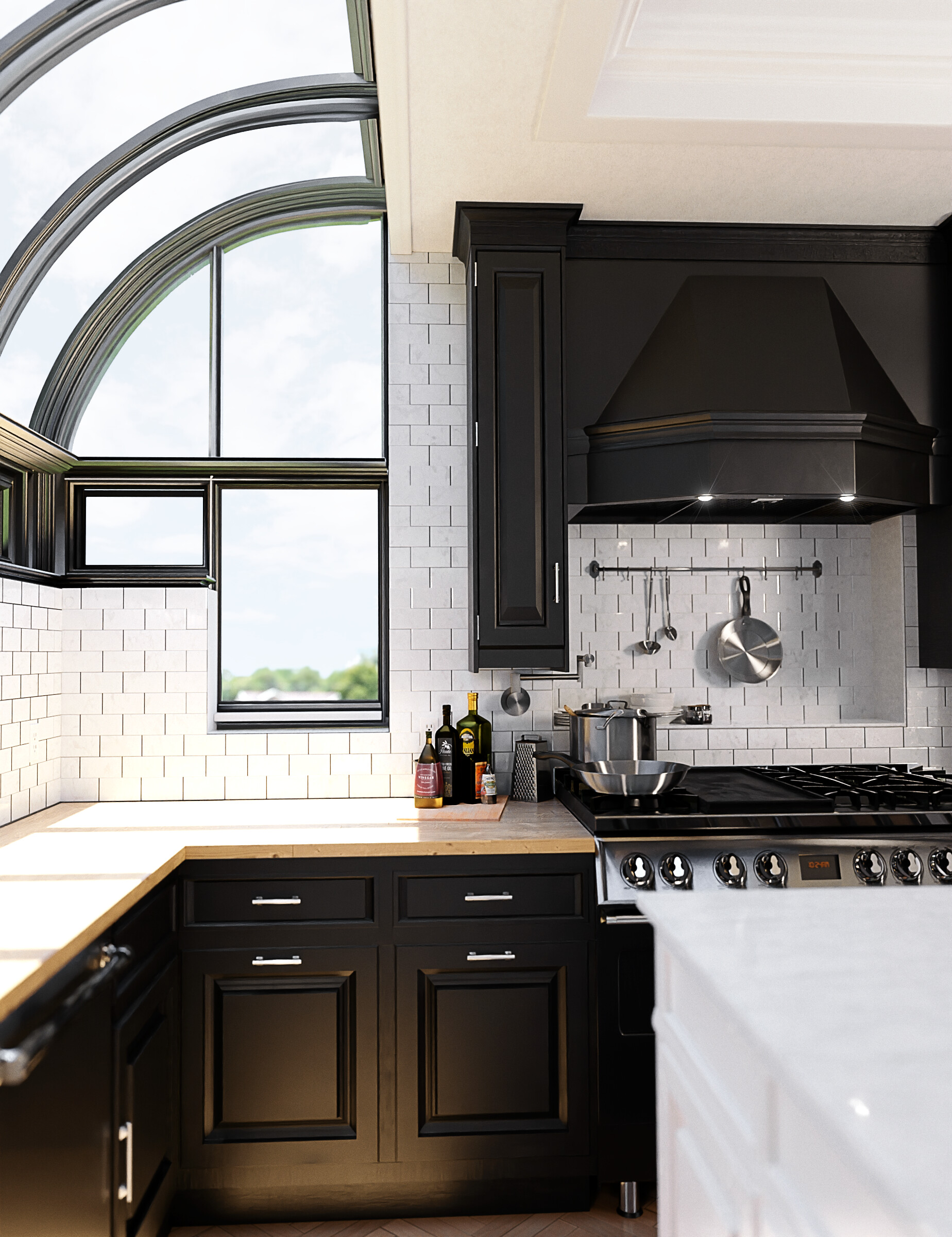
I’m on a phone now, but overall it’s really stunning. With not much work it could be something special. Some of the lows may he too low, you might want to raise the level slightly near the bottom of oven. You might lower in it again in post, but you’d have a choice. The materials could use a hint of grunge and bump. Although it’s possible I just can see it on my small screen. And then there’s the bottles, their necks look too narrow and the scales of them seem off, scale of cheese grater and small frying pan seem wrong. As for the sky outside the curved window add really subtle sky or cloud, not just pure color. I’d also add a few more kitchen props in different places. Great stuff!
Your latest image is a step in the right direction, although in an actual shoot we would use a “soft box,” so that the light is evenly diffused across the entire “area of interest” without appearing to come from a hidden source. We’d also be thinkng about the actual “color temperature” of indirect sunlight, and choosing an appropriate “gel.”
If you haven’t yet actually done so, I would strongly encourage you to look at the many books (and, web sites) which talk about what actually happens “on set.”
I was privileged to assist when a well-known magazine set up a shot of the interior of a historic hotel. An absolutely perfect “daylight” shot except for one thing that the magazine’s readers never knew: the shot was made at 2 o’clock in the morning on a moonless night. The placement, gel-colors and power settings of the many strobes had been planned for weeks. Literally “in a flash(!)”, the shot was perfect. (Of course.)
You want to select and place your light so that it gently and unobtrusively illuminates the entire area – with a slight gradient perhaps front-to-back – but without any “hot spot.” Also, the back-of-stove area still needs a bit of “accent and ‘zip,’” possibly through the use of perhaps slightly-warm color.
Think very carefully about where you want the viewer’s eye to go – where first, then where, then where, all the way finally back to the very beginning. Your light will lead them on this journey.
Thanks for the feedback! Changing the sky along with the sizing, the grunge really helped the image along, i’m still messing with the props tho. I’m trying not to overcrowd the scene, while at the same time creating something for the eye to look at that isn’t boring.
I did some research and found an in-depth video on lighting interior scenes for photoshoots, with gels, and softboxes.
I had no idea it was that extensive, thanks! opened my eyes to the world of photography. It isnt just a picture snap.
The story of the scene is something i’m still working on, adding props, and things that really catch the eye. I changed up the coloring and lighting of the scene, added a softbox, and played around with gels. (Ended up not using them due to my lack of knowledge). The journey the eye takes is something i still need to create.
I really appreciate the feedback. That alone opened up a new door to go learn and explore what lighting really is.
This is an updated shot, I wasn’t too sure about the flares on the lights. I’m messing around with those. But as for the general color and light lift, I feel like the scene isn’t as gloomy now. As for it looking more realistic, I’m unsure
To my eye, “there is still a circle on that cabinet door.” Which reveals the presence of the hidden light. Gently illuminate the entire wooden area. You want to eliminate the opaque-black area without revealing that you did it. (But you can get away with that highlight on the dishwasher since that light could be bleeding in from somewhere around the countertop.)
Thanks for the feedback! Which cabinet are you talking about? There are the bottom cabinets that are reflecting the light coming from the window on the floor. And i do see a little bit of white light reflecting off of the cabinet right beside the washer. And then towards the top right there is a little bit of reflection from the false light that is coming in, but I can’t seem to take the reflection off of it without making the scene much dimmer.
The workplate on the left has usually a strong bevel at the top edge.The tiles could need tiny vector imperfections, like real tiles are sometimes slightly different to each other, due the manufacturing process,and the way they are placed on the wall.Give the textures subtle (allmost only in roughness)dirt should help to breakup the clean cg look.
Thanks! I’ll definitely do that. Currently, all the tiles are hand placed but they may be a little too aligned. I haven’t thought about vector imperfections, thanks! That should help a lot